Blues Unveil New Uniforms!
 Saturday · Sep 15 · 2007 | 9:41 AM PDT
  16 Comments
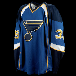
 The St. Louis Blues officially unveiled their new Rbk EDGE uniforms at FANfest this morning. Check out photos.
As I said yesterday when we first saw photos, I love the shoulder design on these sweaters. Unlike some people, also, I don't mind that there are no horizontal stripes at the bottom of most of these uniforms. I think they look great — especially on the ice.
 Even the road jerseys look pretty sharp, and I haven't really loved most of the white jerseys that have been unveiled to this point.
It'd be nice to see how they look on the players in full padding because it can only improve an already excellent design. If you ask me — and I know no one is — the Blues definitely got it right.
Wish I could say the same about the Islanders.
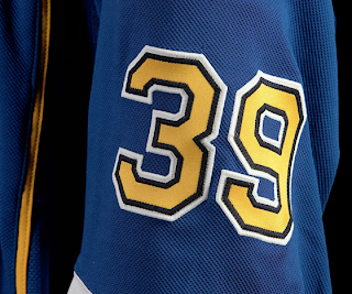
The Blues' online photo gallery of the new sweaters didn't include a lot of close-ups, but here's one I like.
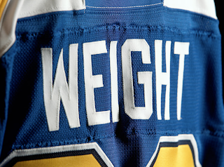
The numbering and lettering text on the jerseys remain the same. Check out Doug Weight modeling the new duds.
Some people have expressed concern over how longer names will look on the back of the sweater. The issue is the yellow piping extending down the back which we really haven't seen on many other new jerseys.
Anyway, I know most of you have already commented on these jerseys in previous posts, but for everyone else, here's your shot. We'd love to hear what you think.
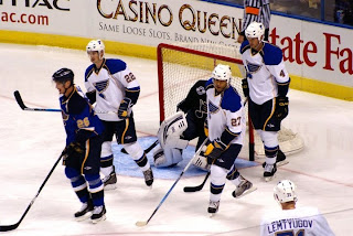
UPDATE (8:26 PM): I was emailed an action shot from a Blues fan who was at FANfest today. I guess some of the players took part in a scrimmage. This photo gives us an idea of how the jerseys will look over the gear. The answer is spectacular.
I'm a Lightning fan and I'm jealous.


Reader Comments (16)
i could actually say well done
i hate whole having a account to comment its so annoying
Wow, that's one of the best so far in my opinion. They look great.
Very, very sharp. One of the best jerseys unveiled so far this summer outside of those teams that stayed pat on their overall designs (the Rangers, Detroit, Montreal, Toronto).
There is only one thing that I think should not have been done and that is the abruptness of the white trim (or blue on the road jerseys) around the shoulder panel that stops at the Reebok logo (above the nameplate). If it was continuous and the logo color was the opposite of the base color of the jersey, it would then be perfect.
Nice use of the yellow piping. I agree with someone here on one of Chris' other posts about the Blues new jerseys that perhaps it is used to pay homage to the Gateway Arch. If so, it was tastefully done.
Any Blues fan that wants this new jersey, you oughta be buying this today.
Like this one a lot.... BUT I hate that RBK is breaking design lines just for their fricking logo. Why couldn't the colors continue across the back shoulders and the RBK be in white or black in that area?
Good looking jerseys! Very sharp indeed.
However I'm not sold on the piping on either jersey. I like the shoulders but for some reason that piping just stands out too much for me. And it's not because I hate piping on all jerseys that have used it.....just these ones. But I guess if it was done on purpose to emulate the St.L arch, than that's a pretty cool reason.
Overall one of the best so far.
what is up with those random white patches above the name plate? That looks.. illogical.
They came so close to a good design, yet so far.
the thing with the reebok logo above the nameplate is the first thing i noticed in those rear shots of weight. it just.... doesn't make any sense.
Not a bad jersey but I hate the piping.
I think these are some of the best so far. The home jersey looks really sharp. Like others have mentioned, I think the only thing that looks kind of silly is the patch for the RBK logo that breaks up the color pattern. If I were a Blues fan, I'd be proud to sport these new duds.
Well done Blues, well done. One of the better looking jerseys, although I'm not sure about the yellow piping on the white jersey (it looks fine on the blue). Look forward to seeing my Wings face off against you New Years Eve.
As a Sens' fan (who likes our new design) I feel these are the best of the RBKs so far, by a landslide. I am not a fan of the piping, but I think it really works for the Blues, especially as a nod to the Archway, or as was suggested in the past, "it looks like a hockey rink." Other new jerseys didn't leave that impression at all.
I wouldn't say these are an upgrade on previous Blues jerseys, but again, the best of the new designs. Bravo, Blues!
No question - this is the best non-Original 6 team jersey. Only New Jersey, Washington, Phoenix & Columbus are even in the same ballpark.
Ok im a Canucks fan but i still think that St. Louis did the BEST job on utilizing every seam and stitch in the new styles. Very very well desighned jersey
They're *okay*. I'm not really sure why people critique the Avs or the Oilers for having stripes run up the front of their jerseys, but not the Blues when they shift the exact same sort of lines ever so slightly outward. I still find their addition gives it a prissy flimsy kinda appearance. Definately better than what Vancouver or Dallas has thrown out, but it still begs the question: "why did you need to change anything about it in the first place?"
The Blues NOW have the worst jersey in the league. Way to go St. Louis, you managed to screw things up big time! They have even managed to pass the new Ottawa uniform system in that category.I will be rooting hard against this team the whole year. What a joke!!
There are going to be quite a number of teams that will look like fools on the ice this season.
As a Blues fan, I have to say I don't especially care for them. They look okay, but there was no reason to change a jersey that was fine in the first place.
They shouldn't have changed them at all, but at least they're not completely different.