Sharks Unveil New Uniforms!
 Monday · Sep 17 · 2007 | 2:11 PM PDT
  48 Comments
 The San Jose Sharks have become the final NHL team to unveil their new Rbk EDGE uniforms today.
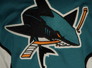
How about those! To echo some other folks, we're definitely looking at a fancy new logo on a very retro sweater. What surprised me was the shoulder logo.
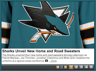
I was expecting a fin logo so I was a little shocked to see the full shark logo. And I'm pretty sure the shield logo will make its way onto the pants, leaving the fin logo homeless. The logos I'm referencing can be found here if you're interested.
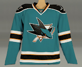
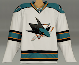
 That teal looks really great on these uniforms, by the way. What totally sells it for me is the orange. I know a lot of fans aren't too keen on it, but I think it brings a great new dimension to a look that in recent years had been kind of monochromatic.
The cool thing is that the stripes around the elbows and waist are reminiscent of the original uniforms from 1991 which had grey in place of orange. And who here doesn't love retro? You know you guys do.
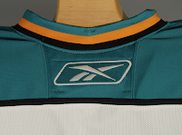
And then here's your close up of the collar. That teal looks really, really great.
Overall, I'm a fan. I think they could've gone with some more curvy lines and vertical piping to match, but they chose something a bit daring as far as these new Reebok sweaters. I'm impressed. I still prefer my Lightning jersey... which is coming in just a few days!




Reader Comments (48)
I have to mention that the quality of the comments here on NHLTOL is very hight.
No other site can claim to have this quality of comments, and the absurb-stupid-agressive comments are nowhere to be found.
The NHL may be in poor shape, but fans seems to be absolutely top-notch.
This is the best jersey the Sharks have ever had, as far as I'm concerned. And if they were to get a serious logo instead of the present comical one, I'd like this jersey a lot.
Artymous-
No you're right I was off by a year, it's been so long I couldn't remember the exact year. Either way last year's design was still in use longer than the original striping and is much better and should not have been messed with for this new god-awful jersey.
These are cool except for the fact that the same logo is on the jersey 3 times. The "full shark" on the shoulders is not significantly different from the chest logo. The fin should definitely be on the shoulders. Weird.
blueshark -
I respect that opinion.
I'm still mourning the original jersey, so I know where you're coming from.
Here's to an alternate we can both, hopefully, appreciate in '09 :)
I agree with the dissenters, this new jersey is pretty brutal. They took the Manitoba Moose jersey of a few years ago and tweaked the colors slightly, added the cartoon shark, and put the numbers on the front. Glhf sharks fans.
Personally, I LOVE those. Retro, but somehow modern.
Take it from a Sabres fan, it could be much worse. I'd KILL for the Sabres to adopt such a classy uniform.
I like everything about the jersey, except the orange.
Great New Logo + Retro-Styled Horizontal Striped Jersey = WTF?!?!?!?!
This logo feels cramped now on the front... there's no flow, no smoothness.
I too like the full shark logo..... but not on the shoulders. That new revised fin in the surf diamond is awesome!!!!! It shouldn't be hidden!
It's not really working for me. It just feels like they mismashed the new logo to a retro jersey without really considering how well the two will work together. There's definately far worse out there but it maintains the status quo of the RBK jerseys being a step down.
Hey, they got it right! Hopefully, I'll get one of those in the near future- this is right up there with the original jerseys in terms of excellence!
I saw them in action tonight at the Teal & White scrimage STH game and I did not like them. The arm colours look like arm bands. The white jerseys from behind under the lights on the ice look like StL Blues jerseys from the back.
I am disappointed and I don't know if I will get used to those things they are wearing now.
Hey guys,
I've been keeping pace with your comments and I have decided to chime in.
I have to express an opinion that I feel none of you have. If you have and I have skimmed your opinion, apologies.
I feel alienated by the sharks new jerseys. I do not feel this way because of the sweater's apparent anachronisms but because of the colors. Yes, yes, we've all heard how many people differ in opinions on the addition of the orange. Yet, I do not just see this as a gripe towards color selection. I genuinely feel like I am looking at a different team. It is how a North Stars fan must have felt when he looked at the Wild. Or a Jets fan felt when they got their other team in Winnipeg. I feel as if the addition of the orange really alters the appearance and persona of the entire organization. It is not just a revamping of the sweater and logo but it is a wholesale recreation of the image of the organization.
I know, i know, its just a color. Yet, the whole reason we invest in jerseys and logo's as merchandise is because we identify with them. We are comfortable with the image and it becomes a piece of us. Now, that image is drastically different. Not only is it just different but, to me, its been so negatively altered that it is very disappointing.
I am sort of dreading my first trip to the tank this season. I wont even recognize the jerseys on the rink and I really wont even like them. Ugh, what a sour taste in my mouth.
It all makes me really frustrated.
Whoever was in the focus groups for these jerseys ought to have been ignored.
Wow, I think these jerseys look great. The orange is going to take some getting used to, especially for long time Sharks fans, but these look really sharp. I'm actually surprised that RBK took a team who had a more modern jersey to begin with and went with a retro look. So far, it seems to have been the other way around with teams that had retro jersey styles getting a modern twist.
As far as Peter's comment about not being able to identify with the team, I guess as a Sabres fan I can relate to a certain extent. Back when the team changed from the original jerseys to the buffalo head logo and the red, black, and white jerseys, it took people awhile to get used to the change. Not only had our beloved logo been changed, but we had a whole new color scheme to go with it as well as a more modern style jersey. Now we're adjusting again to the old color scheme of blue, gold, and white and the "Buffaslug" logo. I guess sometimes it can be hard when the look of you favorite team is constantly changing, but rest assured that you can still show up at games and support your team in the old jerseys and nobody is going to mock you for it. For me, going to a Sabres' game and seeing fans in the wide variety of jerseys we had over the years is actually pretty neat.
I like these jerseys. These guys could teach the jersey people from Edmonton and Dallas a thing or two.
After another look, it's more like the San Jose Dolphins. I'm sticking with last year's jersey.
!
not nice! the orange is real ugly.
the old teal uniform was one of the best, why change it ?
and with the numbers on the chest, the players look plain dumb.
bad design. this will disapear in 2-3 years.
Sharks fans are funny. This uni is the best of all the non-Original Six teams. As an Oilers fan, I'd be pleased as punch if my team had gone with a classic design like that instead of picking a template from the Reebok-O-Matic Jersey Selector. The orange is great, really brightens up what was a dull, monochromatic scheme. The only negatives are the shoulder crests (shoulda gone with the fin) an dthe numbers on teh front (who are teh ad wizard sthat came up with that one?), but overall, that's a great new look.
I HATE TEAL!!!
I love the jersey design and style. I am a fan of the classic look with horizontal striping. But no matter what the design, as long as the Sharks use teal as their main colour I will hate their jerseys.
In my humble opinion it is the best switch of any new logo/colours NHL uniforms. The Sharks introduced a great refresh look and they keeped the bottom stripes which is great compare to jersey like the new Maple Leafs one which looks boring because it is almost unicolor.
Here are some pictures of both home and away jerseys from the intrasquad Teal & White game the other night and last nights preseason game against the Kings.
http://sharks.nhl.com/team/app/?service=page&page=MediaGalleryPlayer&galleryId=2437" REL="nofollow">Teal & White game
http://sharks.nhl.com/team/app/?service=page&page=MediaGalleryPlayer&galleryId=2455" REL="nofollow">Sharks@Kings
After seeing them in action I have to say I still don't like 'em. And not surprisingly, there isn't one picture where the numbers on the front of the jersey help identify the player any more than if the numbers weren't there. Absolutely pointless to put them on the front.
As the Sharks are my favorite american NHL team I do like them. Not a big fan of the orange though. as for the logo, I prefered the old one. Overall, I do like it, but I gotta say that it is my least favorite one out of their 3 different jerseys in their 16 years history. Will I buy one? Probably not. Would I buy either of their previous one? I'd love to! So, again, I hope CCM will keep making the old jerseys!
I think these uniforms are horrendous. Sorry, Sharks fans.