Sharks Unveil New Uniforms!
 Monday · Sep 17 · 2007 | 2:11 PM PDT
  48 Comments
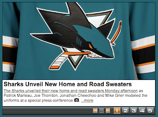
 The San Jose Sharks have become the final NHL team to unveil their new Rbk EDGE uniforms today.
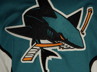
How about those! To echo some other folks, we're definitely looking at a fancy new logo on a very retro sweater. What surprised me was the shoulder logo.
I was expecting a fin logo so I was a little shocked to see the full shark logo. And I'm pretty sure the shield logo will make its way onto the pants, leaving the fin logo homeless. The logos I'm referencing can be found here if you're interested.
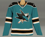
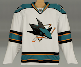
 That teal looks really great on these uniforms, by the way. What totally sells it for me is the orange. I know a lot of fans aren't too keen on it, but I think it brings a great new dimension to a look that in recent years had been kind of monochromatic.
The cool thing is that the stripes around the elbows and waist are reminiscent of the original uniforms from 1991 which had grey in place of orange. And who here doesn't love retro? You know you guys do.
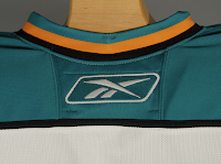
And then here's your close up of the collar. That teal looks really, really great.
Overall, I'm a fan. I think they could've gone with some more curvy lines and vertical piping to match, but they chose something a bit daring as far as these new Reebok sweaters. I'm impressed. I still prefer my Lightning jersey... which is coming in just a few days!




Reader Comments (48)
Unless you can find a photo of Jamison laughing and holding the real jersey, no photos are needed. ;) I can't believe they took a new, updated logo and slapped it onto a retro design. I guess I'll wait and see the new designs next year!
The orange is going to take me awhile, as a long-time Sharks fan.
However, these are a solid, solid look and design in and of themselves.. and guess what.. they didn't block out the back to show off the Reebok logo! That alone gives me new respect.
Definitely top 5 in the new league, and when I'm done hating orange, I'll like them all the more.
The new jerseys look spectacular - they're every bit as good as my other favorites - the Blues and Flyers. If I can afford it, I'll be buying myself a teal Sharks jersey.
Ok. Are we looking at the best jersey in the NHL? I mean, the teal is beautiful, and the white is spectacular.
The full shark on shoulders give these ones a special dangerous look on the ice.
The use of old time jersey desing on the new RBK edge era is a winner.
So question: is these set of jersey's the best in the NHL?
My answer is that it's certainly top four no question.
This is among the top three to five new jerseys in the entire league. What a winner! I know some might be critical of a new modern logo with a retro look to the jersey, but you know what? I think it works. This is SO MUCH BETTER than the previous jerseys we've seen for the past nine years. So much simpler, clean and great use of the colors. I know that orange was less noticable back in 1991 and is more an accent color now, but it works here.
My all-time favorite Sharks jerseys are the original ones when the team entered the league. I own one of each of them. This will eventually be a part of my collection.
Seriously, this is a great new look for the Sharks, hands down. I've been hoping for something like this ever since they've been wearing those ugly jerseys since 1998. The black alternate was the best of the three. I think a black one in the future is worth consideration.
My gut feeling is that this new jersey set will be a big hit with Sharks fans.
LOL.. see, the typical reaction among non-sharks fans are that these are fantastic.
The typical reaction among sharks fans is the Emo announcement of hurting themselves in some way over the brutality of it all.
It's very amusing to watch. Sharks fans never realize how good we have it. lol.
Paul said, "My gut feeling is that this new jersey set will be a big hit with Sharks fans."
On the San Jose Sharks forum, as well as on HFBoards, this is turning out to be untrue. They're getting panned rather harshly, aside from the odd man out.
I am a long-time Sharks fan and I really really like these. In fact, before the Ducks-Sharks game this friday, I think I will pick up a white Grier jersey.
Who says that it is just non-Sharks fans that love the new jerseys? And by the way, does HFBoards (I also posted my comments there) and the Sharks message boards account for all or most of the team's fan base? Absolutely not. It's a small amount of them. Plus, not everyone posts on message boards or blogs.
Another thing, I already know not everyone will like the new look. It's a fact. There's no way any logo or jersey will be a hit with 100% of a fan base. There will ALWAYS be somebody or a group of fans that pick apart even the most popular designs.
Just bought the Sharks new jersey and I am currently wearing it right now. Man, the jersey is great. I too was shocked that they decided to put the full bodied shark on the shoulder. But, the more I look at it, the more I like it.
I feel kinda sad that the poll they have on the Sharks board shows that Sharks fans don't like it. Seriously, this jersey by far is a top 5 this year.
I'm guessing most of the fans that responded to the polls are new fans and not fans since the Cow Palace days.
On a final note, the replicas are a joke. It just feels really cheap compared to the authentic. The front crest is smaller than the authentic, the full bodied sharks logo on the shoulder is ironed on, and the reebok logo is everywhere (on the bottom left front and on the sleeve). You may save $115 if you buy the replica, but the authentic is much, much better.
Paul:
Sorry, was just pointing out what I was seeing in the early get go.. wasn't any comment on you personally.
I know, artymous. I just needed to make a point that I know that there are a number of fans that won't like any new logo and/or jersey no matter what is unveiled. The basis of some comments is beyond reason on other message boards (even more so at sportslogos.net) and even a few blogs here and there.
Hey Mike..
I have been a Sharks fan since I started following hockey in '92. I think that the new age logo on the retro jersey looks slapdash and uncoordinated. And I think that most long term fans will agree.
As far as the crest, it is on the pants. There were some photos from the rookie series with Aneheim that clearly showed that the kids were wearing the new pants. I'm kinda glad that the fin logo seems to be homeless. I think it is kinda goofy with all the orange.
Of all the concepts they could have went with, they chose this? The logo is cool but these colors and jersey design suck compared to what they had. They should have just taken the new logo and added it to what they already had going. That orange is absurd.
NOOOOO...
The new photo on the Sharks site shows the numbers of the front!!
The team site now has on the home page a photo of Patrick Marleau, Joe Thornton, Jonathan Cheechoo and Mike Grier all modeling the jerseys. At the end of the photo gallery, they've added a photo showing the back of Grier's jersey.
artymous, I knew you were a closet fan of these new Shark jerseys.
We went from having the best home, away and 3rd jerseys in the league to the bottom 5 with this design. There's no way these are top 5 Edge jerseys. We replace gray with orange? Are you kidding me? We went from dark blue teal to more pajama green teal? C'mon no way.
The design change of the Sharks jersey in '97 was way better than the original '91 striping design. Now we go back to the original '91 design with orange and instead of having the traditional shoulder fin logos we have a full bodied shark. Not to mention we update our classic most identifiable logo with a fiercer "cartoon" shark and there is no way this jersey looks good.
Once we were leaders in colors and design and everybody copied us. How many sport teams started wearing Teal after we came out with our colors in '91? How about the Florida Marlins, the Mighty Ducks, the Carolina Panthers, the Jacksonville Jaguars, even the Islanders experimented with a Teal-Orange Gorton's fisherman logo. Now we follow and copy others with our new orange addition like the Ducks and the Miami Dolphins, yeah no thanks.
We had 16 years of club history with our old logo and it should never have been changed, it was so unneccesary and now we've joined the ranks of the mickey mouse clubs always switching their colors and logos every 3 years.
Mike-
I've been a fan of the Sharks since Sept '89 when I went to a Penguins vs Jets exhibition game at the Oakland Coliseum and I received a flyer that was being passed out to join "Pro Hockey San Jose" a grassroots organization that Sharks broadcaster Randy Hahn helped create to bring a team to San Jose. I went to my first Cow Palace game during the first season in Jan '92 against the Oilers and it was one of the 10 games they actually won all year. So there are old-timers voting on that poll on the Sharks board
Blueshark:
Closet fan? I've pretty much said right from the leak that I can live with them, although I still don't like the orange... and that'll be something that will take a long time.
It's fine for you to not like them, and you've made some good points, but I find that a lot of your argument falls mainly in the realm of personal and emotional attachment, which is fine. We all have to love something. Personally, I will always love the original sweaters and will to my dying day, but I'm not afraid of change either, and if the team is *going* to change, then I am glad they have gone this route.
And yes, given the league right now and what the jerseys are and how the teams look, this new look is top 5 *EASY*.
As for the color of the teal, that is something that is so very much dependent on lighting, and always has been. I can show you photos of the original sweater looking both very dark teal and bright neon blue teal, and even a green-y teal. the '98-'07 design also looked darker and lighter in different lighting.. do an image search on Google if you don't think so. Sometimes it looked almost royal blue, other times it looked almost aqua.
These new jerseys are no exception. It's the nature of the color. Some people see it different ways and adjust their color-matching in their photos, some lighting affects it differently than others.. welcome to the world of Teal.
As for Mickey Mouse clubs, that's your opinion, but personally, I hated the '98-'07 change as much as you seem to hate this one, so changing again means nothing to me. I find it to be the nature of today's sports environment, the original six notwithstanding, and it's easier to embrace it a little than sit back and be bitter about it forever.
Generally speaking I like the retro design. The teal looks sharp and the orange was kept to a minimum, which is a good thing. There's something about the collars on these Edge jerseys that bugs me. It's bad enough that they're there in the first place, but I really don't like how the stripes on them taper to a point. And the orange stripe on these doesn't help. Don't know why it bugs me, but it does. I think a solid black collar would have looked better. Or better still a black collar with laces. The template is similar to the Bruins jersey minus the laces. And that one is one of my favorites so far.
I'm definitely not happy with the decision to put the numbers on the front. I haven't seen one jersey design yet where that looks good. C'mon is it really that difficult to identify a player when you see him from the front? Whether you're watching the game in the arena or on TV, if you can read the small numbers on the front you most likely can see their face. If you can't recognize their face, what's the likelihood you'll know his number? Seems pointless and it just clutters up the front of the jersey.
And now that I've seen players wearing 'em, I'm liking them less. The number on the front is even smaller than I expected. The crest seems too small or a bit too high. And I never did like the new logo to begin with. Maybe my opinion will change once I see 'em in action. But unless they make it to the Cup Finals, I'm sticking with my circa '97 teal #11 Nolan jersey with the All-Star patch.
decent... i LOVE the logo, but i don't know about it on a really retro jersey. retro isn't bad, but a super retro jersey with a super modern logo just doesn go well.
Artymous-
I own a '91 away jersey and they are light blue teal as were the '91 replica retros that I saw being sold at the Sharks store. I also own a '99-2000 away jersey and they are dark blue teal. There is a difference in teal color. These new ones I have not seen in person, but from all the different pics I can see it looks to have a more lighter greenish teal, hence it is not dark blue teal like last years, therefore it is a downgrade. Sorry, but that's my opinion, and can you make the jersey any worse with front facing numbers? If you thought it couldn't get any worse, it just did. So to each their own.
BTW, last year's Sharks home jersey was introduced as a 3rd jersey in '96-'97 and was used as the regular jersey in '97-'98 so that gives it a run from '96-'07 which is twice as long a run as the original striping, I would say that was a more successful design that was more popular with the fans.
The length of the run is irrelevant.
I also own a '91 away jersey, and in different lighting, it takes on different aspects of hue.
When I see a Sharks game in the tank, the number of people wearing both styles of jerseys (and the black), is pretty much even. There are a ton of '91-'98, and a ton of '98-'07. (I'm using dates that correspond to the jersey's actual use as a full-time home/away. '98 crossed over).
What it comes down to *is* personal opinion, so glad you made that critical connection.
The original jerseys, at the time, served as a spring-board for fashion in the NHL. They were unique, (yet classical), and quickly became best sellers among fans throughout the league. The Sharks then capitalized again on a 3rd jersey design that outclassed everything else in the 3rd jersey program, and fan support was large enough for them to decide to change. I was sad, but life moved on. Now, reebok has moved in and the whole league has got caught up in new hype, and the Sharks took another opportunity to re-invent themselves... which, if rumor is to be believed, they were going to do *anyway*. Now you're sad, and life will still move on. The Sharks are Dead, Long Live the Sharks. :)
Oh.. and no, last year's jersey wasn't used as a regular jersey until '98-'99.
I attended a Sharks playoff game against the Stars in the spring of '98, and have photos from that game, and they are wearing the original uniform. Also, you can check www.nhluniforms.com as well.
As a Sharks fan since day one, I'm disappointed. I had so much hope for these new jerseys, seeing as the previous design was so original. Now we get this retro fad that doesn't mix with the new cartoon logo. AND the goddam numbers are on the front! I don't hate this jersey, but I don't like it. There was serious potential for this jersey....
Here's hoping their 3rd jersey is a great design that becomes the new home one in a few years...