Seeing Stars!
 Saturday · Sep 1 · 2007 | 6:06 PM PDT
  30 Comments
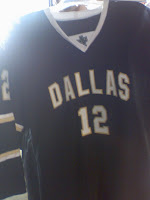
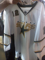
 Hot off the presses at HFboards.com come photos of the Dallas Stars' Rbk EDGE uniforms...
...or so we'd be led to believe.
As many have stated, what stands out most is the lack of an NHL shield at the collar — a feature on all the new EDGE uniforms. But that's not the only reason why I'm leaning toward the belief that these are fakes. Look at the material. We've seen lots of photos of the new sweaters at this point. These seem too thin.
Check out the back of the collar where the tag is supposed to be. Nothing. And not a Reebok logo in sight. Another good question: Why is "DALLAS" written across the home black jersey? Shouldn't the home crowd know where their team is from? And why the lack of color and such thin striping around the sleeves?
You think you know where I'm going with this? No, it's not a Photoshop job. While I cannot state to an absolute certainty that is true since I've only been looking at these pictures for five minutes, I'd bet real money on it.
My feeling: Somebody actually made a mock-up of a Dallas Stars jersey — then took photos of it to pass off as a "leak." When Photoshop skills lack, tailoring skills can be money in the bank. Someone with a sewing machine and some extra fabric went out of their way to create a concept so much better in quality than any of the concepts I've ever featured on this site. You can actually touch that sucker.
So color me impressed. I don't want to sit here and tell you for a fact these aren't the jerseys, but there's too much wrong about them for me to believe it. And I've been looking at these jerseys for a long time while running this blog.
Now is your turn. Are these real or are we seeing stars?
UPDATE (8/2 2:03 PM): The general consensus seems to be that these uniforms belong to a junior team in Dallas which has traditionally worn the same sweaters as the Stars. Makes more sense than somebody creating a prototype just to have a little fun with people.
Anyway, it's not clear if that practice will continue and these are close to what the Stars' uniforms will look like or what. We'll have to wait until September 14 when the Stars are supposed to unveil their jerseys.


Reader Comments (30)
THose are fake so eazy to tell and i dont think thats one of the RBK templates FAKE
The basic *design* could be based on a real representation.. nobody will know that until the Stars either leak something or unveil.
However, there are other things of note in these fakes:
Look at the striping at the bottom of the white jersey. That's right, it's right at the bottom.. no curved hem. The Edge jerseys all have a curved hem, it's part of the design.
The cut isn't the Edge cut in any way shape or form.
There's a TM on the Stars logo. heh.
So yah, like you said, this is probably someone with far too much time on his hands sewing up a knock-off for 15 minutes of fame.
Still, they might be basing the look on something we don't know.
Also, didn't that one pair of mock-ups based on what someone in the Stars Organization described have Dallas on the home jersey?
No doubt I agree with everything you stated in your post, Chris. I don't believe these are the real jerseys either. But certainly whomever created these mockups did a wonderful job in stirring up debate on if this is the real design or simply way off of what the final product will be.
I personally don't like the specific designs of these Stars jerseys. The mockups that were first posted at sportslogos.net based on what Dallas Morning News hockey writer Matt Meika described are better looking, in my opinion.
also note the lack of sizing tag on the bottom right of the jerseys...definitely fakes
ugly jersey there.
My beef is there is the state or texas team logo inplace of where the NHL logo should be like with the rest of the already released jerseys.
They may be fake, but they're based on information that people who've seen the new jerseys have given, so they're not far off. The only thing I see that could be wrong are the stripes, other than that it's pretty darn accurate.
"Another good question: Why is "DALLAS" written across the home black jersey? Shouldn't the home crowd know where their team is from?"
Actually, the home jersey will be black and have Dallas written across the front, with the number below. That's well known among Stars fans.
Where's the NHL logo? Where's the tag on the inside on the back? Where's the sizing tag? I hope they're not real, they're weird.
Those aren't real jerseys for one.. the lack of a curved hem, the lack of an NHL logo or sizing tag.. the TM by the Stars logo on the white uni... the chest number seems higher compared to other teams jerseys that have been revealed.
"Another good question: Why is "DALLAS" written across the home black jersey? Shouldn't the home crowd know where their team is from?"
Yeah, Sarah is right: for whatever dumbass reason, the Stars have decided to just plaster "DALLAS" across the home sweaters. I wouldn't mind seeing that on an away jersey, but putting it on just the home jersey makes no sense at all.
I'm really just hoping that the reporter who described those jerseys simply forgot that the whites are now the aways, and was actually describing an away jersey, but I don't remember how he worded it, so I base that suspicion on absolutely nothing.
if those are even remotely real... then i feel bad for dallas... worst jersey change yet.
Those are new jersey's for the Dallas area youth leagues. The problem is that those youth teams have always had similar jerseys to the big club.
BARF.
I sincerely hope the real jerseys look nothing like these pieces of shit.
Sadly, they probably will.
RBK Edge is ruining the best jerseys in sports.
those are definitely fake...i would hate the stars if that was their jersey, and i am a huge fan of them...the jerseys don't even look real...who would think their real
their fake...no NHL jersey has the "TM" next to their team logo (on the white jersey)
FROM THE HF BOARDS:
"Those are the Dallas Stars Selects youth hockey jersey. They were on display around the metro rinks today during the leveling tournament otherwise known as the Texas Shoot Out. Identical to the NHL Stars? They have been in the past."
So that's probably not far off of what they will look like.
that's them. those are the "replica" version that will retail for less or a bootleg version, but that is the design. you'll see the official ones in a few days.
These jerseys make the Panthers and Islanders jerseys look like masterpieces.
While the jerseys have been coming out, it seems that each successive jersey released either makes all the other ones look much better by comparison, or they just look average. I haven't been really blown away yet. Although I think Boston has the best jersey so far.
These new Dallas jerseys are very tacky. Yuck.
Note they have the "TM" next to the Stars logo on the second one. Not sure why they'd add that. Probably another sign that it's fake.
Look at the white jersey's logo, it isn't sewn on, it's printed on.
since the dallas stars are my favorite team in all of sports, i sincerely hope they dont do this. and since these are the youth league sweaters, it looks like there is a strong possibility that it is, sicne in the previous years the youth league jerseys in the area have been replicas of the real ones.
you can tell because the tag that says reebok nhl is not in the back of the jersey. and theyre ugly
love the texas logo on the collar even if it is fake that's still cool as $#!+
they are also the same material all around
Definitely fake. Besides the lack of Reebok logo and collar NHL logo, the seams on the white jersey just aren't right; it's missing the seam that runs from the armpits to the collar (which is in all the Edge jerseys I've seen so far).