Rbk EDGE Review: Bruins
 Monday · Sep 24 · 2007 | 12:38 PM PDT
  10 Comments
 Part 1 of 30. All 30 NHL clubs have unveiled new jerseys under the new Rbk EDGE Uniform System for the 2007-08 season. Here at the NHLToL, we're going to review every one of them. Read up and then rate the new sweaters. We'll do a full ranking after completing all of the reviews.


The Unveiling
Thursday, June 21, 2007. The Bruins unveiled their new logo and uniforms to fans at an event the day before the NHL Draft.
Home vs. Road
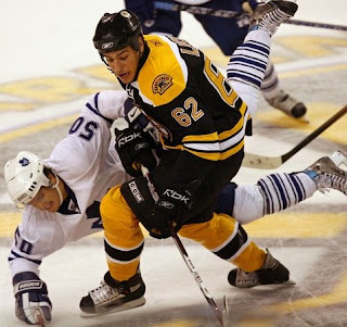
Home: Black. Road: White. Both sweaters feature the same crest and secondary logo patches on each shoulder. The primary colors are black, yellow and white.
The black home jerseys feature yellow-white-yellow spaced stripes around the elbows. The same pattern is found around the waist. The yellow shoulder yoke features white stripes beneath that extend from the laced collar almost to the shoulder.
The white road jerseys feature yellow-black-yellow spaced stripes around the elbows. The same pattern is found around the waist. A black cuff extends up the sleeve to the elbow stripes. The black shoulder yoke features yellow stripes beneath that extend from the laced collar almost to the shoulder.
In The Details
The shoulder patches are different for the home and road sweaters. On the home jersey, the word "Bruins" is arched above a bear with the word "Boston" underneath. The words are swapped on the road jersey.
New & Old
The biggest uniform alteration, aside from the new logos, is seen along the shoulders and sleeves. The vertical stripe down the arms are gone and the horizontal elbow stripes have been wrapped completely around the arm. In addition, the stripe colors around the waist have been swapped on the home jersey.
Standard FAQ
Numbers on the front? No.
Laces at the collar? Yes.
NHLToL Editorial by Chris
By all accounts, the Boston Bruins by far have one of the best uniforms in the new crop. Classic and dignified. The essence of a hockey jersey. From the stripes to the shoulder bars to the collar laces, the style is top-notch. Even the upgrade to the primary and secondary logos is simply stunning. Boston's was the first jersey unveiled this summer and it gave hope to everyone dreading the "new-fangled" style being introduced by Reebok and the NHL. It's a shame this style didn't permeate more teams. 5/5


Reader Comments (10)
How can you review the sweater for real without actually having the REAL sweater in your hands?
Otherwise, it's an art review, isn't it?
Perhaps it is. Sadly, though I don't have access to the physical jerseys for all 30 teams without spending $4,000. So take the review for what it is and enjoy it... or not. But feel free to post your review here in the comments and rate it above. Thanks, Dennis!
I don't see the vote button.
I'd have to agree with you Chris...a very classic style and a well deserved 5/5
I really don't think you need to have the jersey in hand...if you have one then you have how all are made and I'd say this is a review of the look the redesigns not quality of the jerseys
I don't see the vote button either.
Hi guys! I know the poll isn't appearing properly on the main page to a lot of people. I'm trying to figure that out. In the meantime, if you click on the post title, it will work just fine. Thanks for letting me know!
Along with San Jose, I think these are the best of all the new jerseys. (Columbus' new ones are pretty sweet too.)
I like the way the Bruins kept most of thier original style, and added more to new Edge style. In my opionion, one of the best uni's in the NHL.
Bar none this has got to be the best Edge jersey out of the crop. Didn't really change much at all and what they did change was made more traditional. I can't complain about this jersey in anyway. The only thing that hurts these jerseys with the horizontal stripes is that rounded hem at the bottom. I'm not sure why Reebok has done this unless it has something to do with tucking.
I'm not sure how a jersey that basically remained the same can get more than a 3 (same with Montreal, Detroit, etc). Personally I have not even noticed that the Bruins changed their uniforms and even after reading about the new logo I'm struggling to see what's new about it.
I live in Boston and I always thought the Bruins unis looked all right, but 5 out of 5 for something that basically stayed as is?
I actually like the Providence Bruins unis this year much better. It's interesting that they decided to go with a different look than the parent team. Big fan of the vertical yellow stripe down the sleeves. Makes the uniform look modern and sleek.