Rbk EDGE Review: Devils
 Thursday · Sep 27 · 2007 | 4:13 PM PDT
  4 Comments
 Part 4 of 30. All 30 NHL clubs have unveiled new jerseys under the new Rbk EDGE Uniform System for the 2007-08 season. Here at the NHLToL, we're going to review every one of them. Read up and then rate the new sweaters. We'll do a full ranking after completing all of the reviews.


The Unveiling
Thursday, September 13. Photos of various Devils players wearing the new sweaters began appearing on the team web site. No unveiling ceremony was held.
Home vs. Road
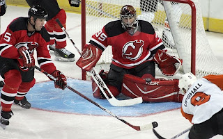
Home: Red. Road: White. The two sweaters essentially mirror each other in terms of overall design.
The red home jerseys feature white-black-white stripes around the elbows and waist with the black stripe being roughly twice the thickness of one white. The black shoulder yoke is squared and slightly curved at the ends. The black collar features a thin white stripe within. The primary mark is featured as the crest.
The white road jerseys feature red-black-red stripes around the elbows and waist with the black stripe being roughly twice the thickness of one red. The black shoulder yoke is squared and slightly curved at the ends. The black collar features a thin red stripe within. The primary mark is featured as the crest.
New & Old
There are no major differences. The design of the old sweater was merely adapted to the Rbk EDGE cut.
Standard FAQ
Numbers on the front? No.
Laces at the collar? No.
NHLToL Editorial by Chris
Given that the Devils have had one of the league's best uniforms since exchanging green for black 15 years ago, I'd say this would be among the last uniforms to need a change. I'm glad to see they didn't do any major alterations and that some of the more glaring EDGE elements (e.g.: piping) were left out of this design. The colors make the jersey simple and strong. A split-second look leaves you with no doubt that you are watching the New Jersey Devils. I can't think of a single thing that would improve it. 5/5


Reader Comments (4)
"A split-second look leaves you with no doubt that you are watching the New Jersey Devils."
And thats when you realize that watching a tree grow would be more entertaining than their brand of hockey and change the channel.
I wonder how bad the Devils, Canadiens, Red Wings, and Blackhawks had to fight with RBK to keep their looks intact.
I bet RBK was all like, "come on put some vertical piping on the shoulders Montreal...and come Detroit, lets do a shoulder yoke and some half sleeves, that will really accent the nhl logo on the neck."
I love the Devils uniforms. Like you said, not much to fix there.
Average - Same as last year and that's not a bad thing...at least they didn't make it any worse