Hurricanes Unveil New Uniforms!
 Thursday · Sep 6 · 2007 | 1:32 PM PDT
  26 Comments
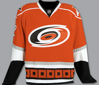
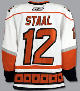
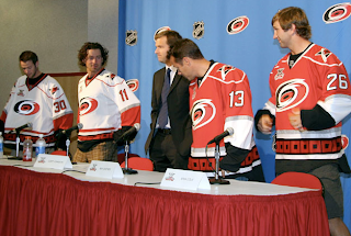
 This afternoon, the Carolina Hurricanes officially unveiled their brand new Rbk EDGE uniforms! Photos follow!
It's pretty much what we saw in the NHL 08 renderings from EA Sports — only in physical form. I like them. Not sure about the shoulder piping. Seems unncessary, but what do I know. I do like the hurricane flags around the bottom of the jersey. Glad they kept that element from the old uniforms. Check out the back!
Also unveiled today was the club's 10th anniversary patch.
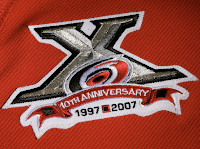 As you can see here, it will be worn on the front of the sweater on the right side — where a potential Stanley Cup Finals patch would go.
It's a very nice logo. One nitpick I have though is the flag between the 1997 and 2007 at the bottom. That's a tropical storm flag. A hurricane flag is two of those side-by-side. But that's only minor. You'll notice the banner that reads "10th Anniversary" has the flag on both ends.
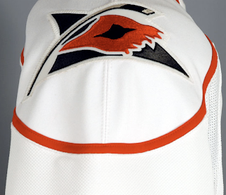
The 'Canes also kept their secondary shoulder logo which features a torn hurricane flag ripping in the wind.
And here you can see Cam Ward, Justin Williams, Ray Whitney and Erik Cole modeling the new sweaters before the press today at the RBC Center.
As always, you can find these and as many more photos of the new jerseys as I can find in my official Rbk EDGE gallery.



Reader Comments (26)
The shoulder piping reminds me of the way jerseys were in the old NHL games for Genesis (circa 1994).
First impression:
Good jerseys. Why every team start to mess with their already good desings?
So far, the bests jersey's are the untouched ones.
very nice, very well done, because its quite simply: more than enough, yet not too much color, limited piping, no big wordmark on the front, and no state/national flags instead of genuine shoulder patches
i do wish the bottom was a bit smaller...
Pretty sharp. One of the best to date.
The jerseys are pretty good but could still use some improvement.
Yes, they are definitely bottom heavy, though the new piping balances it out some. If they repeated the flag border on the sleeves, I think it would add some balance.
Honesly, I feel like the Canes' uniforms were thrown together pretty hastily when they moved to NC in '97. I think they should have used this as an opportunity to tweak the design a bit more.
Actually, a hurricane warning flag is two of those on top of another.
Just like their shoulder patch has always been a tropical storm warning flag. Why they don't change that is beyond me.
Good improvement, though. Not TOO much -- the added shoulder piping is alright, IMO.
NHL 08 for EA SPORTS was RIGHT!
You know, NHL 08 having the right Hurricanes jerseys makes me hope that the hockey video games this year got the uniforms early so they could be accurate. It would suck if only a few teams had their new uniforms.
Shouldn't the Huricanes change there logo in memory of and respect to the lives lost from major real Hurricanes, like Katrina. If you've lost a loved one, or lost your home don't you think you'd have a bad taste in your mouth everytime you hear the word "hurricane". Can you imagine one of these persons buying a Carolina jersey and then watching a game and screaming "Go Hurricanes Go" or even "Go 'Canes Go". I can't. I wish the league was smart enough to step in and get them to change there team name and logo. Anything is better than the dumb logo they have now!
kirk, just b/c we live in a Political Correct world (which in essence is DUMB!) doesnt mean sports teams and college teams have to change their nicknames due too a natural disaster. are you going to ask the miami hurricanes or tulsa golden hurricanes to change their name due to katrina and rita? how bout the san jose earthquakes due to the 1989 quake? i don't think so. don't get me started on the native american names either. let em play as they are known!
I just don't get the multi-colored sleeve look that so many teams are going with. Particularly on this jersey, it almost looks like the players are wearing t-shirts with long sleeve shirts underneath. Am I the only one that feels that way?
jerseys are nice, they didnt mess with an already good jersey unlike pittsburg.
numbers are just massive tho.
If there is anything bad about carolina's jerseys, it'll quickly be paled in comparison to the fail that Atlanta is undoubtedly going to show us in the near future.
Chris,
I find it funny you have a problem with the little flag between the dates because it is solo and thus a tropical storm flag and not a hurricane flag... yet then you seem to have no problem with the flag on the shoulder patch which is also a solo flag and thus a tropical storm flag...
Any reason why such a minor detail bothers you on an anniversary patch but not on a main element of the teams design?
Not a fan of the black sleeves.
I find it funny you have a problem with the little flag between the dates because it is solo and thus a tropical storm flag and not a hurricane flag... yet then you seem to have no problem with the flag on the shoulder patch which is also a solo flag and thus a tropical storm flag...
Any reason why such a minor detail bothers you on an anniversary patch but not on a main element of the teams design?
Speaking as a lifelong Floridian, I've seen more than my share of tropical storm and hurricane flags blowing along the beaches. And while they're usually two stacked on top of each other in a hurricane, I've seen them side-by-side as well.
So to me, the shoulder patch looks like a flag that's been torn in half by some nasty hurricane winds — only serving to make the team's identity even cooler.
I guess the other part of that for me as that I feel like I get what makes a good logo. In terms of keeping things simple, two flags would be a bit much and would create a strange aspect — which is why they went with the simple square between 1997 and 2007.
I'm not oblivious to that and so I accept it. I just thought I'd mention it. I don't know if that makes any sense at all.
Beyond that, though, it's hard to say what I'll decide to notice and comment about on any given day. Although I do make an effort to avoid contradicting myself too much.
Thanks for the comments, all!
Ok Kirk, if we looked at it your way...
Bruins: Remembering ppl killed by Bears
Senators: remembering how gay the Roman Soldiers were before they discovered Christianity
Sabres: How many people have died by sword (or stampeding buffalo/slug?)
Flames: How many people suffer first second or third degree burns
Avalanche: how many people suffer from falling mounds of snow
Devils: Satanic stuff, there.. thats just a nono
Sharks: how many people lost their life due to Jaws (or great white sharks in general)
Really.. I could go on.
I really like the secondary logo for the Canes. First, the ripped storm flag on the stick I think looks pretty good. If you put the second flag in there, the logo would just look awkward.
The other good thing about that logo is that it makes a very subtle reference to the geographic area that the Canes play in. The triangle that is in the background of the logo represents the Research Triangle region of North Carolina (Raleigh, Durham, Chapel Hill).
Just to informe every one who dont know it. NHL 08 from EASPORT have ALL the new RBK Edge jersey in this year edition AND also, they all have the NEW AHL RBK EDGE uniform. The game goes on sale sept 11, BUT, not all the jersey will be available...Sept, 24, Easports will give a CODE then, ALL the new RBK Edge Jersey will be unlocked.
Have a nice day
dear spaghetti,
you're about a couple of months behind with that information.
Chris,
Being a lifelong Floridian you must REALLY be irked by the fact that the Florida Marlin's logo is really a sailfish... and yes, I'm just kidding with you...
Being a lifelong Floridian you must REALLY be irked by the fact that the Florida Marlin's logo is really a sailfish... and yes, I'm just kidding with you...
Actually, despite being a lifelong Floridian, I'm oblivious to baseball. I'm exclusive to hockey — always have been. And I've never fished. I wouldn't know a marlin from a sailfish if someone was offering me a million bucks. ... And I know. Thanks for the comments!
There's always somebody like Kirk who comes along and thinks that we're being insensitive because we root for a team named "Hurricanes". The fact of the matter is, we get lots of hurricanes on the North Carolina coast. Throughout history, thousands of North Carolinians have been displaced or killed by hurricanes. Many millions of dollars in property damage has been caused. The fans of the Hurricanes are well aware of the destructive and deadly force that a hurricane is. That's part of the point. Out team is supposed to be something powerful and destructive.
Sorry, but the good people of New Orleans didn't invent despair, and Katrina wasn't the first hurricane in the history of the world (nor was it the most destructive). Changing the name of a sports team isn't going to make the painful memories go away.
We North Carolinians have painful memories of Hazel (October 1955), Hugo (September 1989), Fran (September 1996) Connie and Diane (three days apart in August 1955). Dozens of others have been unkind to us. Collectively, they killed hundreds of North Carolinians and caused billions of dollars in property damage. We're not about to have the word "hurricane" purged from our lexicon, though. We know what we're doing.
I suppose Kirk also wants the Lightning and Avalanche to change their names, too. People die every year as a result of lightning strikes and avalanches. Sharks? Predators? People die from those, too. Flames!
Maybe certain people dream of a day when all sports teams are named things like "Chicago Puppy Dogs" and "New York Strawberry Fields" and other ridiculous things that invoke pleasant thoughts and memories.