Friday
Sep072007
Wild Unveil New Uniforms!
 Friday · Sep 7 · 2007 | 9:21 AM PDT
  26 Comments
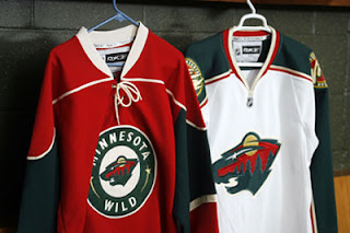
 The Minnesota Wild have unveiled their new uniforms via their web site, today. Look at them here.
Same as we expected. No big changes. The old alternate is now the new home sweater. I also like the fact that they didn't use the circle logo on the road jersey. The bear head is awesome.
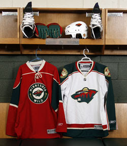
This is another shot of the jerseys hanging in the locker room.
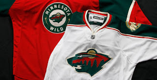
You can see the detail of the jerseys a little better in this photo. Sorry they're so small, but the Wild have yet to post a photo gallery like most of the other teams have done. If I see better quality pictures elsewhere, I'll be sure to post them for you. In the meantime, any thoughts on these new sweaters?


Reader Comments (26)
Look pretty good and classy, no complaints.
Wow i cant believe i never noticed that forest looking thing was a bear or cougar head or whatever. I feel stupid lol
I posted this over at the Minnesota Wild message board and I will here now share the same thoughts.
Overall, it's not bad at all. I can live with them. However, I'm far from being totally satisfied with what was unveiled today.
The Wild did not need the shoulder piping at all on their new home jersey. For what was the original alternate jersey, it was fine as is. I just don't understand the need for any change to its design. As for what is now the road white jersey, I don't like the changes. The collar sucks. It looks like Nashville's. They should've went with the collar that a number of our teams have gone with such as Pittsburgh and Carolina most recently unveiled. I don't like the accent striping change either. Same with the smaller primary logo on the front. I would have wanted it bigger, not smaller.
I guess what the Wild did was satisfy both sides of what fans wanted, keeping both the primary logo and alternate logo as crest logos. Some want the alternate logo full-time and others want to keep the primary one full-time. I don't know what to think right now, but if I had to choose, I'd prefer the primary to stay on the home and away and the alternate logo on the alternate jersey as it was last season. Hopefully it will return to that arrangement next season.
I like the shoulder piping. Although on the red home sweater, the green stripe on the bottom was taken off. Im a huge fan of the horizontal striping on jerseys. Also, doesnt it look like the logo on the white sweater is a little small?
no the logo isn't small, you are just used to living in the age of HUGE LOGOS. I think find any time a logo shrinks, it's is a breath of fresh air. Like when Team USA wore those 1920's retros with the tiny USA badge on the front.
They look good although I would of loved to have seen the circle logo on the white road jersey!
Is it just me - but shouldn't the name mark be on the "road" jersey - so people know where they're from - as opposed to the "home" jersey - where people should know they're from Minnesota....
oilfan, im with you on that one, ive never noticed it either.
GOOD BUY GOLD PIPING!! At least they will look less like Christmas trees on skates. This will open the door for another cool 3rd Jersey. The team site said no 3rd jersy would be presented in the first year of the RBK.
GO Wild!!!!
Although this comment will likely irk Wild fans and hockey traditionalists, I really never liked the Wild's 3rd jersey. Why make one of the most creative logos in all sports smaller and enclosed in a circle? What makes NHL uniforms superior to MLB, NFL and NBA uniforms is that there's plenty of space to have images, not just the name of the team or city. The NHL and its teams should take advantage of this. That's why a lot of people may be against the big "VANCOUVER" on the Canucks jersey.
I agree with ted. My first thought when I saw this set of jerseys was that I was glad the Wild kept their Primary logo on one of their jerseys. It is one of the best logos I've seen as relating to the team's name. The double meaning of the wild animal and the wild being the great outdoors is very cleaver. But is now hidden in the home jersey.
This is also a case where another team has switched their primary home colour to red. I don't mind the jersey itself, but by my count this brings the NHL to 11 red jerseys (Calgary, Carolina, Chicago, Colorado, Detroit, Minnesota, Montreal, New Jersey, Ottawa, Phoenix, and Washington). Now the only team wearing green is Dallas, and that could change too.
I think the Wild's logo is one the best ever. While I thought it looked good in the 'retro-style' circle, it was only because it was only on the alternate sweater. Now that's its the home sweater, I don't like it so much. Tedd is right: make the logo bigger & take it out of the circle.
This logo existed for about a year before I realized it was a bear's head. I guess that's not too bad - I didn't realize until a few months ago that there was an arrow in the FedEx logo!
Personally I would have preferred the road one be a white or off-white version of the red one.
Holy crap, I never noticed the Bear in the wild jersey.. I just thought it was a picture of a forest. Good eyes lol.
if on the home jersey it was just a giant logo like on the away jersey, they'd have some duo of jersies.
but the the way the logo is presented on the home jersey is too much and quite gaudy to me.
the wild simply have the coolest, most creative, most aestetically pleasing logo ever (in my eyes).
they should do everything they can to have it in your face. the circling and minimizing its size in the home jersey is anti-productive to say the least.
oh well. at least i wont have to see it very much livin here in ny
chris et. al.
i am shocked to hear that was a bear head- always pictured it as a mountain lion head...much too streamline for a bear. the profile of the nose and jaw line looks much more wildcat-like to me.
can we get some confirmation on this bear thing?
rankly, dunno why it even matters to me-but it does. You reader probably understand that more than anybody else- except maybe ESPNs UniWatch guy!
All in all, like the jerseys- glad they absorbed the old alt as the new home, and the piping is FINE people!
WonderBread
The red one is really sad. Hands down, the ugliest jersey in the league. Christmas on ice. Should have kept the old home jersey and said goodbye to the 3rd. Oh well, they can try again next year.
haha. i didnt know that it was a bears head either.
But yeah. Those away jerseys are the best new ones yet. Ive always like minnesotas jerseys.
I really like the home jersey! Very classy and really dig the retro look. One of my favorite jersey so far! As per the away jersey, don't hate it, don't like it, just neutral...
Hmm. I thought I was the only one who hadn't noticed it was a bear. I thought it was...well...a forest.
The new home jersey is well...undesirable. I loved the green, and they went and shrunk the leagues best logo.
Oh and Steve is right. Having the city name on the home jerseys....sheesh.
Wait....
Everyone is back to white at home now right???? It seems everyone here does not think that.
I can't believe people couldn't see the bear head in the logo. They also wanted to honor the North Stars which is used as the bears eyes. The iron range red is to show appreciation to the northern iron range miners. Obviously the moon is for the wildlife and the river is used as the bears mouth.
I love the home jersey...
I'm not too crazy about the away jersey... I would like to have seen the same design as the home only with the red and white reversed...
Personally I think the logo on the home jersey should be on the away, and the bear head should be on the home. I don't understand the logic that teams think they need to put their name on home jerseys as though they need to tell the home crowd who to root for. Then they put just a primary logo on the away jersey, so anyone not familiar with hockey will have no idea who the home team is playing... it's just odd.
Look at the Red Sox and countless other MLB teams, when they play at home they have Red Sox on their jerseys, when they are on the road they have Boston on their jerseys... don't dumb it down for the home crowd and tell them what city they are in.
I didn't see the bear, but thats cause I thought it was a cat. I knew it was something like that. Can't see the bear through the trees. I like them and I'm probably one of the few that like the home. I like the vintage feel to it although I think the logo itself could be alittle bit bigger.