Thursday
Apr242008
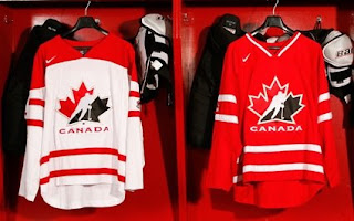
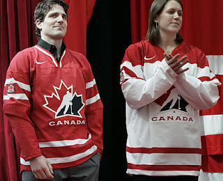
New Canada Sweaters Official
 Thursday · Apr 24 · 2008 | 11:38 AM PDT
  26 Comments
 Just following up on yesterday's scoop regarding a new look for Team Canada here. Seems it's official now.
They're being called "retro-futuristic" if that's even possible and TSN has more on the story.
Hope all you Canadians like them.


Reader Comments (26)
yuck.
Couldn't have done worse than the cookie-cutter jerseys they've been wearing for the past 2 years.
Nice to see they've gotten rid of most of the black.
I am Canadian...and I don't like 'em
why is Patrick Sharp modeling the jerseys??
whoop-dee-friggin-do
Sharp looks really stiff in that picture.
The red? Yes, please. The white? Not so much.
i guess im in a minority here, but i like em...especially the white one
im just glad to see theat reebok didn't make these jerseys. Thank god they havent taken over eveything. On the other hand i dont mind them
I kinda like the white one the best. I don't like the small elbow patches, they should be on the shoulders. The red one kinda reminds me of the very bland Toronto Maple Leafs home or road. I am scared to see what the USA jersey is going to look like.
They are a huge improvement from what they have been wearing. Nike never should have gone with the vertical stripes. I think the 2002 jerseys were the best.
A '72 throwback would have been best. With the namebar reading "CANADA"
i'm torn.
the red's not bad.
the elbow crest is an interesting touch. where do the numbers go?
the 02' kit wasn't bad.
hell, anything's better than
the 96 world cup though.
Thier wearing the 1976 throwback jerseys for game 1, which makes up for the sub-par design of the new retro-futuristic jersey.
I said i hated the canucks jerseys when they came out this past year, but now i like them. Hopefully these new jerseys can grow on me as well, but the turnaround rate of canadas jerseys seems to be 2-3 years so il expect something new then.
They're an improvement over what we had been wearing with the goofy vertical striping, but I'm not crazy about these. The red jersey is fine for the most part. The red shoulders of the white jersey seem really big, bigger than I can remember seeing before. Too big, I think. The patches so far down the sleeves are different. Not sure if I like that or not.
On the positive side, we have lots of nice horizontal stripes and less black. Not related to these jerseys, but how nice is it to see one without that stupid rounded hem? Did Reebok or the NHL ever explain what the purpose of that is supposed to be?
I wish they'd have just kept the stuff from 2002. They looked perfect and we finally won gold at the Olympics for the first time in ages. You'd think that they would keep them for luck if not because of the look.
I like the girl.
<3 x 1,000,000
the shoulder logo needs to be bigger
I like them alot.
I know we want the world to know we did the dollar coins first, but c'mon, can the logos on the sleeves be bigger than a loonie?
I didn't mind the previous jerseys. Vertical striping was interesting. And hell, I'd probably prefer to see the entire NHL wearing those rather than some of the terrible designs RBK came up with.
I also liked the black. We might not have black in our flag (but can you imagine how bad ass that would be?), but damnit, it's one of our hockey colours. American gets red, white, and blue, we get red, white, and black. There just isn't enough with just a lot of red and a little white.
I don't really jerseys much at all. I think they're a rather large step back from what we've had. I'm all for retro third jerseys, keep 'em coming, they're always interesting, but not full time, this just isn't cool. ...or maybe it will be really cool once I see our boys playing in them... I'll just have to wait and see, but at this point, things are looking negative.
Oh hi, we're the Coyo- erm.. Team Canada...
coyotes
i see nothing that would make me think futuristic.
Those are tight... By that I mean I like them...It wasn't gay or anything that I said that, right? Not that there's anything wrong with that...Penis..
The jerseys look like canvas or something.