Eastern Identities
 Wednesday · Jun 11 · 2008 | 4:26 PM PDT
  32 Comments
 Just when you thought things couldn't get better, what with the Wallpaper Wednesdays kicking off today, I have concept logos. And some really great ones too. And since we did the West yesterday, today we're sticking to the East. Dare I say it, some of them even rise to level of Matt's work.
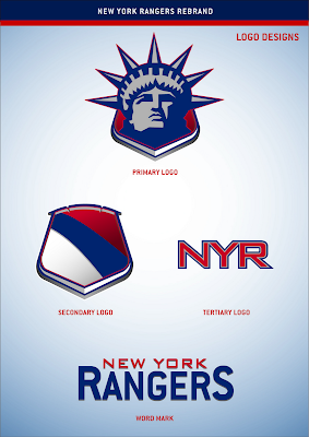
We're starting with the New York Rangers. And before you balk at the notion of rebranding a member of the Original Six, just give it a chance.
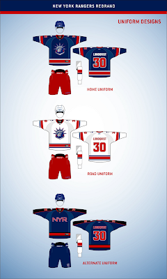
If you've been reading this blog a while, you know how much I love the Lady Liberty logo for the Rangers. Here are the uniforms to go with that logo set.
These work exceptionally well and I think that's hard to deny. Now I could go on and on about the quality of this artwork, but I'm more interested in reading what you guys have to say, so comment below.
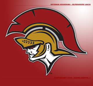
But first, let's move on to the Ottawa Senators.
It's like a Hulked up version of the new alternate logo. Scary. Very scary.
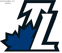
Got a couple more neat designs before I call it a night, including a secondary logo for the Toronto Maple Leafs.
Or who knows, maybe it would even work as a primary. But I'm smart enough to know you guys don't like messing with tradition.
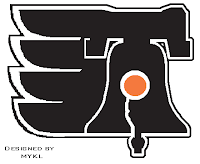
Then this here is just a Philadelphia Flyers logo incorporating the Liberty Bell.
So we begin and end with "liberty" today, apparently. Weird. Totally unintentional. Seriously though, drop us a line. I really want to read what you guys think of these logos, especially the Rangers. (Take a close look at that secondary mark.)
I hope to have more for you tomorrow.



Reader Comments (32)
Interesting ideas for the Rangers. To me, the word mark needed to be diagonal to preserve *some* tradition. And the third jersey would be something the Knicks would wear if it were a hockey team.
I dig the Rangers primary, because I've always been a fan of the Lady Liberty look. The alternate jersey seems too "Columbusy" to me, plus the plain "NYR" on the front looks bleak.
I have to admit that I don't understand the redone Leafs logo. "TL"? I get that it might indicate "Toronto Leafs," but that's more of a colloquialism. After all, the Rangers use "NYR" for "New York Rangers," and not "TBS" for "The Blueshirts."
The Sens' look is pretty wicked, I think.
That Philly Liberty Bell logo belongs on a Freak Out Friday post!
OK, whoever makes those logos, the Sens logo(awesome) and the preds one posted earlier, you could have a future in logo designing.
Not enough can possibly be said about that Rangers design. That "Lady Liberty" logo is PERFECT for the team because it represents not only New York but all of America. If they threw that crest on the front of their jerseys, the Rangers would definitely be by far the best-looking team in the league. That logo looks great on the jerseys, also.. of course anything would look better than "RANGERS".
i like the ideas, but leave the Rangers out of it.
I checked out the logo & jersey set of my #1 favorite team,the New York Rangers-featuring the"Statue of Liberty" logo that was drawn up. And it's absolutely "FABULOUS"! They're probably are just as gorgeously done or perhaps just as better as the ones I personally drew up for the Rangers. You must convince this guy who made this Rangers' design set to compare his to the ones I made & maybe bring them in to Rangers' general manager Glen Sather & perhaps encourage him to choose between the two of our design ideas to use for maybe the 2010-11 NHL season. Have him contact me at my above Email address.