NHL Tournament of Logos

Entries in fan art (328)

Sunday
Jun292008

Red Wings Alternate Logo Art

I've got Detroit Red Wings concept logos tonight. The first comes from an artist I like who's come up with new marks for the Devils, Predators, Senators, Flyers and last week, the Coyotes.

It's a great piece of artwork, I'm just not entirely sure it's worth considering as a replacement for the Stanley Cup champs' current symbol. That aside, he's got a pretty nice secondary as well.

The last logo I have to share with you is from a different designer. Have a look.

Two more days until ICETHETICS launches. Get excited!

Saturday
Jun282008

Colorado Concept Logos

Recently I noticed in the comments of various posts, some of you pointing out that among others, the Avalanche may indeed have the perfect logo. That is, there's no way to improve upon it. Some even went so far as to challenge anyone to make one that's better. And a few people responded.

This is the best of what I received but even it doesn't come close to the Avs' current logo. A valiant effort to be sure, but certainly no replacement.

There were a couple of others, not as great, but worth a look.

And then this one which borrows a major element of the actual Colorado logo.

That does it for tonight. I'll have a look at some Detroit Red Wings concept logos tomorrow.

Friday
Jun272008

Just To Freak You Out XXXVIII

The absurdity continues here in my little corner of the world. First thing's first. We all have to be able to laugh at ourselves every now and then and god knows I make a habit of it. But this whole "rebranding" thing — it's a little weird, right? I mean it takes a special kind of person to keep an entire blog dedicated to the redesigning of NHL logos by various artistically inclined hockey fans.

I got a graphic emailed in this week that really made me laugh and I have to lead off with it.

Let the petty sniping begin (we all know that's what the comments are for anyway). I think it's absolutely hilarious. And when it comes to well-designed artwork, I get inspired regardless of whether I think a team should actually wear it in real life. That's what art is for anyway, isn't it?

But this post is about freaking you out, so you won't find any detailed and well-thought-out designs here. Instead, imagine the Quebec Nordiques going out west to become the Denver Dekes.

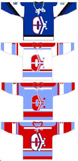
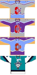
I don't have the words for it. Nor this.

I need a prescription for a drug that will allow me to fly. What's that? You say they don't make one? Hmm...

Forgive the poor quality of the jerseys in the next image, but these are worth looking at.

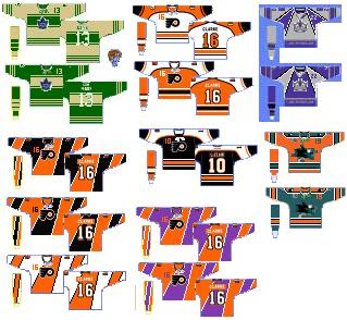
Be sure not to miss the purple and orange Flyers jerseys.

And lastly, an article on Yahoo! was pointed out to me today. The writer talks about the horror that was the Mighty Ducks third jersey back in the mid-'90s. (You guys should know, you voted it worst third jersey logo EVER!)

Anyway, that got me thinking. A while back I got these logos from a reader. He took the duck bursting through the ice and painted a different team's logo and jersey onto it — and then did it again for every team in the NHL! It's an absolute riot and this is the perfect time to start posting them.


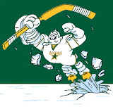
As you can see I started with the Pacific Division so that I could show you the crazy duck with the new Ducks logo and colors on it. Just wait until you see the rest of the league. I'll post a new division in each Freak Out Friday post until we get through all six.

Wednesday
Jun252008

Wallpaper Wednesday III

It's Wednesday and that means I have wallpapers for you. You guys have been sending in some great stuff, so pick something new to grace your desktop this week.

First, Roberto Luongo's mask won the NHL Tournament of Goalie Masks so one reader designed a wallpaper with that in mind along with the blog's new name.

Plus, for all you Canucks fans, a couple of logo wallpaper options here.

And our friend SnyperP who's been fulfilling some requests has these to share.

That Islanders background is nice, but so are the Leafs and Sharks.

And finally, for Ducks fans, I've got a couple of excellent wallpapers to share.

Giguere looks great (from LightItUp4126 at allducksgraphics.com), but I like the color scheme here for Schneider (from Dark Knight at allducksgraphics.com).

So if I were a Ducks fan, it'd be a toss-up as to which one I went with. Hope you guys enjoyed those. I'll have more next week. And if you've designed any you'd like to share, email them to me at nhllogos@gmail.com.

Tuesday
Jun242008

Reworking NHL Uniforms

There's another new artist I've received several submissions from but he's not looking to redesign team logos league-wide — just the uniforms. His sets include a home, road and alternate jersey for every club. On Sunday I posted his Ducks set (it's the first one in the post). But he's been working his way through the NHL alphabetically and I have a few more to share with you today.

We'll begin with the Thrashers.

I have yet to see a design from him that I don't like. And that streak continues with the Bruins.

If you scroll down to the bottom of the post you'll see a bonus alternate sweater design. But first, the Sabres.

A very unique set here mixing old with new in terms of logo design — a rare example of the designer going with a completely new logo. The Flames are next.

In this design he reintroduces the horse head secondary logo (which I always liked) while keeping the jerseys mostly unchanged except for the striping patterns.

And finally, here's a look at that bonus Bruins alternate design.

It's basically a black version of the yellow one above.

I'm enjoying very much being able to post some outstanding work lately from some very talented artists. I look forward to being able to share more with you as ICETHETICS launches in just one week.

Monday
Jun232008

Designs For The Desert

One of my favorite new designers submitting artwork has sent in a lot of great concept logos for teams including the Devils, Predators, Senators and most recently, the Flyers. Up next, he's taking a shot at the Phoenix Coyotes.

And it seems to me his work just keeps getting better with every design.

I've read that some of you are comparing his logo designs to Matt's work and I'm not sure I can argue with you there. These two concept logos are top notch — definitely worthy of any professional sports club.

That's all I've got for today, but what we lack in quantity here I believe is made up for in quality. Let me know what you think of these in the comments.

Sunday
Jun222008

Anaheim Sweater Concepts

Today I've got a number of sweater designs sent in by readers to share with you — specifically for the Anaheim Ducks. Interestingly, none of them features a redesigned logo or color scheme. So have a look.

This first set is all about unique striping patterns and I'm a fan — especially the orange one.

The next one is simpler with a little less originality than what we just saw but I'm sure traditionalists would love it.

And this one is another example of why the Ducks would look good in orange — except you obviously can't have gold numbers on the back of it.

The next two are sort of an upgrade to the current uniforms.

I definitely think the wordmark needs to get off of the chest.

And these two are just examples of gold jerseys — probably not the best of ideas.

Lastly we have a black jersey with some simple striping and the team name down the right arm.

Some of these are pretty bad but it could be worse. They could keep wearing what they have now.

Saturday
Jun212008

Fan Art Fit For Kings

I know in Thursday's post I promised some L.A. Kings concept art for yesterday but that's what I get for promising things. But I just crashed in the afternoon. I must've slept 14 hours yesterday. Anyway, I've got it for you now.

A couple of great artists have recently started submitting new concept artwork to me to post here. You saw one example yesterday with the Flyers. On top of that, I mentioned his work on the Devils and Predators while completely forgetting about his Senators design.

But in that same post was an amazing concept for the New York Rangers. Well that artist has now come up with a beautiful rebrand for the Los Angeles Kings.

The gold offsets the purple perfectly and the silver doesn't hurt either. And the logos look great on the jerseys.

I love being able to post work from truly talented artists and look forward to continuing that. However that doesn't mean I won't also post the simpler designs, such as this one — which takes a page from the past.

And yes that alternate jersey is a recolored Ducks sweater. Wow.

Keep the fan art coming!

Thursday
Jun192008

Philly Concept Logos

You've seen concept logos for the Devils and Predators from this artist and now he's moved on to the Philadelphia Flyers for his latest design.

Here are the secondary logos he came up with.

Even if they aren't entirely feasible as NHL logos, they're still very sharp and nice to look at. It's got the best Liberty Bell logo I've ever seen too. Anyway, what do you guys think?

By the way, I've got some great Los Angeles Kings concept art to post tomorrow. I think you'll enjoy it too.

Wednesday
Jun182008

Wallpaper Wednesday II

This week brings the second edition of Wallpaper Wednesday and this one is focusing on player-centric designs. We'll start with Alexander Ovechkin.

And we have lots of goalies too — like Marc-Andre Fleury...

...along with Henrik Lundqvist and Martin Gerber.

And I thought this was cool — this year's complete playoff bracket.

Speaking of the Stanley Cup champion Red Wings, check this out.

And this, also designed by SnyperP.

He's actually gone and fulfilled several requests but unfortunately I don't have room for all of them here. I'm putting together a gallery that will be available soon. In the meantime, here are a couple more.

And I chose those two to post because they were voted best secondary and third jersey logos by you guys in earlier logo tournaments.

So keep sending in your desktop wallpaper art. You never know, it may one day appear right here on a Wallpaper Wednesday.