AHL Third Jersey Update, Part 3
 9 Comments
  Thursday · Oct 16 · 2008 | 8:36 PM PDT
 In my continuing effort to expand Icethetics beyond the NHL, I have a few more tidbits on third jerseys in the American Hockey League — with a nod to my buddy Mike for helping out with the research. We'll start in Binghamton.
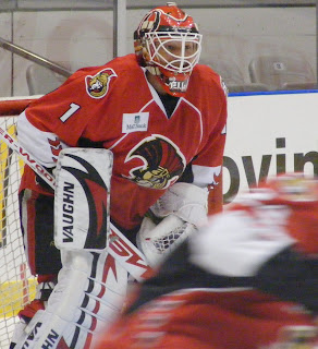
 This is kind of a funny story actually. I first reported on the B-Sens last month when an interest not-so-new logo cropped up. Did some investigating and determined it was a one-time deal a couple years ago.
Now that story's changing. Could that logo be on the new third jersey for the Binghamton Senators?
Mike, who shot this picture, tells me he's "seen it in photos on a black third jersey. But [it] looks like they have made the switch from the 'big chin' logo to that third logo on their away jerseys. I'm not sure about there home ones."
So this is a case where I'm not sure whether we're looking at a third jersey or a new logo on a regular dark jersey. Sorry to leave this one so open ended.
 The Rockford IceHogs are taking the lead from their NHL affiliate, the Chicago Blackhawks, for their new third jersey. And by taking the lead, I mean copying almost exactly.
Here it is, in all its pork chop glory.
Shoulder patches are different though. Guess the Indian head just wouldn't go with the whole look. Pig gnawing on a hockey stick, etc.
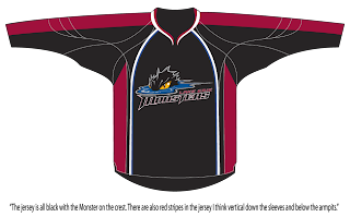
 Finally, the Lake Erie Monsters will allegedly have a black alternate sweater this season. No pictures at this point, though. But Mike's on the case.
He writes, "I was on the message boards for the Lake Erie Monsters. I came across a thread about their thirds for the upcoming year. Two people on there said that a photo was passed around and described it a little. It’s not too informative but I was looking around and then I remembered the Avs' Rbk [EDGE] jersey. It seems to fit the bill. So I made this concept based on the Avs' jersey. I think it looks sweet in black."
So there you have it. And as always, should any more news come my way, I will continue to use Icethetics as a proper dispersal device.
By the way, my apologies on the lack of updates the last two days. I've just been absolutely slammed with other work. But not to worry, I have big plans for Icethetics and a big change is coming. I know Icethetics has only existed for four months (technically), but it's about to get so much better. Even I'm excited about it! I can't wait to tell you all about it.


Reader Comments (9)
You mixed up the pictures there.
Good call. Fixed.
I still wish the IceHogs would have kept their pig butt alternate logo from their days in the UHL. I loved that logo. They could have worn it on one side and the indian head/c with tomahawks on the other side.
Pig butt logo? I'd like to see this....
The B-Sens also last season used this same logo on their alternate thirds.
All they did for last season's alts was take the big clubs old 3rd black sweaters and add the current logo they are using this season.
Last year the main logo they used last season is the one with the menacing Spartan holding the hockey stick (as seen on the site in the top left corner)
Having said that, I was surprised when I was at the Marlies and Sens game in Toronto last weekend and saw it was their new main logo.
can't wait for the changes/upgrades to Icethetics
Ok, so the Blackhawks leak is the real deal. Didn't believe it first. Looks great.
I hate to always be butting in on your AHL info, bu that red Senators jersey is their away jersey, but with a new logo tis year. The white jerseys have not been used yet, so it is not known if they will have the new crest as well, but the home opener is tonight. It appears from the team's website that last season's logo is still the official logo but even though the "menacing head" is the new crest.
i first noticed the sens new logo on nhl 09 i think its way better looking then the big chin guy