Helmets Fighting Cancer
 15 Comments
  Friday · Oct 17 · 2008 | 11:48 AM PDT
  A couple of people wrote in asking about the stickers appearing on the backs of players' helmets. Since the Vancouver Canucks seem to be a hot topic as of late, I'll use them in my example.
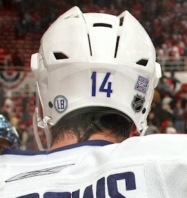
For most teams, players are wearing two decals on the backs of their helmets. On the right, the NHL shield and on the left a square logo you can only make out up close. It's the Hockey Fights Cancer logo. However, for the Canucks, they're wearing both decals on the right side while they wear a tribute decal for Luc Bourdon on the left.
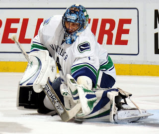
That's the back side of Alex Burrows, demonstrating this quite nicely. Goalie Roberto Luongo isn't bothering with the NHL shield but he does have the HFC and LB decals on the back of his mask.
And while we're on the subject of Luongo, he's either got a second mask or he repainted it to make the C on the chin white instead of blue.
Luongo was named captain of the Canucks but league rules prevent him from wearing the C on his chest.
 Back to helmets for a moment. A couple other readers noticed that the Dallas Stars have made some modifications to the logo on theirs.
The green star within the gold star appears to have gone away in exchange for a large gold star on the black helmets.
Meanwhile, I can't tell if the star on the white helmets is still green or has been switched to black. Not enough good photos out there. But many have asked whether this is a sign of things to come in Dallas. Will the green go away completely, forever severing ties with the North Stars? I sure hope not.
By the way, the wait is almost over for Part 6 of the Icethetics Season Preview. It's coming this weekend.


Reader Comments (15)
first WOOOO.
Second is the cool one now, not first! I'm the cewlest! OMG! Amazin'! Like, LOL!
Sigh. Internet idiots have invaded.
I don't mind black and gold on their own as a color combo. I will admit that black green and gold seems awkward. But I would prefer if they never added the black in the first place. However, I wouldn't blame them if they got rid of the Green, they are in a different city now and Minnesota have a team back, They're within their rights to move on.
Wasn;t the black and gold a possible color scheme that the north stars were going to use but never did? http://sportslogos.net/logo.php?id=389
By the way, the wait is almost over for Part 6 of the Icethetics Season Preview. It's coming this weekend.
Finally, I can't wait. Hopefully my excitement remains until then. It will if the Kings beat the Hurricanes tonight. I've never seen the Hurricanes in person, whether Carolina or the good ol' Hartford Whalers (I don't go to all the games, despite being a season-ticket holder). So I'm really looking forward to the game tonight in about 7+ hours.
Nice catch on the Luongo mask. In addition to the change of the colour of the "C", the "RBK" from above the cage has also been replaced with "Reebok". This link shows the way it used to be.
http://canucks.nhl.com/team/app/?service=page&page=MediaGalleryPlayer&galleryId=7498
the new mask with 'reebok' (instead of rbk) does not look good. the reebok logo is, first of all, ugly, and second, it's way too big.
is it publicity or what ? there's no reason why the logo needs to be so big. does rbk even produces goaler masks ???
The star logo on their helmets still has the green in it. Which makes sense if you look at their home jersey which has the same logo as before.
Well they're using the North Stars' logo so shouldn't they change that too? Not a fan of the black and gold, it needs green too. We've already got the Penguins.
Luongo's helmet is redone, a new helmet. Note it says "Reebok" instead of "RBK" on the previous one.
another way to prove that its new is the left skate of Jonny Canuck its lower on the mask then the original.
The Sabres have had the classic logo on their blue helmets and their secondary blue B logo on their white ones since the return to blue and gold two years ago.
My money is on the Blues Rebrand as the "Part 6"
Reebok is re-branding all of their hockey equipment with Reebok instead of the Rbk they've been using since they entered the market upon purchasing The Hockey Company (CCM, Jofa, Koho). You'll notice "Reebok" on sticks, goalie pads, etc. in addition to the goalie helemts.
The "C" on Luongo's mask is his way of getting around not being able to wear it on his chest as the canucks' captain.
Also, thought i would point out, Ottawa also wore those decals on their helmets and had many autographed limited merchandise in support of the Hockey Fights Cancer.