Monday
Oct062008
Maple Leafs Unveil Third Jersey!
 17 Comments
  Monday · Oct 6 · 2008 | 5:10 PM PDT
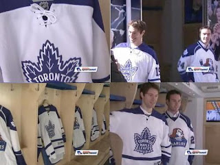
  The Toronto Maple Leafs unveiled their new third jersey today for the 2008-09 season at the launch of the Leafs Nation Mobile Fan Zone to kick off Blue & White Week.
The Leafs showcased the new duds without as much fanfare as some of the other teams have done this summer. Images grabbed from a video posted on the team's web site offer a first look at the sweaters.
It's exactly what we expected. No surprises. The same as what they wore prior to the Rbk EDGE era. The team made no indications of when the jersey will first hit the ice.
If you'd like to see the video in full, it's right here.
I'm really liking the way teams are offering embed links for their web videos. Makes it easier for me to show them to you.
So there it is!
tagged  maple leafs,
  news,
news,  official,
  thirds,
  video
video
 maple leafs,
  news,
news,  official,
  thirds,
  video
video 


Reader Comments (17)
I kind of liked the Mariles old sweaters. They looked like the Leafs decided to try something a little different. I thought they were cool.
I'm not so sure about these new ones...
Not a Leafs fan but those are nice!
The new Marlies are pretty ugly though. Their old jersey and logo was really good. But I guess they want to have a difference between the Leafs and Marlies.
This looks much better than the boring garbage they currently wear. The two stripes on each arm on a plain blue jersey is so dull. At least for the third, they have a bit of action with the stripes.
I wouldn't be disappointed if they made these the primary set jerseys, but a team like the Leafs won't dare mess with tradition.
Also, Chris, don't forget to change the background in the "New third jerseys" section on the right column.
Nice to see that there's no sort of piping on the sides of the jerseys. I'm not a fan of the Leafs, but I very much like that old logo. Very nice look!
Those came from a video on the sportsnet website, that is a valid news site, they're legit.
And exactly what was expected. Yawn.
There's a video up on the leafs website that shows em off a little bit too. The video focuses on the fan appreciation week (wow, the Leafs appreciate their fans?), but the jersey's there.
Um, why is Toronto aloud to have a white home jersey? I didn't get it before and I still don't...I guess being the biggest money making team in the NHL helps.
Spencer, this isn't a home jersey, it's a third jersey, sure it's worn at home, but any team could do this, Montreal's Third jersey was white two years ago.
Hey Chris.....will you be updating the Icethetics Season Preview: Part V? It would be nice to have all the 3rd jersey news in one spot!
The Marlies Jersey up there is just going to be there 3rd as well. this is not the Regular one going to be used every game.
There's never actually been a restriction on Third jersey color- but color jerseys tend to sell better and allow for more interesting changes, so teams usually use a color.
As for the video: "Another successful leafs season"? Successful in that it wins them the top pick?
am i the only one who noticed that the new marlies jersey is just a recoloring of the Blues design?
Does the blues design have those side panels? I didn't think it did...
I think it's just the yoke that has the same design. And It looks even more pointless without the piping. Not to say it looks good with the piping.
Do teams have to pay extra for the non template designs or something? Or does somebody actually think it looks good?
Ksy92003, I totally agree about the regular jerseys. They're beyond dull. This new third, of course, is nothing earth-shattering, but it's a classy and attractive jersey.
So far, I like all the new thirds (haven't seen Edmonton's yet).
Not a Leafs fan at all, but those are great looking jerseys. Glad to see them back.
It is time for the Leafs to get rid of the "Harold Ballard" Leaf logo and put the horizontal strips back on the bottom of their sweater. The Leafs NEED to make their third sweater their full-time uniform. The original Leaf crest is symbolic of Toronto's ancient success and the blue shoulder yokes look colourful. I may jeer Toronto, but a classic is a classic.