Icethetics

via Blogger

Entries in maple leafs (12)

Thursday
Oct092008

Leafs Go With Third For Opener

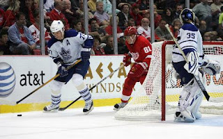
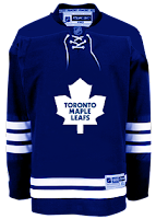
The Toronto Maple Leafs began their season on a high note, defeating the Stanley Cup Champion Detroit Red Wings tonight. And they did so wearing their new third jersey — unveiled earlier this week.

That makes the Leafs the first team to wear a third jersey in the Rbk EDGE era. Hooray for them. Pics ensue!


credit: Gregory Shamus / Getty Images

First up, Niklas Hagman in action in his new alternate uniform.


credit: Michael Sackett / US PRESSWIRE

That would be Mike Van Ryn above. And below, I have to say, I did not recognize Pavel Kubina in that No. 77 sweater.


credit: Michael Sackett / US PRESSWIRE

Kubina was No. 13 forever when he played for the Lightning but I believe opted for for No. 31 when first joining the Leafs.

Whatever, not the point. The point is, the first third jersey has hit the ice. A momentous night!

Monday
Oct062008

Maple Leafs Unveil Third Jersey!

The Toronto Maple Leafs unveiled their new third jersey today for the 2008-09 season at the launch of the Leafs Nation Mobile Fan Zone to kick off Blue & White Week.

The Leafs showcased the new duds without as much fanfare as some of the other teams have done this summer. Images grabbed from a video posted on the team's web site offer a first look at the sweaters.

It's exactly what we expected. No surprises. The same as what they wore prior to the Rbk EDGE era. The team made no indications of when the jersey will first hit the ice.

If you'd like to see the video in full, it's right here.

I'm really liking the way teams are offering embed links for their web videos. Makes it easier for me to show them to you.

So there it is!

Monday
Oct062008

No News Yet From Leafs

It's almost 6 PM in the east and we have yet to hear anything from the Toronto Maple Leafs regarding a third jersey announcement. I'm as confused as anybody since a lot of different things seemed to indicate today being the day — not the least of which being a schedule from Reebok.

I'll keep an eye out for the rest of the night and I expect emails from you guys should you hear anything first. But it's not looking good. There isn't even a mention of a third jersey on the Leafs' web site.

However, tomorrow is the unveiling date for the Edmonton Oilers' third jersey and they do have a graphic on their web site promoting the event.

That just leaves the Atlanta Thrashers on Wednesday and there still isn't anything official coming from them. Hmmm...

Maybe Reebok's having a little fun with us. Reebok, you kidders, you.

Tuesday
Sep302008

Icethetics Season Preview, Part II

NEW CENTER ICE DESIGNS

The Icethetics Season Preview continues. All week, I'm doing my best to get you caught up with what's new in the world of hockey as it pertains to the right side of your brain.

Every year, every NHL team repaints its ice rink. In fact, this happens several times a year. But usually, they paint the same logo down on center ice each time. For the 2008-09 season, a half-dozen clubs are giving their manmade ponds a makeover.

In this post I'll be using concept images to show you what the center ice logos will look like. They are not entirely accurate representations of what's painted on the ice, however the logo dimensions are correct. The arena names have been left off along with the center line design which can vary from team to team.

A couple of teams are just enlarging their primary logo under the main faceoff circle.

The Dallas Stars increased the size of their logo and also added small stars to dot their red line. The Toronto Maple Leafs actually removed one. Previously, the Leafs center ice featured two logos, one facing the television cameras and the other facing opposite.

Two other teams are using their center ice circle to celebrate their anniversaries.

The Montreal Canadiens' 100th anniversary logo replaces the classic CH logo this season while the Edmonton Oilers are going with a simplified version of their 30th anniversary mark, which includes the vintage logo.

Finally, two other teams are going with their third jersey logos at center ice.

The Buffalo Sabres will use their updated vintage logo while the Carolina Hurricanes are going with the storm flag and small square storm flags along their red line.

There are unsubstantiated rumors circulating that these designs are temporary for the Hurricanes and Sabres, meant only as a marketing tool for the preseason in creating awareness of the teams' new third jerseys. I'll keep an eye out when the regular season starts to see if the primary logos find their way back to the ice for these two teams.

I'm only covering the NHL with this part of the preview, but if you think I missed anything, shoot me an email and I'll be sure to add it. Otherwise, that does it for the second day of the Icethetics Season Preview. Tomorrow, we're looking at minor league teams introducing new logos this fall.

Monday
Sep292008

More Third Jerseys Next Week

I have new — reliable — information tonight regarding the various third jersey unveilings throughout the NHL.

As I mentioned in tonight's Live Chat, the Toronto Maple Leafs will be unveiling their new third jersey for the 2008-09 season on Monday, October 6.

It's expected they'll be wearing the same third jersey they did prior to last season — only it'll be Rbk EDGEd.

We already know the Oilers will follow with their unveiling a day later. Tonight's news is that the Atlanta Thrashers will follow Edmonton on Wednesday.

The rumor going around is that the Thrashers will don maroon with their name arched across the front of the sweater above the player's number — a lot like the Stars.

We'll know for sure next week though. And if you're interested in some other dates, I've made some updates to the Countdowns in the sidebar!

The dates seen there are not official from the teams but they are official from the NHL and Reebok. There are a bunch more — in fact, all of them — in the sidebar. Enjoy!

Friday
Sep052008

Toronto's New Ice Logo

I've got a quick follow up on a story form Tuesday talking about how the Toronto Maple Leafs are redesigning center ice at the Air Canada Centre this season. It's now been revealed in a video on the team's official web site.

You can see a screen grab from the video currently appearing on their home page or see it below.

I'd call it a huge improvement. What do you call it?

Tuesday
Sep022008

Leafs Redoing Centre Ice

Just as we're wrapping up our Center Ice Tournament, we learn things will be changing pretty drastically for one team — not the Canadiens. In fact, it's their arch-rival the Toronto Maple Leafs I'm talking about.

The man with all the info — allegedly — Howard Berger had the following to say on his Hockey Buzz blog tonight.

Fans attending games at the Air Canada Centre this season will notice a pair of significant changes. The centre-ice design will now feature a giant Leafs logo enveloping the entire circle, rather than the two smaller logos that previously flanked the checkered red line. I saw the updated art-work earlier today and it looks sharp.


For those with short term memory loss, here's what was entered into the competition for the Leafs.

Yeah, not surprisingly they saw a first-round exit from the tournament at the hands of the Blue Jackets. Should be interesting to see what they do this year. But don't count on Berger to provide pictures though. He's industrious enough to "see" things but can't quite show them to us. Ah, but he is a radio man after all, right?

Tip of the hat to Alan for the link. He's asked that anyone interested throw together a concept of what this new ice design might look like. My inbox awaits.

Monday
Jul212008

Third Jersey Fan Renderings

It's been mostly quiet on the third jersey news front so far today. But several fans have been hard at work designing sweater concepts based on the rumors that have been swirling lately. There's a lot to get to so I'll dive in.

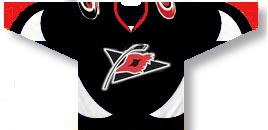
The Hurricanes may adopt a third jersey this season that looks a little something like this.

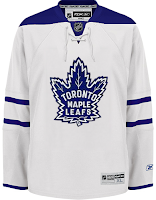
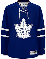
Meanwhile the Maple Leafs will likely take a more traditional path.

It's more likely they'll end up with a white sweater, but blue is certainly a possibility as well.

The Bruins have sort of already leaked their third jersey design and it looks like this.

The Oilers will probably go with a retro look...

...same as the Sabres.

Still other teams may ditch the historical look for something more contemporary. If the Stars go with a green third, it could look like this.

And the Lightning and Senators might go with informal nicknames on the front — the Bolts and Sens.

Not sure about the gold Ottawa sweater. I like black better for them. I also wouldn't expect to see the 2D logo on the front of a jersey anytime soon, but that's just me. I've been wrong before.

I'll have more later today including the next division in the IHA branding project.

Saturday
Jul192008

Leafs Confirm Third?

This is a followup to a story I posted on Wednesday about a jersey that turned up on the Maple Leafs' official web site recently.

According to a reader who emailed me, that is going to be the Leafs' new third jersey this season. The following is the email sequence that was forwarded to me:

Whats the deal with this? thats not the Leafs jersey! Is it being altered to fix what was broken last year? Please tell me it's true!!!


Thank you for your email,
The jersey in the link you have provided is the new Maple Leafs third jersey.
Thanks for being a fan!

Names have been removed for privacy reasons. I have no other corroboration this information so take it for what it is — I'm sounding like a broken record, I know. But I don't want to pass stuff off as factual before I know it to be so.

The thing is, the majority of rumors swirling suggest a vintage white sweater as next season's alternate. That could just be excited fans promulgating wishful thinking... or not. But if the above does turn out to be true, we saw the Toronto Maple Leafs' third jersey 11 months ago. Here's another look at it.

If anymore support for this surfaces, I'll let you guys know.

Sunday
Jul132008

Pens, Leafs Fan Art

One new artist I've been receiving concept designs from signs his work Ivall. His first submission was a Blackhawks logo that was met with a lot of praise. His followup was a Sabres logo that landed in a Freak Out Friday post.

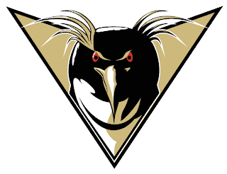
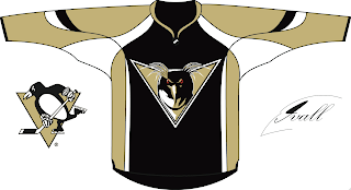
In the last few days he's been hard at work on new logos for the Penguins and Maple Leafs. We'll start in Pittsburgh.

You know, of all the Pens artwork I've been sent, I think this is the first time I've seen a forward-facing penguin. Despite its intricacies, it's a pretty well-drawn logo. Check it out on a jersey.

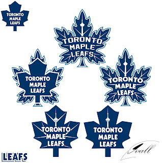
He also made five attempts at a new Leafs logo.

It's hard to say which is my favorite but I think I'd have to go with either the one on top or middle-right. Thoughts?

By the way, we've got new sweater designs from Paul (aka capn89). He's made Philly, Columbus, Washington and one other team — got to leave something to the imagination. Check back tomorrow for that!