Thursday
Jul172008
Ducks Logo Enlarged?
 13 Comments
  Thursday · Jul 17 · 2008 | 4:37 PM PDT
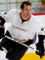
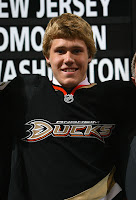
 Apparently the Ducks' uniforms will be slightly altered for the 2008-09 season. Don't get too excited though, it's nothing huge. It's just bigger — by that I mean the logo (er, wordmark?) on the front of the sweaters. Based on the looks of things at the draft, this is the case.
Examine these two photos as evidence. On the left is Todd Bertuzzi in game action last season. On the right is first round draft pick Jake Gardiner.
Compare the size of the logos on the two sweaters. It does appear that the logo stretches farther across the sweater on Gardiner's jersey.
But this could all be in our imaginations. Thanks to Jason for pointing out this possibility.


Reader Comments (13)
They just need a new logo.
The colors have grown on me(even though you'll never find a gold black & orange duck) but the logo has not.
lol when i clicked here, it said no comments and then when it came, it said ^that comment
lol your saying "so what"
hard to tell on a black jersey. plus I'm sure Bert's chest and jersey therfore are much larger than Gardiner's.
I KNEW IT!!!
they look the same to me. match the size of nhl logos to the size of the letter 'U'.
you are also comparing a black jersey vs white, and different size players/jersey (with and without pads)and angle of image.
they look to be the same to me.
I refuse to look at a picture of a Douche as big as Bertuzzi
haha i agree with what Tom says! But it is kind of hard to tell in the pics... They definitely need to do something better with those sweaters though
Sens Fan has a point. This is Bertuzzi, an enormous human, and some kid who probably checks in at the draft average of 5'11" 180.
I have seen the Ducks' RBK Edge version these jerseys that have been worn for the past two seasons now.
The wordmark logo on the front was smaller last season than the 2006-2007 campaign. No doubt in my mind. I wish the Ducks would go back to their original uniforms already... maybe in the current colors if there's a need compromise.
Different size jersey I bet. NHL Jerseys typically use the same size logo and numbers regardless of jersey size, so the logo will look bigger on some people then others. It's just too much trouble to keep at least 3 or 4 logo sizes on hand, number sizes on hand, so on and so forth. Simpler to produce, simpler to stock- both for the team and the gift shops.
its the exact same size. the pic of gardiner is just closer
no change I bet... there could be any number of reasons for the illusion of a larger wordmark on the right, it's either: different size jersey, or pre-Rbk Edge jersey