Icethetics

via Blogger

Entries in ducks (7)

Thursday
Sep252008

The Slow News Day

Seriously, nothing seems to be going on today. Yesterday I had five posts. Seven on Sunday. Today, I'm barely going to get this one to count for Thursday. Anyway, it was a nice break and it gave me some time to start putting together next week's Icethetics Season Preview.

Anyway, just so you guys aren't left with nothing tonight, I'll respond to a few of the emails I've been getting pretty frequently these days.

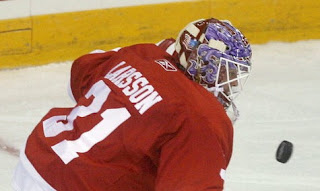
No, the Detroit Red Wings are not changing the nameplate lettering on their jerseys. This is something we seem to go through every year around this time.

During the regular season and playoffs, each player has a custom made arched nameplate on his back. Obviously, something of that nature requires considerable time and effort — something wasted on the dozens of guys who are only trying out in the preseason and won't actually make the team. So a simpler lettering process is put to use.

That's a sample of what they're using for the preseason. Everything will be back to normal once the regular season begins. Count on it.

...

Back in July, I wrote up a bit after the draft about the Ducks enlarging the wordmark on the front of the jerseys. There appears to be new evidence of that in photos of preseason action.

It's a step in the right direction, Anaheim. Now if you just drop the UCKS, you'll have a happy camper over here.

...

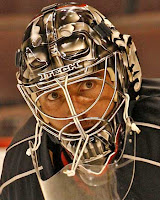
The Ottawa Sun, who I was recently mean to has pictures of Darth— pardon, Martin Gerber's new helmet.

Gerber made waves last season by wearing an unpainted black goalie helmet. It earned him the nickname Darth. Apparently he liked it because he's had his new helmet painted like Darth Vader.

During the Goalie Mask Tournament at NHLToL several months ago, he was unsurprisingly defeated in the first round, garnering only 25% of the vote against Mathieu Garon.

That's all I've got for tonight. Hopefully there's more going on tomorrow. If nothing else, I'll at least have some concept art for your viewing pleasure.

Monday
Aug252008

Ducks PR Confirms No Third

Not that this is going to come as a huge surprise to anyone, but the Anaheim Ducks will not be among the handful of teams wearing third jerseys this season. It was confirmed today on the team's official web site by PR man Adam Brady in his blog.

...there hasn't been anything official about this yet, but there is talk that several NHL teams will be adopting third jerseys for the 2008-09 season. I can tell you with 100 percent confidence that the Ducks will not be one of them. However, several clubs will apparently be following the Ducks' (and several other teams') lead by adding black jerseys, including the Kings (though they already have black jerseys), Bruins, Hurricanes, Sharks, Blackhawks, Senators and Coyotes.


Somebody's been reading Icethetics.

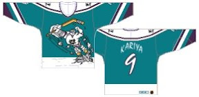
And in an effort to perhaps remind us why sometimes third jerseys are a bad idea, he shared the worst two in history.

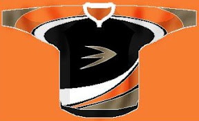
But to that I have to add that I love that Kings logo and I actually own that horrible Ducks jersey. No shame here.

So you can now officially include the Ducks along with the Capitals on the list of teams that will under no circumstances wear anything but their home and away sweaters this year.

Thursday
Aug072008

Overnight Art: California Style

It's late and I feel like you guys got shortchanged today with only an IHA Poll being posted. So I'm sitting here and I feel like writing up a pretty big concept art post — all about California. We'll start in Anaheim.

Here's an unusual idea for the Ducks — get rid of everything in the logo except for what's inside the D.

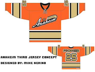
Or, to be more conservative, I've got an orange third jersey that's pretty sharp.

And an orange third jersey based on a purple one from the old days.

We could just go an entirely new route and find ourselves with a unique, new logo.

But maybe we'd better not. Continuing our California trip, let's head to L.A.

Same logo, two drastically different uniform designs. This next one loses the color altogether with a callback to the Kings' Gretzky days.

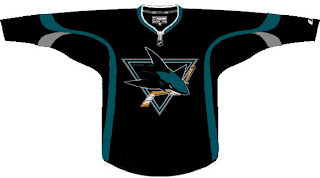
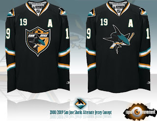
Now we head north to San Jose where we start with a new logo for the Sharks.

Notice the complete lack of orange. I always thought it was a nice accent. But that's why we have the one on the right. Though comparatively, those sweaters are a bit boring.

One designer suggested the team keep the shark of their current logo with the triangle of the old days.

And this last one was forwarded to me, I believe, from a message board somewhere. If anyone's got the link, I'd be happy to add it. (Update: See the original post at HFBoards.com.)

I like both but the shield logo is my personal favorite.

Happy now? Go get some sleep. (And if it's morning where you are when you're reading this, have a nice day.)

Monday
Aug042008

Ducks Confirm No Third

You know, with all the talk about which teams are getting third jerseys this season, I guess it makes sense to mention confirmation of those that aren't.

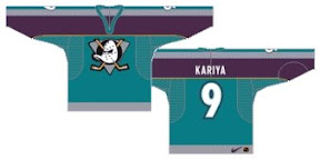
According to Curtis Zupke from the OC Register, Ducks management says they will be one of handful without one. It's funny because, 1) they could use one, and 2) history shows Anaheim has been one of the most prolific clubs in terms of thirds. A quick look back at the last 12 years turns up four different alternate sweaters for the Ducks alone.


credit: Andrew @ NHL Uniforms.com

It's worth noting the gradual increase in quality here over the years from something that should never have been worn in an NHL game to something that I wish was still around.

Sunday
Aug032008

Inspiring Concepts

It's been a while since I've done a concept post. But as you know I've been busy redesigning the blog this weekend (again). Before I get into today's artwork — and there's a lot of it — I wanted to share my inspiration for this latest round of design upgrades.

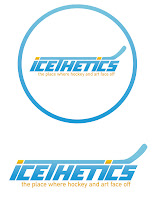
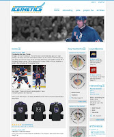
A reader and graphic artist named Guillaume Bellemare emailed me a couple of weeks ago about the design of Icethetics. He said he had some ideas for improving it and I asked him to send me whatever he came up with. I just wanted to show you guys what he sent.

First of all, Guillaume obviously does really great work. You can check out his web site for more like it. You can click on the images above to enlarge them. On the left is the logo he created. I don't plan on using it (not a big fan of the font) but I do like the concept a lot. And on the right you can see the site design he came up with. So I have to credit Guillaume with putting the idea of a pollbar in my head. It wasn't until I saw his design that it really clicked with me.

One of the main focuses of this site is the polls. Why am I letting them get buried in pages of posts? It didn't make any sense. Now you have a quick at-a-glance way of seeing what you can vote on — and how long you have left to do so. That was the main element I took away from his demo here.

As for the rest of it, like I told him, the majority of the people who visit Icethetics are designers or otherwise artsy people who tend to use higher resolution monitors. Tiny text is difficult to read so I prefer large text and lots of spacing. I also widened the page for the same reason. Anyway, there's no need to beat this to death, so I'm not going to go into anymore details unless specifically asked.

If you have any questions, email me or comment. Now for today's concept art...

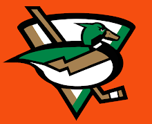
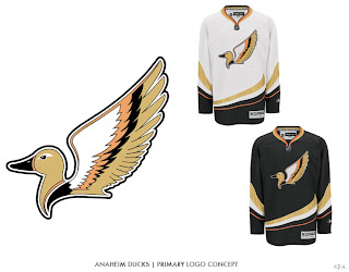
We're beginning with the Ducks because I have two great logo designs for them.

This one I like a lot but it's funny to me that, like the Canucks, the uniform would feature a prominent color not in the actual logo itself. The designer created orange uniforms for this concept. Still a great logo. The next one, I don't know.

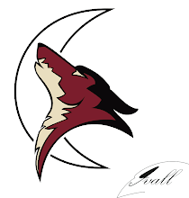
It is quite duck-like, but I'm not sure that's winning it points. A little detailed perhaps, it makes great use of Anaheim's new colors. Moving on now to the Coyotes.

I think this logo would be improved by filling in the moon with a color. And while I like Phoenix's actual logo better, in this one, the coyote actually appears to be howling.

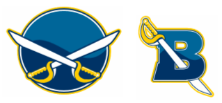
Another interesting Sabres design to add to the pile.

Simple, straightforward, traditional. Nothing wrong with that.

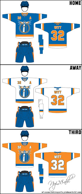
The next piece is based off an Islanders concept logo I posted here about a month ago.

Those are some nice jerseys and I can't see how the club from Long Island could go wrong with a logo like that.

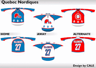
We'll finish things off with a little something for the Quebecois population out there still missing the Nordiques. Here's what the old club might've looked like in today's Rbk EDGE sweaters.

Not bad at all.

Thursday
Jul172008

Ducks Logo Enlarged?

Apparently the Ducks' uniforms will be slightly altered for the 2008-09 season. Don't get too excited though, it's nothing huge. It's just bigger — by that I mean the logo (er, wordmark?) on the front of the sweaters. Based on the looks of things at the draft, this is the case.

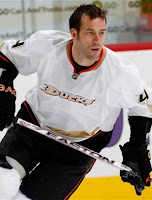
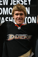
Examine these two photos as evidence. On the left is Todd Bertuzzi in game action last season. On the right is first round draft pick Jake Gardiner.

Compare the size of the logos on the two sweaters. It does appear that the logo stretches farther across the sweater on Gardiner's jersey.

But this could all be in our imaginations. Thanks to Jason for pointing out this possibility.

Friday
Jun232006

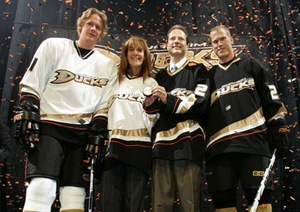
Ducks Change Name, Uniforms

The following entry contains material copied from a web page that no longer exists. It has been posted here for informational purposes only.

On June 23, 2006, the Anaheim Ducks officially unveiled their new name, logo and uniforms. Here is the press release posted on the team's official website.

Anaheim Ducks Officially Take Flight

Ducks unveil new uniformsANAHEIM, Calif. – The Anaheim Ducks today unveiled the club’s new logo and jerseys at a press conference held at the Arrowhead Pond of Anaheim. At the same time, the club officially changed its name from the Mighty Ducks of Anaheim, to the Anaheim Ducks.

“We’re both proud and excited to bring hockey fans in Southern California a new look and new name,” said Anaheim Ducks owner Henry Samueli. “We think the new logo and jersey portray the same passion and energy our players and fans bring to the building every night.”

The new look and identity of the Ducks were a collaborative effort, mixing opinions of fans as well as Ducks players, ownership and management. After sports branding firm, Frederick & Froberg Design Office developed dozens of concepts in an exploratory design phase, all parties involved unanimously decided to go beyond simply altering the original concept of an aggressive duck character.

In shaping the new design, the focus was sharpened to create an overall image that expressed excitement, speed and a competitive edge. In addition, a classic color palette of black and metallic gold was developed, with an accent of orange as a metaphorical link to the teams’ Orange County home.

“As area residents, we felt it important the jerseys in some way represent our home,” added owner Susan Samueli. “And, we believe this new look serves as a fantastic way to update the franchise’s growing tradition.”

The result is a strong, typographic mark anchored by a stylized “D” that echoes the image of a duck’s foot or footprint. The custom typography has a powerful forward momentum and is made up of metallic gold letters with orange drop-shadows and a black holding shape. The new uniforms are an evolution of the earlier sweater design but with gold, white and orange sweeping stripes influenced by the curves of the “D” in the Ducks’ logo.

The overall look is a distinctive departure from the original design, introducing a more sophisticated, powerful and timeless identity.

“I really love the new look and thank the Samuelis for giving me a chance to have input on the design,” said Ducks winger Teemu Selanne. “I can’t wait to hit the ice with it this fall.”

ABOUT THE DUCKS

Since their inception in 1993, the Anaheim Ducks have earned four trips to the Stanley Cup Playoffs, including a trip to the Finals in 2003 and the Western Conference Finals this past season.

Just over a year ago, on June 20, 2005, the Ducks’ franchise was purchased by Orange County residents Henry and Susan Samueli. In the Samueli’s first year of ownership, the Ducks went on to break franchise records for overall wins (43) and standings points (98). Entering the 2006 Playoffs as the Western Conference’s sixth seed, the Ducks upset the third-seeded Calgary Flames in a thrilling seven-game series and went on to sweep the Colorado Avalanche before losing to the Edmonton Oilers in the Western Conference Finals.


Reference Posted 3/20/10
Original URL: http://www.anaheimducks.com/press/release/topstory.php?dir=200604&id=1364