Finding Lost Logos
 21 Comments
  Thursday · Aug 21 · 2008 | 9:34 AM PDT
 Tuesday's post about blogger James Gordon finding unreleased logos in public trademark filings and an email from JP at Japers' Rink got me thinking about what other hidden gems might be out there on the United States Patent & Trademark Office's web site. Now I think "gems" is misleading because, by and large, logos that were trademarked but never used probably weren't that good in the first place.
Even one that was trademarked and will be used wasn't that good. I'm of course referring to the Kings.
That got me thinking about the one other team who is supposed to be getting a new logo for their third jersey — the Blues. And we haven't seen anything from them yet. So I did a search. Unfortunately, it seems they haven't filed yet. However, I did find one interesting wordmark.
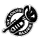
A Blues fan would have to let me know if this was used or not at any point. But I don't remember ever seeing it. I believe it dates back to the days of the trumpet logo you see on the right. That was a secondary logo worn as a shoulder patch during the Gretzky days when the team introduced red into the uniform.
I did like that trumpet logo a lot though, for what it's worth.
Moving on now to the Capitals. Here's a logo we have seen before here.
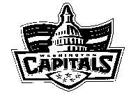
And here's one we haven't.
This is what JP pointed out to me in the first place. Last year he wrote up a post about these two logos. He didn't like either and while I know my opinion doesn't count for anything, I have to say I really like the one on the right.
Yeah, it has text in it and all that, but if you can look beyond it's major flaw, I think it's a very balanced and well-designed logo. Shame it never saw the light of day.
And finally, I have to bring it all back to my Tampa Bay Lightning.
This logo was trademarked by the Bolts but never used — thankfully. I first saw it at Boltsmag a few years back.
If you guys find anything else of interest, let me know and I'll post it.
UPDATE (8/22 1:02 AM): All right, this is incredible. Not only were both of those Blues logos used, a reader emailed in a picture of a banner that features both on a hockey mask — together!
How cool is that?


Reader Comments (21)
Do a search on the Ottawa Senators. You'll pull up two interesting logos that were rejected back in 1993. They made the right decision I think
I can't figure out how to use their search, every time i type something in and search for it my firefox times out.
1) I miss that St. Louis trumpet logo. Its too bad their jerseys were terrible with the red in it.
2) I don't mind the second Washington logo with the word mark. It has an interesting silhouette while still feeling like a hockey crest. The word mark doesn't bother me since that team has always used one.
3) The Tampa logo is interesting. I think the left part sticks out too far but I like the "shield and lightning bolt" idea. The word mark above could be dropped though.
Cool post! Keep up the good work. :)
Scott,
i'm having some real problems searching the site (comes up with a page not found when i search ANYTHING), could you paste direct-links to those sens logos? (right click, properties, highlight and copy URL) they'd be great to see.
i believe the blues wordmark was a rejected logo from the same time as the rejected 3rd jersey, but i'll have to check on that.
and i actually like that second caps logo.
I figured out that this is the search http://tess2.uspto.gov/bin/gate.exe?f=searchss&state=a0m9s5.1.1
second capitals logo is AWESOME! they should think about using that for their thirds someday.
Can someone color that last caps logo? I think everybody would appreciate a color concept and maybe put it on a jersey design.
St. Louis used both of them. Please see the top row of pucks from my collection - both logos are there.
http://picasaweb.google.com/Larryspucks/Pucks/photo#5234115949668809426
St. Louis actually first introduced red to their jerseys in 1984. They just made it a lot more prominent during the Gretzky/Shanahan days.
I am so glad the caps never used the eagle logo, just seemed like such a weird shape and combination of looks. But I really like the one with te capital. Not sure it's better than the one they used on the black jersey for awhile, but still solid
Ok how about instructions how to get there:
-Click the link chris posted.
-In the drop down menu at the top right choose Trademarks-Logos-Brands and then click Go next to it.
-On the right side of that page click the link Trademark Search.
-On the next page click the center link Search Trademarks via TESS.
-In the small table on that page click New User Form Search (Basic).
-Now use that search tool.
I'm not sure if its the right one though, but it finds logos.
The TB logo looks like it says Tampa Gay...just saying...
The Blues wordmark was used on some of their merchandising because I remember getting a metal trash can with that logo printed on it from Merle Harmon's Fan Fair or some sports store like it.
http://www.nhluniforms.com/2000s/Images/CapitalsNeverWorn.gif
this is what the Washington uniform would've looked like.
The first Caps logo was supposed to be a part of a jersey, but they had second thoughts.
i didnt like the trumpet logo
As a st.louisan, I can attest to BK's comment that the wordmarking was only on merchandise. Those mock-up jerseys with the wordmark on them were rejected as thirds during the Keenan era.
Those mock up jerseys also go with the other "trumpet" motif jersey in the book "Note by Note." I believe it was done by then Blues PR guy Jim Woodcock.
The trumpet logo was used as a secondary logo on the shoulders when they had the red "angle" motif. I think I just threw a catalog away that had that wordmark on it, though I think I might have a photo of it somewhere.
http://www.onfrozenblog.com/wp-content/uploads/2007/08/blues.jpg
http://www.prosportsmemorabilia.com/Images/Product/33-20/33-20926-F.jpg
ellen, agreed that the Bolts logo looks like it says "Tampa Gay", lol
You can get better grahics from the Canadian patent office site:
http://strategis.ic.gc.ca/app/cipo/trademarks/search/tmSearch.do?language=eng
I seem to remember that Blues wordmark from some of the old NHL Hockey video games. I think it was NHL 97, where they used team wordmarks through the game quite a bit, for the selection of teams, etc.