Thursday
Aug212008
Catching Up On News
 11 Comments
  Thursday · Aug 21 · 2008 | 9:48 PM PDT
 It seems I've been slacking a little this week when it comes to news coverage. I really try to stay on top of this for you guys so here's a wrap-up some of what's going on.
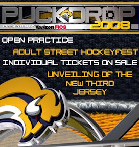
The Buffalo Sabres became the first team in my book to bring the new third jerseys into their marketing campaign. This ad began appearing on their official web site this week.
This comes after Sunday's announcement of a sweater unveiling ceremony to be held on September 20.
On Monday the AHL's Wilkes-Barre/Scranton Penguins — better known as the baby Pens to fans — unveiled their new third jersey. Yes, even the AHL is going that route this year.
credit: wbspenguins.com
No word on whether the green plaid shorts will be part of the official uniform.
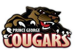
The WHL's Prince George Cougars unveiled a new logo on Wednesday.
credit: pgcougars.com
You may remember the Cougars saw a first-round exit courtesy of the Regina Pats in the WHL Tournament of Logos back in March. Perhaps this logo will give them a better shot at advancing further in the future.
Such a cute kitty.
There you have it. Sometimes I think it's just better to get it out all at once.


Reader Comments (11)
Awesome to see the Sabres with an official announcement. I am hoping the jerseys look as nice as I'm enviosioning them.
Not too much EDGE to it I hope.
I still have a bad feeling that its going to be Buffaslug Replaceing the Buffalo on the old logo and the sabers are going to be like the way you have them on your matt. I mean just look at the add, they put the 2 together in there.
that pens jersey was on Uniwatchblog and i hated it then. i loathe it now. the whole wordmark jersey thing has got to stop. I work in college hockey and i hate it at that level, at the pro level there's no excuse.
maybe if it were better executed, i could get behind it, but three-color tackle-twill letters with one-color tackle-twill numbers beneath it looks very cheap. not to mention, idk if it's the shrinking of the image, or if there's actually gold in that wordmark. either way, it looks like hell
The team name is the Wilkes-Barre/Scranton Baby Penguins. There is no WBS stuff, there is no "baby" ...with the pens logos on the shoulders, how could you identify that this isn't for the nhl club? maybe when they slap an advertizement patch on it...that's one of the few ways they can cheapen this look
i want to point out that the base-jersey is the 1976-79 Pittsburgh Penguins home jersey, and it's actually my personal favorite jersey of all time. they've ruined a classic
@Hockey Week
The team name is not the "Baby Penguins," that's just what the fans call them, Similar to the Bruins fans calling Providence the "Baby Bruins."
So that's why there's no "baby" on their jerseys. And either way, don't you think that would look a little ridiculous?
Yeah im not a fan of the Baby in the AHL its still a pro leauge. Im not calling My Marlies the Baby Leafs.
lol people used to call the st. john's maple leafs the baby leafs!
@Hockey Week - There's a pretty big baby in the jersey.
Signed - A Caps fan.
I hate how some hockey teams are making their jerseys look like long-sleeved basketball jerseys.
Scott,
You mean you hate how pro teams are wearing college-like jerseys now? Me too. I love it in college, but that's where it belongs.
The Stars are the only professional hockey team that can pull off the name above the number look. Hockey is unique in that we're one of the only sports to have a logo covering the whole front of the jersey (football: numbers, basketball: wordmark and number usually, baseball: has a wordmark or small logo, etc).
I'm with hockey week on this one, I'm a pens fan, and this is one of their best jersey designs of all time, and the wordmark and number destroyed it
PG changes logo? NO!
Bring back the Yawning Otter!