IHA Atlantic Final Logos
 23 Comments
  Saturday · Aug 9 · 2008 | 12:38 PM PDT
 Almost four weeks ago we began Project: IHA and as we continue unveiling teams and logo finalists, we're now beginning the process of revealing the final logos for each team. Thanks go out to all of the amazing designers who had a hand in this.
Below are the final logos for the Atlantic Division. Each team has a primary logo as selected by the voters at Icethetics and a secondary logo from the artist's original set. I'm not posting wordmarks because not all of the winning logo sets included wordmarks.


New York Americans
Designer: Sigma Kappa


Philadelphia Titans
Designer: Andrew


Pittsburgh Miners
Designer: Andrew
Just to clarify once again, your votes determined the primary logos. The secondary logos are basically the other logo from the designer's set. The only exception being the Stars as these logos were submitted singularly. In other words, I made an executive decision on the secondary logo based on comments written on the poll post.
Congratulations to all the designers! These logos will be submitted for use in the IHA online fantasy league. If any of you would like your credit changed, let me know.
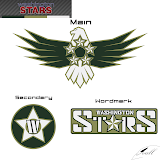
By the way, as a special bonus I have a couple of late submissions for the Titans and Stars that couldn't be included in voting. Wanted to share them with you.
If you guys have any questions, email me or ask in the comments. I'll be happy to answer.


Reader Comments (23)
All of them are excellent, worlds better than anything i submitted.
Congrats to all who had theirs used!
those two logos that were not used are awesome!!!
and why is it that some secondary logo where included in the vote for primary's?
maybe you explained and id didnt get it,,
who9a i was up for more then 24 hours and i just got back from work,,so sorry,,my sentence doesnt make much sense right now,,:P
Let's over-ride the votes and make those Titans and Stars logos the winners. They're killer!
the miners logos are soooooooo great
fire ok, same with americans
dont like the titans, and stars much, but better than what i did
that washington stars concept is KICKASS! i love that titans secondary logo too.
why wasn't that miners secondary included in voting? that ones' great too!
and so its a fantasy team, who will control the teams?
i'm totally recommending a re-vote between those stars logos and what was voted in.
though i wonder how well they'd survive the conversion to vector imaging. i know those titans logos wouldn't survive
Man I really wish my Works e-mail did lose those 2 logos on the way to chris. im really pissed that i didnt make it. but rest asured ill have a logo for each of the North East. as long as chris gets them all.
That Americans secondary should really be the primary. It's that awesome.
I really like the Americans' combination. It's too bad those two extra ones didn't make it in on time tho, they are both really good!
Wow, that unused Titans logo is AMAZING!
its sick how the unused logo for the stars was a different colour really looks good
re-vote for the stars!
unused logos = best logos in this thing
re-vote for the titans, because that is literally the best logo i have ever seen in my entire life.
Thanks For liking my work everyone. I wish we could re-vote to, but I guess fair is fair. I know i have at least 2 really good logos for the up coming North East.
Is the original design changed from original to the one posted? Because I noticed that all the logos have the same background and all look very sharp.
Thanks for the help.
@ Mike Phoenix
The shear bad-assery of those logos is (are?) amazing. I love the military feel to the Stars stuff. And the Titan helmet looks like it belongs on the Witch King or whatever his name is from Lord of the Rings 3. Great stuff!
Re-do the Titans votes please!
Sorry guys, no re-votes. Them's the rules.
Chris, after the teams are all decided... are we going to make, and vote on jerseys too?
I really like the Stars' secondary logo. It includes the 'W', a star, and the Washington Monument.
As for the late submission.. not sure why the artist completely changed the color scheme.
That Atlanta Fire secondary is so similar to the Chicago Fire logo of the MLS it's scary.