Monday
Sep012008
Making Over The Sharks
 13 Comments
  Monday · Sep 1 · 2008 | 12:13 PM PDT
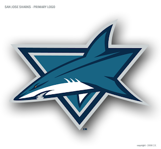
 One of my favorite regulars has a new logo redesign. You've seen him give new looks to teams like the Red Wings, Devils, Predators, Senators, Flyers, Coyotes, and most recently the Panthers. Now he's taken a shot at the San Jose Sharks — who just unveiled a new look last season.
As you can see, it makes use of the Shark in the triangle. Here are a couple of secondary logo designs.
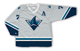
And even a couple of jerseys.
It's great work as always if you ask me. Feel free to post your opinions on these designs below.


Reader Comments (13)
Whilst the overall colors and design direction are really quite good, the typography for the numbers and "A" simply does not match.
I like how the third logo pays homage to the sharks playoff performances, they usually play like they were hit in the head with a puck.
Well it may be well done, there is no creativity at all. Its the exact same logos we always see for the sharks. We get it, people can but a shark in a triangle and draw a fin as a secondary logo....
I like the patch logo... just seems to have a little more character than their actual logos. Otherwise I don't think there's much need for a makeover in San Jose now. I wish they would use the full shark logo instead of the shark in the triangle as the primary though
i Think That secondary logo sould be the main. Im the same with Tony Im tired of the Triangle. But The work overall is top notch.
This designer seems to really like sharp edges. Personally, not a big fan.
i like most of the ones he does and this isnt one of them
This is fantastic looking. I would keep the Fin logo as a shoulder patch though, its not strong enough for a main logo. Way better than San Jose's recreation. A big plus in my book, no black anywhere in the color scheme.
The problem is that the Sharks really have such a solid logo to work with, and it's hard to take away from that. Nothing says "Sharks Hockey" better than a Shark biting through a hockey stick.
I'm not big on the logos, but I like the colours and the jerseys.
I think these are awesome. The current colors of the Sharks (teal, black, orange, grey) seem haphazard. But the colors used by Sigma Kappa 'make sense'.
i love the sharks and love these logos. but i would rather give up my season tickets than have to see the sharks play in a blue jersey
great work but the overall design for the jerseys is pretty gross looking. frankly, the designs of the logo are a little too robotic/computer generated. makes me think of the Buffalo Sabres motocross/rollerhockey jerseys too much. i suppose when youre dealing with a Shark, youre going to get pretty lame logos though. the primary one is decent but a truncated shark or a contorted one just tends to look "incomplete" or asymmetric in general and isnt iconic in the spectators mind.
the logo with just the fin looks like a really bad logo for some florida resorts letterhead.