Icethetics

via Blogger

Entries in fan art (44)

Tuesday
Oct212008

Third Jersey Fan Concepts & More

We haven't had a good concept art post in almost a month because of the explosion of third jersey news. Now that we're getting a little bit of a break from it, let's take a look at what some fans would like to see as alternate sweaters. And get comfortable, because this is going to be a long one.

We'll start with some update Flyers logos that were submitted.

My personal favorite is the bottom right corner in the sketches. Up next is a great set with some uniquely updated logos.


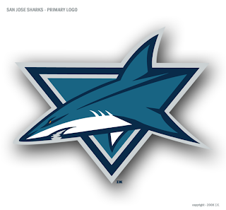
And speaking of updated logos, check out these for the Sharks.

The artist who submitted these prefers the one on the left but I thought I'd post them both and let you decide for yourself.

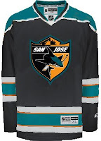
Now let's get into those third jersey concepts I was telling you about. We'll start with San Jose. Rumors have circulated that the shield logo could go on the front, but I wouldn't expect to see any white or orange anywhere else on the jersey.

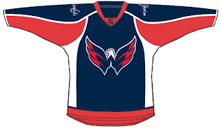
And the Predators concept is purely from the mind of the artist. The Predators haven't announced any plans for a third jersey either this year or next. Neither have the Capitals, but many people are wishing for something like this.

Many Canucks fans were hoping for a green third jersey. Maybe something like this isn't too far off.

Yeah, maybe not the one on the right, though.

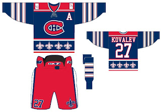
Here's a very busy idea for the Canadiens.

Maybe if your jersey was distracting enough, you could just win that way. Sticking with the Canada theme for a moment, how about these for the Senators?

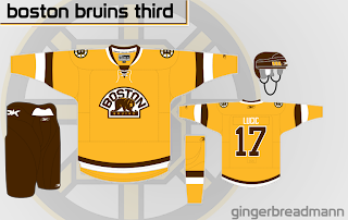
And finally, hoping for the return of a yellow third jersey for the Bruins? Here's one of my favorite concepts from this batch.

What do you think of these? if you have any concept art of your own, feel free to send it along.

Friday
Oct102008

Freak Out Friday XLIII

Another short edition of Freak Out Friday is upon us. We'll dive right in, starting with the St. Louis Blues. Here's an interesting alternate jersey.

And what has the Detroit Red Wings' jersey been missing all these years? Wings?

I don't really get this one but someone obviously put at least 10 minutes into making it.

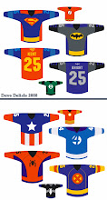
And finally, our buddy Dave Delisle from last time is back with more. What do all of these jerseys have in common?

Keep all your odd artwork coming so Freak Out Friday can continue!

Friday
Sep262008

Fans Get Creative

I've been trying to get some concept art posted a little more frequently. So since we're lacking any real news today, I can offer you these concept designs created by some of your fellow readers.

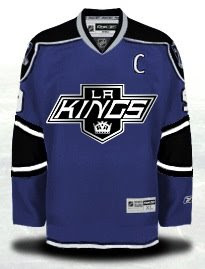
We'll start with the Kings and some ideas for their new third jersey.

And here's a series of various Kings logos from history in black and silver on a black sweater.

They don't all work, obviously. So let's get some color back in here.

I could really get behind a jersey like that.

Got a couple of concept logos to share as well. We'll start with the Blackhawks.

You already know I'm not a fan of their Indian head logo, but you can also be assured that I don't think this is the right direction. Very clean design though.

This would only work for the Islanders if the Rangers didn't exist. But this Big Apple imagery won't fly for the team on Long Island. Still, it's another excellent logo.

And we'll finish where we started — colorless.

These are some all-star game jersey ideas. Not bad, but very plain.

Friday
Sep192008

Freak Out Friday XLII

Freak Out Friday is finally back! After taking six weeks off, everybody's favorite series is making its' big return today. For those of you who just joined us in the last six weeks, take a look at some past Fridays. Some of the best ones were on the old blog. Basically, I take the opportunity every couple of weeks to showcase some of the weirdest and craziest concept art that turns up in my inbox.

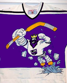
Now, we're starting back up with an easy one. What did we last make fun on Freak Out Friday and what do we make fun of the most? Could it have been the Mighty Ducks' mid-90s third jerseys? What if they mated with the Kings?

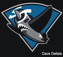
Sticking with California for a moment, imagine if the Sharks went in an entirely different direction with their logo design.

That's not even the best one, and you'll notice that the majority of today's Freak Outs come by way of David Delisle who, while doing excellent work, sure ends up with some odd stuff.

Last month I featured a blog that was holding a competition to design the best Hurricanes/Whalers hybrid jersey for the franchise's 30th anniversary.

That's so scary it's actually good. And to all of you who think the Hurricanes' logo looks like a toilet flushing... this logo brings back memories of when my first goldfish died.

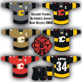
The Flames will be our next topic of discussion.

Check out that logo in the middle. The more astute among you will notice some things hiding in plain sight. The less astute will just be amused by this.

The Blue Jackets are next on our hit list. All this time and no one's ever made a concept showing jerseys that look like blue jackets. Until now.

How would that not get your team laughed off the ice?

Finally, a combination of odd designs by our new buddy Dave.

Yes, we get it. There are a lot of cabs in New York. By the way, the record needle on the end of a hockey stick is pretty funny.

One more thing, which isn't related to hockey but still funny. Kurt Snibbe of ESPN.com's Page 2 had some fun messing with NFL logos last week. I highly recommend a look even if you don't like football.

And that's all there is for this 42nd edition of the Freak Out Friday. I hope to be back in two weeks with a new crop of the ridiculous so make sure you guys keep them coming.

Tuesday
Sep092008

Concept Art Is Back

It's late. I'm bored. Seems like the perfect reason to write my first random concept art post in over a month. Obviously it's going to involve a lot of third jersey speculation. So let's start at the beginning.

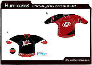
Tomorrow afternoon, the Hurricanes will become the first team to unveil a third jersey in the Rbk EDGE era. You can even join us for a live chat as it happens! On to the art, now.

The one labeled "a" seems to be based on the standard rumors. The other one is pure fantasy. Unique. This same artist has been working on speculative designs for a few other teams. He's got the Kings and Sens covered.

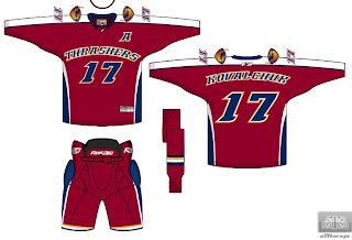
Sens, what a joke. Guess I won't be laughing so hard when my team wears jerseys that read "Bolts" across the front. Our friend Vlad also took a stab at the Thrashers.

Again, rumor-based on the left, fantasy on the right. I really hope Atlanta can do better. I do have another concept design for the Thrash which came before the real text design leaked.

Aside from the choice of font, it's a nice set.

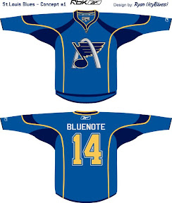
This next one seems to be half-based on rumor. It's a concept for the Blues featuring the Arch but their new third jersey is alleged to be navy.

And we'll finish with an artist just having a little fun with the Devils.

Stare at that logo a little while. You'll start seeing things.

So anyway, time to get excited about all the new third jerseys. The fun kicks off tomorrow when we'll know for sure what at least one of them will look like.

Monday
Sep012008

Making Over The Sharks

One of my favorite regulars has a new logo redesign. You've seen him give new looks to teams like the Red Wings, Devils, Predators, Senators, Flyers, Coyotes, and most recently the Panthers. Now he's taken a shot at the San Jose Sharks — who just unveiled a new look last season.

As you can see, it makes use of the Shark in the triangle. Here are a couple of secondary logo designs.

And even a couple of jerseys.

It's great work as always if you ask me. Feel free to post your opinions on these designs below.

Sunday
Aug312008

Third Jersey Interpretations

A few weeks ago, the folks over at JerseyDatabase.com posted their interpretations of Howard Berger's descriptions of this year's new crop of third jerseys. I realized I hadn't written anything up about it yet.

These images are by no means official nor have they been created with any information beyond what Berger wrote — as far as I know. But I at least thought they made for an interesting discussion. Here are a few of the speculative designs.


For a complete look at what they've come up with, check out their web site. They have all 18 jerseys plus a couple of bonuses divided into two parts. Click for Part 1 and Part 2.

Remember, this is all speculation and nothing official has been confirmed yet. And for what it's worth, I understand NHL 09 is coming out soon and may feature the new third jerseys. If they do and someone can provide screenshots, I'd be happy to post them. But for official release dates, stay tuned to the Countdowns element in the sidebar.

Monday
Aug252008

Hurricanes/Whalers Jersey Contest

This upcoming season will mark the 30th anniversary of the Hurricanes franchise — this includes their time in Hartford as the Whalers. The guys over at Hockeybums have a contest going to mark the occasion. It's something a lot of you might be up for.

They want artists to submit designs incorporating both the Whalers and Hurricanes jerseys. I'm guessing they also want some sort of hybrid logo as well to keep it from being too easy. They're also promising a "special prize" to the designer of the best jersey.

The contest runs until the start of the season.

Sunday
Aug102008

IHA Northeast Finalists Unveiled!

Last week you saw the logo finalists for the IHA Atlantic. This week, I've narrowed down three finalists for each team in the West Division for the logos I received. You'll begin voting on them tomorrow but for right now, have a look. I think we've got a good batch for this division.

BOSTON ROYALS

HARTFORD BEARS

MONTRÉAL ROUGE

OTTAWA CAPITALS

QUEBEC GLACIER

I'm leaving off credits here as usual. However, if your logo is featured here and you would like a credit, drop me a line via email and I'll be happy to add it. Otherwise, I plan to wait and credit the logos that win for each team.

Polls will be posted throughout the week to decide which logo should be used for each team. Along with each poll, I'll show some of the logos that were submitted but didn't make the final cut for one reason or another. So if you sent in a logo that wasn't selected as a finalist, it should be there. If it's not, the image you sent was probably unusable in some way.

By the way, I've tried to weed out any logos with elements stolen from actual professional sports team logos, but if I've missed anything be sure to let me know. I've got backups to put in for most teams as far as the polls go. Speaking of backups, there's one more logo I have to post because of it's homage to the Whalers.

I'm not sure it would be a good idea for this competition for obvious reasons, but how cool would it be for this alternate universe league to share a logo trait with the NHL's best like that? It would be like a destiny thing for the city of Hartford.

Seriously though, the Whalers had one of the best logos ever (even you guys agree as evidenced by your voting in the Vintage Logo Tournament). Anyway, I just wanted you guys to see it, but it probably won't be up for a vote in the poll this week.

Post your comments and critiques below!

Saturday
Aug092008

Make Your Own Jerseys

A reader named Mike recently brought to my attention a cool service that I'm sure would be of interest to the rest of you here at Icethetics. A company named Athletic Knit, which specializes in custom sports jerseys, has a special feature on their web site that allows you build your own custom jerseys. For those of you lacking the more creative Photoshop abilities but wanting to express your ideas for concept jerseys, this could serve as quite a useful tool.

Click here to visit their web site and see the graphic below for where to access the Online Customizer feature.

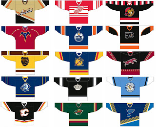
So naturally, using this feature, Mike tried his hand at all 30 NHL clubs and came up with his own concept third jerseys. I've split them into two sets for your viewing pleasure.

Very unique look for Anaheim. Everything else looks pretty tame. (Maybe Detroit and St. Louis are a little funky.)

Colorado and Washington. I'm just shaking my head. Got some odd striping for Columbus. Odd colors for that particular Vancouver logo. But I'm a fan of Tampa Bay so I can rest easy.

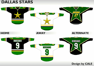
And because lately we can't seem to get enough of the Dallas Stars, here's a concept design that was sent in recently.

There are sweaters to go with these logos as well.

Interesting take on the Texas team.

Now feel free to spend the rest of your weekend at Athletic Knit cluttering up my inbox.

By the way, logo finalists for the IHA Northeast coming tomorrow. And boy, is it a doozy (I mean that both good and bad). You'll be stunned by what folks came up with for the Rouge, Capitals and especially Glacier. The Bears and Royals, not so much. Mainly the Royals. If anybody feels like cracking out an awesome logo for that team tonight, I'd be eternally grateful.