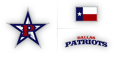
IHA Final Art: West
 12 Comments
  Tuesday · Sep 2 · 2008 | 9:00 AM PDT
 This week we're unveiling of the winning logo sets for each team in the IHA Project. Yesterday we looked at the final artwork for the Atlantic Division. Today we move on to the West.
Below are the logos you selected for the IHA. On the left is the team's primary logo. To the right is the secondary and the wordmark is beneath it. Under the graphic is the designer's credit.

Erroneous Art
To all the winning designers: If you would like your credit changed or a link added, please don't hesitate to let me know. Since you aren't being compensated monetarily for your hard work, the least I can do is offer a link to your web site, blog or online portfolio — just in case certain eyes are looking. You never know.
However, if you would like to remain anonymous, that's fine too.
Tomorrow I'll unveil the final logo designs for the Northeast Division.


Reader Comments (12)
i'm just amazed at peoples artisitc abilities out there. All of the logo's (Atlantic and West) shown are amazing, and better than some real sports logos out there.
Keep up the good work everyone!
Oh NOW the parentheses around the horse make sense! I quite like that as a whole package.
Awesome logos :) And yes, the parentheses on the horse make a lot more sense now. Great job, and glad to see that these were done by 5 different artists.
i'm esspecially impressed by the Seahawks secondary
I think that the Seahawks secondary would make a sweet primary.
Jason New Era Usher's logo for the Comets looks just like the "Buzz Cola" logo, in The Simpsons :P
I didn't realize my logo looked like http://farm3.static.flickr.com/2406/2667879148_e229502344.jpg?v=0
this.
Could have fooled me...
aww man, calgary gets this kick ass logo while my beloved e-town gets a demented blob seahawk...boo
Am I alone in thinking that calling a team from Edmonton the SEAhawks makes no sense?
I also like the idea of switching the Edmonton secondary logo with the current primary logo.
The Dallas Patriots? That doesnt make a whole lot of sense. I guess it doesnt have too...why not Steers?
Unless I missed it, there isn't an explanation on the side curves on the Calgary logos. I keep thinking of a girl in a thong bending over when i see Calgary's secondary (and the wordmark). Are they the sides of a horseshoe? The "V" is just there to make the "M"?