


Olympic First Look: Canada
— ICETHETICS EXCLUSIVE —
We're less than a week away from the official unveiling of Team USA's jerseys for the 2010 Winter Games in Vancouver. And while I haven't yet come across a date for Team Canada's Olympic sweaters, I do have a first look for Icethetics readers.
 Team Canada's 2010 Olympics red sweater
Kind of what a lot of fans were expecting. Classic, old-time hockey feel. Very impressive. Same with the white ones.
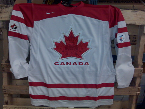 Team Canada's 2010 Olympics white sweater
The red shoulder yoke keeps the sweater from looking washed out. Now you're probably all wondering about that odd-looking crest, wanting a closer view. Check this out.
 Team Canada's 2010 Olympics sweater crest
The subtle nod to the style of the Vancouver Olympics artwork all but makes these jerseys perfect. I'm no Canadian so I want to know what you guys think of these.
By the way, for those not in the loop, the reason this was such a big deal is that with the announcement that national federation logos would no longer be permitted as crests on Olympic jerseys (i.e.: Hockey Canada, USA Hockey, etc.), many wondered what the new sweaters would look like. Now you know.
 Chris
Chris
For those who haven't heard, it's worth pointing out again. Team Canada will officially unveil these jerseys on Monday afternoon. Team USA will do the same. I will, as always, have pictures to share.
By the way, welcome Toronto Star readers! Once you get your fill of the Olympic jerseys, have a look around the site. I'm sure you'll find something you like.


Reader Comments (89)
I came here from Sportsnet.ca, Wow these jerseys look pretty good. I can't wait until Team Canada wins the gold. I never liked the new Vancouver Canucks jersey but it grows on you and you appreciate the jersey. I am going to buy one ASAP. I have tickets to the Canada vs. USA prelim match.
I AM CANADIAN!
Shenanigans are afoot!!
This is the exact same jersey they used in 2008! The only thing they've changed is the crest, and the mini logos on the sleeves.
No creativity at all! Bring back the black!
See Hockey Canada's website for proof!
simply awsome! there is no jersey I would be more proud to wear. My birthday is soon...somebody send this link to my wife & kids with "Hint Hint" written all over it.
Simple, Classy, no black, not corporate (aside from Nike, and the arm patches) and incorporates true Canadian heritage that we should all be very proud of.
they are talking about you on the radio RIGHT NOW!
Fan960 in Calgary
The red jersey is terrible. Why not go with a white maple leaf to have some contrast. The white looks ok, but these look like a they were done overnight. I know i am going to miss the Hockey Canada logo.
Sounds like this leak has bought icethetics a LOT of publicity! The jersey is pretty sweet, but they definetly need a black one!
Nice job getting picked up, Chris. I hope this equals more recognition and more hits for you.
They even talked about it on the French-Canadian network TVA, showing the main page of icethetics.info
@BrianB23
the jerseys introduced in 2008 were intended to be worn through the 2010 Olympic Games, the only reason the Hockey Canada logo was removed as the main crest was because of IOC rules (finally) being enforced...
so, yes, it is the 'same' jersey as in 2008 except for the crest and logos because that's exactly what it's supposed to be!
I'm not a Canadian,I'm Russian,but this is fkn awesome!
Can't wait for USA's one.
I don't like it. the design in the Leaf itself is TOO subtle. I'm more of a traditionalist, so I would have LOVED to have seen the old fashioned maple leaf with the word CANADA underneath it. (the one they used to have as a shoulder patch or sometimes as a third jersey)
I believe they dropped the ball on this one.
get rid of the Native art.... they would then be fine
The inside of the leaf is probably native art from a different world, not from Canada and it looks very cheep.
just made the Toronto Star too, one of Canada's bigger newspapers
They made a mention in the Toronto Star Newspaper sports section on the front page about these jersey pictures and that they came from here.
I see the Good old Hockey Canada logo still on the arm, so hopefully that stays... I guess I can suffer with this design and get used to it, but There is no reason we shouldnt be able to display the Hockey Canada logo.. It's our international team logo and shouldnt be ignored.
Looks good. On the red one I half expected to see CCCP ;)
Team Canada will officially reveal the jersey next Monday at 1 p.m., Pacific Time
Jerseys as expected...very safe but yes, classic...fine using native "inspired" motifs but to make it into an East German inspired eagle logo...hmmm...not very Canadian to me...
CTV Olympics/The Globe and Mail has picked up the story as well.
I love them !! One of the best jerseys I have seen! Go Canada
Hey just so you know, your site was mentioned on the Edmonton Sun news article about the leak of these images. Obviously they'll claim they're prototypes until the official announcement on Monday, but you always seem to have reliable sources, so I'm convinced they're the final version
"Prototypes of a new design have been making the rounds on the Internet, such as on the hockey blog Icethetics, ahead of the official unveiling Monday in Vancouver."
The full article is here
Looks good, but I'll have to reserve judgement to see it with pants, helmets and numbering. It's not bad!
Meh!
Something that just occurred to me about the First-Nations art in the leaf - and this is a response to the comment by d - is that it isn't a German Eagle design so much as it is a mirror image left to right. At least that's my take on it.
Also, I love that Icethetics is getting a ton of love now. A fantastic site that deserves the attention!
regarding the hockey canada logo, the only deal with it was that u cant have the corprate logo as the primary logo (ie. the front of the sweater) as far as im concerned these are definitely the new team canada jerseys
I like the red jersey over the white jersey. The red shoulders just don't work for me. I do like the concept of using Native art in the Maple Leaf.
The only problem with the Hockey Canada logo as far as IOC was concerned, was they weren’t an ‘Official Olympic Sponsor’ and therefore the IOC couldn’t make a dime off it.
Slap any Red Maple Leaf on a Hockey sweater and it’ll sell. And the IOC will be happy.
PS love the site.
The just posted photos of the new jerseys at the Hockey Canada website do not show a Hockey Canada logo on the sleeve, just the Vancouver 2010 logo on the sleeve. I think they look cool and I will be buying a couple for me and my wife. We will wear them proudly to the Bronze medal game and hope like hell we will not be cheering Canada at that game (we will cheer them on at earlier games, but we did not get Gold medal game tickets).
Totally uninspired logo. It's just the old (crappy) Hockey Canada logo with the lame split silhouette player and puck removed. It even uses the same copperplate gothic font. and the jersey hasn't changed at all from what HC has used for the last several years. I had hoped they would use a retro leaf like the one that had the semi circular "Canada" on a white banner underneath the logo. Adding some Inuit images doesn't do it for me.
Is it just me or are these jerseys basically the old jersey with a new crest and secondary logo? There's nothing really special about it, except the crest. IMHO, I would have changed the jersey silhouette, as well. No doubt the politics over the logo change impacted the ability to do this. It's a shame.
The artwork inside the logo looks interesting, but you won't be able to see it from a distance anyway so there is no real point to it.
The jersey as a whole is a big disappointment - dull beyond belief; like a practice jersey . It's even a step down from the previous one with the player inside (which I didn't like either).
If it was possible, should have gone with the jerseys like they used in the Canada cups with the diagonal half leaf. Could even have used a jersey with a logo like they brought back for some event a while ago with the old Winnipeg Falcons jersey (but don't bring back that baby puke yellow).
Best U.S. one I saw was from 1976 Canada Cup with the white stars inside the blue shoulder yoke and lots of red stripes along the waist, and the 'USA' eagle on the chest.
The jersey is simple, clean, with excellent colours, though the reds should have a white leaf. Not bad. Glad the corporate logo skating man is out. Damn that was irritating. Maybe for juniors but not the national team. Like other posters have mentioned, the 70's and 80's canada cup jerseys were the best! No black, please.
Love the jerseys - they look really cool in this new design. I will be proud to see the players wearing them! Of course, our players could wear burlap sacks and I would still be proud of them.
cool hockey jersey! I like the subtle image in the leaf
I really like the looks of the Team Canada jerseys.
great jerseys
which is home? white?
As this article is now stale-dated, I'm not sure if anyone will still post or check it--besides me obviously--but here goes.
Someone mentioned "blood-red" jerseys the Canadians wore at this past world juniors (09-10). I am aware of the green jerseys they wore to commemorate Saskatchewan's traditional sports-team colours, but I am not aware of any "blood-red" jersey they wore (beyond the regular red jersey they wore). Have I missed something? Anyone have a link to a pic?
As a Canadian I'd have to agree that the Canadian Jersey's are perfect. The designers really did a great job on the crest (Maple Leaf) and the style.
Great post Icethetics!