Friday
Aug142009
Senators 3rd Jersey Poll
 Friday · Aug 14 · 2009 | 10:30 AM PDT
  37 Comments
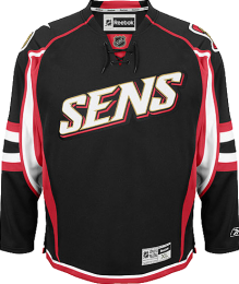
Current 3rd Jersey

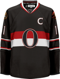
Heritage Jersey
Ever since it appeared in a video on the Ottawa Senators' official web site, Jacob Barrette's Heritage jersey, has been getting a lot of press. Now Icethetics wants to know what you think about it all!
Which jersey do you like better? After introducing it just last year, should the Sens hang onto their new "SENS" jersey? Or should they send it to the scrap heap and go with Jacob's Heritage look? Vote now!
And after you've voted, if you'd like to sign the petition to get the Senators to adopt the Heritage jersey, click here.


Reader Comments (37)
Wow, I'm not a fan of the "O" jersey, but that side by side REALLY makes the "SENS" jersey look ridiculous!
The heritage looks really good. Not that anything wouldn't compared to the boredom that is Sens. Logoless jerseys like that one are just terrible.
This should not be even close. =O= Jersey ftw!
Who the hell voted for the current 3rd? That thing's the most disgusting excuse for a jersey since the Quack Attack or Gordon's Fishermen. At least the "Bolts" isn't black...
I actually am insane and really like the Sens current 3rd. However, the proposed design is even better, and gets my vote.
The heritage is way better that the SENS jersey. Seeing my Senators wear the =O= jersey make me so proud. You totally get a historic and refined vibe with it, dare I compare it to Orignal six? It really has that old time classic feel.
---
Chris, I'm a long time reader, first time poster. I find your site really amazing. I'm currently completing a bachelor's in Graphic Design and I was always interested in sport jersey and logo concepts. It's nice to see someone who has taken these interests to another level by providing this kind of quality content.
Thanks!
The heritage jersey is so much better, it's ridiculous. Btw, I recently ranked all 88 jersey that were used in the NHL last year. The Senators alternate made it to place 81...
I vote for the one that doesn't look like the jacket for a track suit (in other words, the vintage one kicks the new jerseys ass)
if the current third jersey had the =O= as the logo and not SENS then it would be a pretty sweet jersey. i like the design of the current jersey because its unique and in my opinion looks sharp, but the SENS on the front completely ruins it. i would go w/the heritage one. i love how teams go w/the classic looks.
I like the Senators third jersey design but they screwed up along the the "'BOLTS" by giving theses ridiculous nickname wordmarks. They should have used the "O" logo on the current design. I still voted for the "O" though.
That current jersey is a little too flamboyant for my tastes. Not even placing that classy "O" emblem on it would fix it. I did the sensible thing and voted for the heritage jersey.
Putting the "SENS" nickname on the jersey was a mistake. I fear the day when they put player's nicknames on their backs instead of their actual names.
Lace collar would look good on the Heritage jersey.
How the current third got 52 votes (as of now) is beyond me. Traditionalists and modernists and everyone in between knows the heritage design is better. Some people are crazy.
There really isn't any comparison, the heritage jersey isn't perfect but it's a huge improvement.
The heritage by far. A slam-dunk. The "Sens" one is awful, from the ridiculous wordmark to the Bettman-striped madness.
That said, a little bit of tasteful horizontal striping along the bottom of the heritage design would go a long way.
Heritage jersey, no question. Besides being a great design, it highlights the fact that the Ottawa Sens name is older then a some of the original six.
I voted for the heritage. That said; and I might be in the minority for this, but I like the current third enough to see the heritage jersey saved for a Winter Classic type release rather than replacing the current third right away.
I like the heritage shirt, however were they to adopt the laced collor then it would be a really perfect shirt. I don't know the simple V neck, just makes it look like 99% of other shirts. Third Jersey's should be different from regular jerseys
Take the "O" jersey, make the arm stripes the same as the chest stripes, then add a small, single colored waist stripe and THEN you have a great look. The Sens 3rd is an abomination. Too many stripes going too many directions.
The heritage design is much nicer than their current thirds, though I don't think their current thirds are horrible like some Sens fans out there.
Im a huge fan of the current Sens third jersey, not the logo but the jersey, its one of the nicest things Ive ever seen in my life
If they could put the O logo on the Sens current third thats my new favorite jersey by far
The design is just incredible
The other one is to plain IMO
Yeah the arm stripes on the heritage don't look good, they should change them to the chest stripes.
Not even a sens fan, but love it when teams to go back to their roots, EXCEPT for the burger king uniform or the blues ridiculous marching band jersey (think thats what they call it).
I love the colour scheme of the "Sens" jersey...I think it looks very sharp.
Make the heritage jersey the current jersey and keep "SENS" as the third. It's the only sensible thing to do.
I recently began visiting this site again, and I was just browsing through the IceHL section...and I just have to say....There are really some talented people out there. If I had any say in the NHL, a lot of the participators in IceHL would have steady jobs.
heritage - a no brainer.
the 3rd isn't up to beer league standards much less the pros; what the hell were they thinking - did they lose a bet.
I love the heritage =O= but think that they should stick to the original striping patterns from the 20's and 30's much like the Ottawa 67s currently wear. I see the actual wool sweater versions of these sold at retail outlets and think they would rock with an rbk edge cut to them. I would also be curious to see the font change for the heritage jersey to a more block letter pattern much like the sens white jersey worn from 92-07. =O= for 2010!
I do like the "O" better, but I have no problems with the Sens one. I wouldn't have been able to select which one I like better, if there were less stripes on the Sens one.
I think they're both great actually. I would definately vote for the current 3rd if it said senators or ottawa and they arranged it from the top left to bottom right (diagonally i guess) like the rangers or the old colorado 3rd jersey.
I actually really like the current "Sens" jersey, but I think the heritage jersey is way better looking
I hate the 'Sens' logo, but I love the jersey. That jersey with the 'O' logo really doesn't do anything for me. Try and come up with an 'O' logo that will work on the current jersey and you've got my vote.
should put the tie up on the O jersey
If i did not have the SENS jersey i'd vote for the heritage
The "heritage jersey" is a horrible idea, because you'll have players skating around with a big zero as their crest. It's like giving your unborn child a unfortunate name that will make their school days hell. Just because the original Senators had it doesn't make it good, just like using the full barbershop stripping wouldn't be a good idea either.
The Sens one, on the other hand, is a bad one, too. The poll really should have had a "neither" option.
Hockey jerseys, no matter how ugly they appear to be in pictures or on TV, always look better in person. That being said, the Heritage jersey just doesn't do it for me. All I can think of when I see it is Oprah's O Magazine. Enough said.
I think that if the sens really want to go heritage, then they need to add the laces that the current alternate has, the "O" jersey. i have a "Sens" Jersey, and its pretty cool, but the new idea is definitely a cool modern look, that boasts the rich heritage of hockey in Ottawa.