


Olympic First Look: Canada
— ICETHETICS EXCLUSIVE —
We're less than a week away from the official unveiling of Team USA's jerseys for the 2010 Winter Games in Vancouver. And while I haven't yet come across a date for Team Canada's Olympic sweaters, I do have a first look for Icethetics readers.
 Team Canada's 2010 Olympics red sweater
Kind of what a lot of fans were expecting. Classic, old-time hockey feel. Very impressive. Same with the white ones.
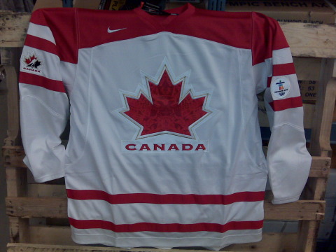 Team Canada's 2010 Olympics white sweater
The red shoulder yoke keeps the sweater from looking washed out. Now you're probably all wondering about that odd-looking crest, wanting a closer view. Check this out.
 Team Canada's 2010 Olympics sweater crest
The subtle nod to the style of the Vancouver Olympics artwork all but makes these jerseys perfect. I'm no Canadian so I want to know what you guys think of these.
By the way, for those not in the loop, the reason this was such a big deal is that with the announcement that national federation logos would no longer be permitted as crests on Olympic jerseys (i.e.: Hockey Canada, USA Hockey, etc.), many wondered what the new sweaters would look like. Now you know.
 Chris
Chris
For those who haven't heard, it's worth pointing out again. Team Canada will officially unveil these jerseys on Monday afternoon. Team USA will do the same. I will, as always, have pictures to share.
By the way, welcome Toronto Star readers! Once you get your fill of the Olympic jerseys, have a look around the site. I'm sure you'll find something you like.

Reader Comments (89)
Well, I wasn't expecting much of a change to happen to such an already-fantastic design, but the First Nation-inspired artwork (is that what that is?) on the crest compliments the overall sweater very nicely.
Can't wait to see the Team USA sweaters!
Something is missing. Maybe with black pants they will look great though.
Can someone explain how they can't use the Hockey Canada logo on the front, but can hide it on the side? Or is this a replica, and it won't be featured on the Olympic jersey?
On second thought, I am sure these will look great when the gold medal is hanging from their necks!
It took me a while staring the the olympic website to figure out the correlation between the center and the olympic art but i do see it now. I like the tie in, though don't know if I am crazy about the look. At first I thought it looked like shiny velvet, which would be pretty cool as well. Other than that it's a great looking sweater.
Wow. That actually looks really cool. If the corporate logos are not allowed, then why is the Hockey Canada logo on the sleeve?
I do love the Native Art in the maple leaf... that is really sweet.
I still say it's beyond stupid that we were forced to change our logo... and why? Because it was successful logo. Sweden's been using their logo for how long, and it's not commercialized over there? Give me a break.
Personally I'm less than impressed with these. Like you say, it's basically what we expected, but as I said at the World Junior Tourney in January, it's more the boring jersey itself that I don't like because they remind me too much of the Leafs' sweaters (only with the shoulder bar and hip stripes). Bring the black accents back for some contrast.
I was really hoping they'd use the retro-styled jerseys that the Junior team wore at their tournament in December (with the diagonal cut maple leaf covering the whole front). Oh well.
Looks pretty cool, could be used across the board for any team sport without having the silhouette of a hockey player.
Thanks for the pics!
LOL those are the Leafs Jersey's the Toronto fans want so badly!
I for one am very pleased with the design. I was dreading that they would drop the awesome jersey design, but they didn't so I am happy... Now to find out where they are going to sell them so I can wear a Nash Jersey to the game I am going to. GO Canada Go.
Beautiful. Love the design in the maple leaf!
I think this is a design that grows on you. It will be fine for the Olympics, I was kind of hoping that they would go with the updated '72 jerseys, I think it would look great in white.
The Hockey Canada logo is still on the elbow though...
I am Canadian and I think they look great. I have never liked the Hockey Canada logo with the blue in it. However, I will not give a unanimous approval until I see the entire uniform, namely the pants. If they are black it will be a disappointment. I have waited years for Canada to eliminate the black from their uniforms. Black does not belong on a Canadian uniform and neither does blue for that matter.
Finally some team Canada Jersey news!! And might I sing to the colour black...
Na, Na, Na, Na!! Na, Na, Na, Na!! Hey, Hey, Hey, Goodbye!!
Overall I'm very impressed with it. The native art inside the maple leaf is a very nice. If you remember back to the beginning of the year, you'll recall the Blood Red Retro Jersey used during the World Juniors. The way blood red is used truly represents "The Blood of Canadians." On the downside...this isn't so much about the jersey, it's more of a complaint to VANOC. Native symbols and art have been used too many times for the 2010 Olympics.
The next thing that bothers me is the logos in between the stripes.
The 2010 logo patch doesn't fit with the jersey. I'd rather see it being on the chest of Canucks players for the duration of the season. But here it just doesn't fit. I wish they made the 2010 logo completely red so it at least matched the jersey.
And the Hockey Canada logo, the logo that caused all this Trouble. How did it even get on the Jersey? IMO, I would have either not had it on there at all, or if I did I would have removed the "Canada" text from it since you can see it clearly on the front.
This is making me mull over which jersey to buy. They're both so nice. Oh well, no question as to which "1" gets his name on the back of it...Luuuuuuuuuuu!!
I currently give it a 4/5.
Looks great! I'll have to get a Burrows one...
Anyone know the whole reason behind not being aloud to have the Corperate Logo which Team Canada has worn in the Olympics since the late 80's early 90's.
I'm not a Canadian but I really like those. At the moment, I think these are the best Olympic jerseys in use.
If corporate logos are not allowed, why is the mark of the beast (swoosh) on the right front chest?
About the reason why the old logo could not be used: the IOC has a rule that forbids the use of the national sport federation logo (in this case, the logo of Hockey Canada) as the team crest. They warned all countries three years ago that they would enforce that rule in the 2010 Olympics. So good-bye old Hockey Canada logo as the main crest of Team Canada.
Someone mentioned the three crowns of the Swedish team: that's not the logo of the hockey federation of Sweden. The logo is the little patch with a ship that you see on their left shoulder. In fact, the national hockey federation patch is allowed anywhere on the jersey as long as it is not the main crest. That's why the Hockey Canada patch is still on the jersey.
BTW, the rule only applies to the Olympics, so Team Canada will probably go back to the Hockey Canada logo as their main crest for other international competitions like the World Championships.
Well i was worried abotu what team canada's logo was going to look like, but i have to say I'm impressed. And I LOVE the Nike jersey, thank god no more Reebok Edge crap.
Bring on Team USA!!
Love the red jersey! Brings back the classic vintage look.
Love the red jersey! Brings back the classic vintage look.
Isn't the Nike Swoosh a Corporate Logo
Looks much better than the terrible nike swift things from last olympics. No black is a huge plus. I'm so happy with the improvements that i won't even bother complaining about the odd designs in the crest.
I am Canadian.
The uniform looks great, but I am one who likes the black. It is a nice accent that helps the red and white stand out more, in my opinion.
If that pants are black it will look really cool. The crest is awesome, they will be sold to First Nations like crazy, which is awesome. It is good that they get a nod.
Does anyone else think that the White jersey is simaliar to the Maple leafs before the reebok era
As a Canadian living in the host city of Vancouver, I love these jerseys!
I was never in favour of having the coporate Hockey Canada logo on the front anyways. This is a nice update. The subtle native design is awesome. You won't see it on TV but the attention to detail is great.
I would be happy if they lost Black in the jersey altogether. Detroit looks great in simple Red and White. I think Canada should do the same. There's not Black in our flag anyways!
Big thumbs up!
First off, thanks man. I've been looking for a sneak peek since Christ was a cowboy. They look f-ing great. I'm getting myself a Spezza or Richards ASAP. Question: Are the names and numbers going to have the same font as the 09 World Championship jerseys?
Thanks again.
Still think it's stupid that they had to be changed, but these are fine. Thanks for the pictures.
Honestly i hated the old logo this is a great upgrade
Why can't they just re-do the maple leaf? I never really have a connection to the corporate logo at all. And I'm absolutely fed up with Canada being associated with black. It looks horrible with our shade of red.
The logo definitely looks better after this re-design, but it's still bad for tv cameras.
like most of VANOC's branding, it begs the question: how much of Team Canada (hockey or otherwise) are First Nations?
Ugh, not a fan at all. They look like a quick fix, like someone was told yesterday that they needed a new logo and they needed to be ready right now. Personaly I loved the hockeyplayer in the maple leaf I thought it looked great, its been around for 3 (or more) olympics and Im dissapointed that we could'nt even use it on our home turf. And Fairplay I agree with you 100% black makes the jerseys look sharper, in fact I like the black so mucch I bought the black alternate they had a few years ago! USE BLACK PANTS PLEASE!
Oh and the Nike logo at the top is probobly allowed because it is the maker of the jersey. If they didnt allow that on the jersey, why wouldnt the nike logo be allowed on track runners shoes, or swimsuits during last years olyimpics.
Are the blood-red third jerseys going to be used at the Olympics too? Loved that colour.
Otherwise, loving the subtle artwork inside the iconic maple leaf.
The whole throw-back look dominating so much of hockey (esp. with 3rd jerseys) is just so cool. And basketball too.
Dig the logo. Red one will be next Jersey Purchase.
i like it, simple but complex, but something seems weird about it. they should just have used that blood red jersey and a white version of it, but i guess this is good too. as long as its Canada, its good enough for me. one thing that concerns me slightly is that the jersey maybe appear to just have font from the TV view. we will see in six months.
i was wondering what they were gonna use, since the olympics said no you can't have an organization's logo as your national logo. and rightly so. it was always a weak logo that had no business hijacking the national hockey logo.
the new one is kinda plain, but inoffensive. i'm sure the native art in the maple leaf looks cool, but you'd only see it if you were getting cross-checked into a guy's midriff.
most of the other countries have stuck with the same basic look. Canada shoulda just stayed with the 72 design. or the 76/81/84/87/91 design.
I would have preferred a flat red maple leaf to mirror the flag, and I could have done without the Hockey Canada logo on the elbow, but all said, they are sharp.
Let's hope that the USA can adhere to some standard of class with their Olympic sweaters. A plain wordmark would be nice....but I will have my reservations until I see the final product.
As a Canadian, I gotta say I'm not that impressed.
I like the white, but the red is, well, just too red. Chris, you say the red yoke keeps the white from looking washed out, but how about the red jersey being nearly completely red, with a red maple leaf, and with red drawings ON the red maple leaf that look like they were done by a grade school student.
If those designs in the leaf are to match the Olympic designs, does that mean they need to change the jersey every 4 years? If the Olympics are held in Sweden will we have a bunch of Viking boats inside the leaf next time?
I was much happier with the old Hockey Canada jerseys.
Great jersey, especially red one!
But cold anybody explain what logo on the crest means? It featuring two-headed beast and a crown and reminds me very much of Russian state logo.
Enough with changing the logo already. Hockey Canada has a huge supply of designs and sweaters. They need to pick one and stick with it. It feels like they change the logo every damn year.
The logo on the front of the sweater is disastrous. An up close look at it shows orcas, moose, some kind of Thunderbird, what looks like some other kind of fish and shark fins, and some beavers. Is this the logo for a zoo? Where's the Canadian Horse - an actual official Canadian symbol and breed of horse that the Mounties ride? May as well randomly add more animals - what about the Canada Lynx? Canada Goose? Wolf? Loon? Looks like the Hockey Canada logo is still on the jersey too - which contradicts the whole reason for changing the uniforms in the first place. Way too busy a design, with way too many symbols jumbled together - most of which are not official Canadian symbols.
as a canadian in vancouver this is great news!!! gotta get me onea these babys wow! but... to bad i cant make it to any games :( well theres always broadcast
Looks like a cheep walmart rip off. I agree with Pedro the black is good.
The Jersey's are pretty sick.
Both great looking. The design inside the leaf is gorgeous as well.
Here is my question: They said no logos, but isn't this still a logo, technically?
Article made the sportsnet web site. Biggest one up here along with tsn.ca
Rocot just beat me to it...
Sportsnet link