USA Unveils Olympic Jerseys
 Friday · Aug 21 · 2009 | 3:38 PM PDT
  31 Comments
 ...four days ago. Better late than never, right? I had the hardest time this week both finding decent pictures of Team USA's 2010 Winter Games sweaters as well as time to post what I could track down. It's now Friday — four days after the actual unveiling of the sweaters to the media — and at last I have a post for you.
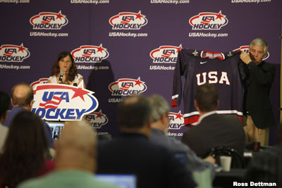
USA Hockey unveiled three jerseys — a blue and two whites.Let's start with the announcement of the new jersey on USA Hockey's official web site, which includes this photo from the press conference.
 Team USA Olympic jersey unveiling
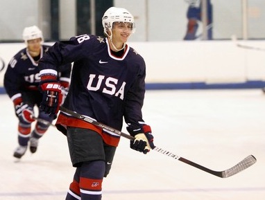
Unlike Hockey Canada, the US doesn't seem that interested in providing us with any really great pictures of the jersey. But I guess that's probably because most Americans don't care. Anyway, it looks better on the ice than the way that guy's holding it up.
 Patrick Kane rocks the new blues
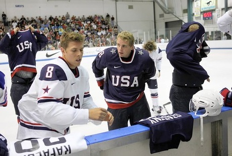
A little dull, but what do you want? It's the Olympics. Short of revisiting the 1980 sweater design — and there really isn't reason enough to right now — there's not much in the arsenal that will still be recognizable. Here's the white one.
 Trying on the new jerseys at the bench
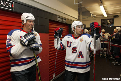
Hoping a better picture will turn up. The third jersey is another white sweater, this one modeled after the one worn at the 1960 Olympics where the U.S. won their first gold medal in men's hockey.
 The Ryans before hitting the ice in the thirds
And what sort of Lightning fan would I be if I didn't use a picture of Ryan Malone? The other guy is Ryan Callahan.
If you'd like more of an in-depth analysis of these jerseys, might I suggest Puck Daddy? Should I find any new/better pictures, I'll add them to this post. In the meantime, feel free to share your thoughts below.
Finally, thanks to everyone who sent in links and pictures all week. You are all awesome!


Reader Comments (31)
What is the jersey that the player to the far right is saying in the third picture?
since when did the rangers get a third jersey with USA on it
Americans care, it's just that there isn't any media support. ESPN hardly even mentions hockey anymore.
the blue sweater is so frigging elegant. Way better than Team Canada's.
Wearing* not saying. It has no markings or patches that I can see or make out.
I'm surprised that there still has been no close-up picture of the "We the People" printing that is supposed to be on parts of this jersey. Apparently its the same printing that appeared on Team USA's basketball jerseys.
Max
I believe it is just the USA practice jersey that the player is taking off. As you say, it looks pretty plain.
Oh no, what a horrible disappointment. With such awesome (and dare I say AMERICAN) type designs featured by the Washington Capitals and New York Rangers, THIS was the best USA Hockey could do?
This whole "no corporate logos" thing really is complete garbage. I liked Canada's original leaf, and moreso the USA swish style logo. It was catchy, sleek, and really just awesome. This... its not necessarily bad, but its so boring!
I am most excited about the third jersey. I actually already own it (or at least the first version of it), since it has been around for at least a year on IceJerseys. And people need to move past the fact that it has similar attributes of the Rangers' away jersey. I mean, that's going to happen when you have the same color scheme. Though they are similar, there are significant differences (though the original version from last year had more obvious differences), and it actually looks better than the Rangers jersey.
What's with the collar on those primary jerseys? It looks like a blue wife-beater with "USA" across the front.
I really love everything about Canada's jersey. I especially appreciate the presentation where there was a photographer assigned to shoot the jersey in an artistic manner. Very classy.
Thats what I thought, I was just making sure. That retro jersey is sweet though!
I really like the primary jerseys. I think they look really sharp and bold. The blue shoulder cap thing on the whites adds a classic feel. I really hope the “Nike We the People Graphic” thing doesn't ruin them. I get the whole tribute to the 1960 team but the thirds are kinda "ehh".
@ Johnny Griswald:
It seems the collar is squared off somewhat so it forms a "U" instead of a "V".
70% horrible, 30% nice. It wasn't what I expected, really.
The USA got it right with these jerseys.
I'm rather underwhelmed by them. If there's some subtle details on them you can't make out at any distance or be able to see on TV, what's the point of having them? Personally, I like the 1960 throwback and just wish they would have gone with that one as the primary and made a blue version for the road jersey. Speaking of blue, why is the blue on the road jersey so dark? That's not the shade used on the flag. Compare it to the shoulders on the 1960 jersey and you can see the difference.
Meh I dont like them. Does anybody else see an eery resemblance to the rangers in the third jersey or is it just me.
The third looks like something Callahan would wear during the regular season. Go Rangers!
I really like the white regular jersey. It just looks really sharp. I think its the blue on the shoulders.
For the third, they should have made a red jersey. That would have been great.
I wish the 3rd jersey was used as the primary white on and then a color reversal of the 3rd was used as the blue sweater...but that's just me.
Hey, at least they didn't use any black...
Besides the We the People graphic on parts of the sweater, isn't it just exactly the same as their World Championship Jerseys?
The whites are nice, the blue is ZZZZZZZzzzzzzzzzzzzzzzzzzzzzzzzzzzzzzzzz.
Not bad at all. I'm not sure about the blue bit on the shoulders of the white jersey, I'd like to see more angles of it. The blue jersey looks nice and the retro is fine.
The blue shoulders part on the white look like something you see in the NHL.. Yuk.. More over... American don't care?! Blasphemy! We do care! Good god... I hated all three of them.. Very disappointing.. I was expecting something from the same design department who did those awesome Washington Capitols jerseys.. =/
The shoulder patches are the most interesting part of the jersey. The "flaming stars" on the blue jerseys look pretty spiffy in the player mugshots on Getty Images.
Looking good Team USA... much better than 2006, when i almost cried.
I like the primary jerseys. The third is a classic look but still bears too much resemblance to the Rangers. Not that that is a bad thing. The Rangers are nice. I like the collegiate look.
I can't tell, are they wearing Black pants or Navy Blue? I hope they would go with Navy as that would match better. Just like Canada should go with Red pants instead of Black. :)
@ Dandy
It looks like they're wearing black pants but I'd expect them to have navy shells for the actual games; they probably just didn't have them yet.
There alright.
I am still pissed that the IOC is blocking our Fed logo on the sweaters.
USA Hockey posted more photos of the jerseys ... http://www.usahockey.com/Template_Usahockey.aspx?NAV=TU_01_01_05&id=273600