


Canucks Unveil New/Old Sweater!
 60 Comments
;) Canucks unveil throwback sweaterThe Vancouver Canucks unveiled their new throwback jersey Wednesday night at the Summer Summit event for season ticket holders. The sweater is part of the team's 40th anniversary celebration and will be worn five times throughout the 2010-11 season.
Canucks unveil throwback sweaterThe Vancouver Canucks unveiled their new throwback jersey Wednesday night at the Summer Summit event for season ticket holders. The sweater is part of the team's 40th anniversary celebration and will be worn five times throughout the 2010-11 season.
Former Canuck Orland Kurtenbach was on hand at the event to model the new sweater in front of fans. It's a replica of the original sweater worn by the Canucks during their inaugural season in 1970.
It had been widely rumored that the Canucks would have a specialty sweater to celebrate the 40-year milestone. We finally got confirmation tonight. Plus, it was also announced that on Dec. 11, the team will retire Markus Naslund's No. 19 sweater.
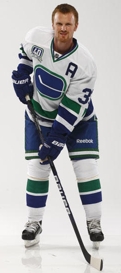 Sedin sports retro lookThe Canucks also used the event to officially unveil their 40th anniversary logo, which now appears in the banner of the team's website. An anniversary patch will be worn on all jerseys throughout the season.
A few things to note about the new jersey, as modeled by league MVP Henrik Sedin (right):
- Original version of stick-in-rink logo is taller than it would later be
- The captain and alternate captain's letters are unusually large
- Check out the white V inside the sleeve stripes
- The original 1970 sweaters had no nameplates and nor do those used in this photo shoot but surnames are now required as part of NHL uniform regulations
The new sweater will make its on-ice debut on October 9 when the Canucks host the Los Angeles Kings exactly 40 years to the day from that inaugural game in 1970. Though they have yet to officially confirm it, reports say the Kings will also be donning retro threads for that game.
The Canucks currently have a blue alternate sweater with the updated stick-in-rink logo. I think this retro look makes for a nice balance. There has been no word on whether the current home and road jerseys will be replaced in the future, though rumors suggest it could happen as early as fall 2011.
You can learn more about the Canucks' 40th anniversary plans by clicking here. And that's all you really need to know. I'll leave you with this shot of Kurtenbach and Sedin. Now tell us what you think of this classic sweater.
;)


Reader Comments (60)
Why don't they just wear these full time? If the sabres can kill the slug, the canucks can kill shamu.
That looks pretty sweet!!! I will not be surprised at all if that becomes the permanent road jersey after next season. In fact it would be a travesty if that doesn't happen.
Gotta love the V on the sleeves! Good job for Naslund getting his number retired!
Really liking the "V" on the sleeve. Very classy.
this sweater would be awesome if they moved the "v" down to the cuff put the stick and rink on the shoulder and put the full on skating johnny canuck on the chest that would be an awesome look and then don't change a thing for 50 years for the sake of everyones sanity.
i really like these jerseys...i hope for the sake of all canucks fans that they ditch the orca and go with this and a blue version of it...or modernize this one like the current 3rd jersey...much like the sabres are doing :) ....also the "V" on the sleeve is a very nice touch
ditch the orca now
Bring back the rink stick jerseys full time and strategically rotate johnny Canuck thirds every few seasons.
Boom
Canucks' identity crisis solved.
Looking at the last pic of Henrik. Are they going to wear them No-name-on-back in an NHL game? That would look awesome, but i didn't think the NHL would allow it.
I hate the Canucks, but I have to admit: that is one of the best sweaters I've ever seen. They've done a great job of making it look both modern and timeless.
they likely wont have a no-name jersey night. i just hope it isn't in that dumb agency font.
Love it.
My VERY FAVOURITE version of the two vintage Stick 'n Rink uniforms. The crest looks more bold and the two thick stripes with the Vs on the arms really stand out. I also love the pants with the trimming looped around the legs. Very, very classy.
Like EL had mentioned, ditch the orca ASAP. However, I still stand firm that Johnny Canuck should be the primary crest, but keep this original beauty as either a new third or a heritage jersey for 5 games per season.
I wish the Canucks would have went with a pseudo-retro jersey like Buffalo is doing, but it's nice that they didn't just bring out the other stick n rink jerseys that they've worn for alternates in recent history.
Love them. Almost makes my 2004 Vintage Sweater with Luongo's # on it a valid jersey. (since he never played in the White Unis) I wonder what teams will play on Vintage nights. The night they honour Kurtenbach (against the Aves) sounds like a lock for this. Also glad to hear Naslund is going up with Linden and Smyl in December.
Anyways onto my Rating...
Pros:
-Green included in the Collar. (I want this on the current primaries and the third)
-Glad to see the 'V' on the Stripes make its return.
-Love the Pants.
Cons:
-The front of the jersey looks crowded. (the 40th logo should be a shoulder patch)
-The arms have too many stripes IMO due to the blue on the end of them.
Overall Rating: I would love to see elements of this Jersey incorporated with current ones when the Canucks decide to go with the Stick-In-Rink full time. 5 Out Of 5.
Looking at the pictures, I almost wish they could play a game without helmets and nameplates for a real vintage feel. In the 40th Anniversary intro video there was a clip of a white 70s Canuck Jersey with a blue nameplate. I wonder if they would pull a Flyers?
I have a Mitchell and Ness jersey of this (it has Rosaire Paiement's #15 on it). These jerseys are kick-ass!
And I agree, they should wear these jerseys full-time. Retro is in, y'all!
Were the Captain and Alternate letters that big on the original jerseys? Or is it just overcompensating to balance with the 40th Anniversary logo? That's the only "qualm" I've got on this jersey. Aside from that, it's a beaut.
Yes the Canucks should definitely switch to this exact version of the Stick In Rink Jersey as their full-time sweaters (with the blue version as the home).
I agree with Connor Hanley in completely ditching the Agency font face used on the current uniforms. It totally ruins the classic look. The "normal" block font seen here works much better for the blue and green.
Oh and of course, use the Johnny Canuck V logo, seen on the shoulders of the current third, as the new primary logo on the third jersey!
the pants are awesome, love seeing stripes again...
Wow! like they say in the McDonalds comercials "I'm lovin it". It's a real sharp looking jersey and the league MVP looks great in it. I really can't wait until this jersey is available at retail stores. Happy 40th Canucks, the 2010-11 season is gonna be a great one.
It's obvious that slowly but surely the NHL is finally realizing that retro is in and the Reebok Edgeification is out. All you had to do was listen to the crowd in Los Angeles at the Draft to realize that retro is hip. When Derek Forbert put on that purple/gold retro jersey the crowd went nuts. Most fans hate the modern streamlined, dull/boring color designs. Especially in an era of HD television, the NHL needs bold/colorful uniforms that jump out at you and grab your attention even if you are not a fan. This is why I believe we need more blue, yellow/gold, green, red and orange jerseys in the NHL. The NHL also needs to allow teams to wear solid colors against each other. Imagine the Kings in a gold jersey playing against the Oilers in blue or the Bruins in gold playing against the Flyers in orange. The NHL's marketing geniousess should have realized by now that grabbing the attention of the casual fan anyway/anyhow is the way to generate interest. Going wtih bold/colorful uniforms is the way to go. While I like the Canucks retro look, the colors are boring and a return to the old black/orange/red/gold would really be a bold statement.
Perfect. This is what a hockey jersey should look like.
Pay attention, Blues.
Those Pants <3.
I despise this jersey - I think the stick in rink logo is one of the most boring logos in the league. Does beat the Orca though.
Bring back the plate of spaghetti jerseys and I'll be pleased!
oh and Chris, when you say they will "return" Naslunds jersey, I assume you mean they will retire it?
Awesome! I'll be ordering my 40th Anniversary Hamhuis jersey as soon as I can!
These are gorgeous. They could have a great, consistent set (just add a green)
I really don't like the agency font numbers but it looks great for everything else. They should just mix agency letters with college numbers or come up with a more angular hybrid.
As for the Canucks uniforms I still think the holy grail is yet to come. I think it will be in the form of a throwback uniform for an outdoor game. By that time the team will have run out of sweaters to market so they'll have to go back to the WHL for ideas. They already sell those black plate on a skate uniforms so it makes no sense to rehash those. The Canucks are committed to blue and green now and there is only so much they can do with that. A WHL Canuck throwback is inevitable in my book.
Make this their road, and fix the alternate so it has this logo, then make it the home.
No surprise. Nothing to interesting about these. That "V" on the arms will make the striping look very messy on t.v. or just from a distance in GM Place.
Boring, nothing new, but Canucks fans like it, so thats what matters.
The V on the sleeve makes the jersey; it should be a permanent addition! The large numbers are great, too. The last time that I can recall that got to go "namebarless" was the Leafs in 1996 with their 1931 jerseys and 14" numbers! I really hope they'd make an exception for the Canucks, too.
As for the Kings, I sure hope the go with Purple versus Yellow for their retro (the Draft jersey suggests otherwise); the Kings wore the yellow one a few years ago as their Retro jersey. It's time for the Purple to make a comeback!
I like it. I much prefer this than their current road jerseys.
As a Canuck fan, I'm having a hard tiem deciding what jersey I'd like to see. A few things I do know:
- Keep the colour scheme - it's perfect.
- Ditch the Orca
- Consider a green jersey
- Stick in the rink (old and new), and Johnny Canuck (Full bodied and V-head) are both good
The Canucks would make a killing if they swapped jersey colours and logos every few eyars, and frankly, I'd be cool with it, as long as they all stayed int he same general theme. I think the Canucks get hard time for the changes of colour schemes more than anything - expecially how drastic it's been (Blue, Green, and White, to Red, Orange, Yellow, Black, and White, to Blue, Maroon, Silver, and White, and now back to Blue, Green and White.)
Long story short - nice.
They ought to just go with this for the road and the corresponding blue version for the home. Then come out with a green alternate with the Johnny Canuck V logo and unique striping compared to these. I'd buy all three!
I like them a lot. The only issue I have is no names on the back of the jersey, but I guess that goes along with the retro feel.
I love it! kinda wish they would have went to the 94' jersey but it is still one of there best jereys yet. ditch the orca and use this jeresy and the blue one like it that they use for an alternate right now. also great news for nazzy, he was a great lplayer in vancouver. GO NUCKS!!!
There are so many things right with this jersey.
And I'm a Calgary boy.
i realy hope they dont make them out names on the jerseys
looking at the full uniform the socks are a little lacking how bout a 'v' on the front of the socks to mirror the sleeves.
Very sharp. If I didn't hate the Canucks, I'd buy one. Why are they only wearing them 5 times? Seems a shame to waste them.
absolutely love this sweater!! I want this come October! can we ditch the orca now?!
Great looking jersey...this is what I think of when I remember games as a kid when the Nucks would come in to play the Flames (Atlanta, that is...)
Dave - like the idea about both teams wearing the "home" or colored jersey in a game. But that is most likely logistically impossible. Teams would have to travel with two sets of everything. I am sure there are equipment managers out there who would fight to the end to keep this from happening.
have to say, i really like this one. and the v on the sleeve is great. and i agree with everyone, kill the orca! imo the current home and away canucks jerseys are the ugliest. if they go back to the stick, i think the whole league would rejoice.
i get the whole "throw back" thing, but those numbers are hideous. what font is that? collegegarbage
One thing I find interesting is that Reebok wordmark on the pants. That might become more and more prevalent - though the 'Reebox' is still on the back by the collar, but for how long?
I like them, but they look a little off. The striping and colours look fan-tastic, but the logo looks a little bland and boring compared to the boldness of the rest of the jersey. Also the A and C and the numbers are too big...whats up with that? I'd love to see these as a permanent road jersey but with the new rink and stick logo and smaller numbers and letters.
The "A" and "C" are original to the 1970-72 style. I think they are a nice touch. The number font isn't the same as many of the 1970 jerseys I've seen but they are close to some of the 1971-72 jerseys. The fonts back then weren't standardized so there is a ton of variation.
As far as the name on back, I'm sure the Canucks got it approved by the league otherwise they wouldn't be announcing that they wouldn't have names. The Maple Leafs wore jerseys in 1996-97 that didn't have names. Im sure the league wouldn't allow it on a full time basis but they are only wearing these for four games.
The stick in a rink is a massive shame. I'll take it as an alternate or a 40th, but otherwise it's a graphic design fail. The current jersey is really solid, and to change again is another mistake in a long line of Canucks jersey mistakes.
Soooo... pretty much expect it to happen.
This uniform and logo doesn't do anything for me. Nothing about the stick-in-rink says "Vancouver" or "Canucks", and the color scheme is nothing special. That could be any team playing in any city in the league. I've always thought the Johnny Canuck logo is the most representative one they've got but they won't put it on the front of a jersey.
40 years of time passage does not make a bland and uninspiring logo & jersey pair "classic". It's still just bland and uninspiring. Little wonder the Canucks keep overhauling their look, because they've never found something that really says "Vancouver Canucks" (without explicitly writing "Vancouver" or "Canucks" out, that is!).
I personally don't want this to become the full time away jersey, but i do like it. i would like it a bit more if it was the new modern retro logo on their current alternate jersey and then just have all 4 jerseys in the rotation i would like that alot cause i love the orca always have always will but i respect the heritage and would like to have a piece of that too.
Awesome. I agree with previous comments - Reebokified, piping jerseys are out - Bring back the Classic look!!!
Nicest Canucks jersey in Canucks history. Stocked for this to come out, going to get a Rypien 37.
These are great. The font is the same as the original 1970 jerseys. I love this jersey, but can't stand the "updated" stick in rink that was their third jersey last year. If it ain't broke don't frack it up!