Chicago Express Joins ECHL
 Tuesday · Sep 21 · 2010 | 1:50 PM PDT
  13 Comments
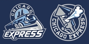
  Chicago Express logos unveiledToday, the ECHL's newest franchise unveiled its name, colors and logos. The Chicago Express will begin play in Hoffman Estates, Ill. in the 2011-12 season.
The name was selected from the "Name Your Hockey Team" contest held by the organization this summer. The reason was explained in an article on the team's website:
Chicago is the most important railroad center in North America. More lines of track radiate in more directions from Chicago than from any other city. Chicago has long been the most important interchange point for freight traffic between the nation’s major railroads and it is the hub of Amtrak. Chicago ranks second (next to New York City) in terms of volume of commuter rail passengers each day.
I like the colors. The logos are about what we've come to expect from minor league hockey teams. They get the job done. But here's what I noticed: The designer used the Icethetics font for the word EXPRESS in the primary logo! It's called Continuum. I think that's kind of funny.
Anyway, there's an article about the name contest winner on their website as well. His name is Marc Johnson and he is stoked, as you would imagine. No jerseys have been unveiled yet and the team won't actually begin play until next season.
And by the way, based on the reaction to yesterday's renaming of the AHL's Hartford Wolf Pack to Connecticut Whale — this is going to be fun. Comment away.


Reader Comments (13)
thats not bad at all. u love the color sceme
The angry face in the train is awesome. Nice and subtle.
Great identity.
Not bad. Kinda reminds me of the minor league baseball's Syracuse Chiefs, though.
Pretty good for a minor-league team.
Pretty cool... But there's a youth team in Park Ridge (a suburb of chicago) called the express too. I think the "enferno" would have been cooler
Another Flynnagain design by the looks of it. The WHL, OHL, and ECHL are eventually going to look the same across the board. No design diversity.
Now, I don't know much about trains, and I admit that as a whole, this is a clean looking logo set.
However.. I can't shake the feeling that the Express needs to decide if its either an electric or steam engine.
Just my two cents.
I was honestly pulling for the Blizzard, but the more I hear the more I'm okay with the Express. And the logo's pretty good, too.
Also, the plural of Express is Expresses, and that just sounds dumb, so at least they have that excuse to stay with the singular. As opposed to the should've-been Whale®s. :D
I submitted the Chicago Brigade... Figured a fire truck inspired logo set would look cool
Love the fact that the train is on a skate blade rather than something simple like a railroad track. Great logo and color scheme overall for a minor league team
I picked this name from the start.
The color scheme is fantastic, and the name does play well to Chicago's railroad heritage...I hope they do well!!
I can't help but feel the circle in the background is wildly out of proportion. The whole logo looks out of balance, though I think the individual parts of it are well designed. Still sad my late submission Chicago Zephyrs didn't make any ground. Reference to this train, the Pioneer Zephyr, located in Chicago: http://en.wikipedia.org/wiki/Pioneer_Zephyr