


Amerks Unveil Third Jersey
 15 Comments
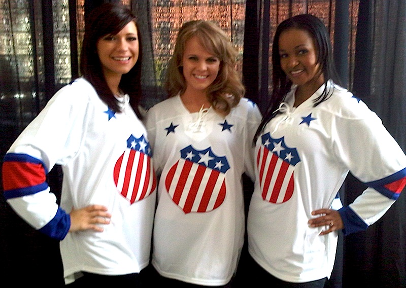 Americans unveil new third jerseyThe AHL's Rochester Americans unveiled a new third jersey at a press conference on Tuesday.
The throwback sweater is a replica of what the Amerks wore back in the 1960s. Team president Lewis Staats called it a "symbol of returning to [the team's] roots."
Members of the American Spirit Dance Team were on hand to model the new jerseys. I like how minor league teams always use the pretty girls on staff to launch a new sweater. Almost guarantees people will look at it.
You can find more information about the new alternate uniform in an article posted yesterday on the team's website — it includes a picture of a bunch of dudes holding up the jersey. Thanks to all the great Icethetics readers who sent this in.
Pirates Prepare for Pink in October

 Pirates unveil special pink jerseyThe AHL's Portland Pirates will wear a special pink sweater for Breast Cancer Awareness Night.
This image (right) comes directly from the splash page of the Pirates' official website, which indicates the jersey will be worn on Oct. 23.
It's actually a really neat design that borrows both from the team's history as well as its NHL affiliate, the Buffalo Sabres and their new uniforms.
The jersey design itself is almost an exact replica of the Sabres' new home sweater with some colors replaced — blue changed to black, gold to pink. But the coolest part may be the crest, which is a fusion of the vintage Pirates and Sabres logos. Replacing the white buffalo above the crossed sabers is the primary mark the Pirates wore from 1990 to 2000.
We've seen some bad breast cancer night jerseys on this blog, so this one is kind of refreshing. I have to applaud the designer for a job well done. And thanks to everyone for emailing it in.
That's all I've really got time for today. But just so you know, there's been a lot going on that just hasn't made it to the blog yet — despite these daily posts lately. So I recommend following @icethetics on Twitter, or at least keeping an eye on the Twitter feed in the sidebar for frequent updates of jersey/logo news.

Reader Comments (15)
Ugh, those Rochester jerseys look like something those chicks would wear to bed. I thought the Amerks learned from the their failed Edge-ification designs. These uniforms need horizontal striping at the bottom in the worst way. The Red Deer Rebels unveiled their thirds today and they are pretty nice, but of course it lacks the horizontal striping on the bottom as well.
Amerks should've just kept the stars and stripes jersey.
I like the Amerks jersey. Don Cherry would approve.
Can we get some more information on the girl in the middle?
Can't say I'm particularily fond of either, but at least they aren't as bad as anything that's come out of Syracuse lately.
The pink and black I'm ok with because of the cause, but that logo just looks sloppy.
Throw some waist stripes on the Amerks and you've got a winner, but as it is Dave is bang on, they look like a girl borrowed her boyfriends shirt for bed.
Amerks look nice. A little too simple, but a great crest and love any star spangled uniform.
Would someone please cure breast cancer already? I'm sick of this pink marketing gimmick disguised as caring.
Why are people so crazy about horizontal striping, like does every jersey have to be of the same template for you to consider it a success or not?
Who designed the pirate? An elementary school contest.
I like those Rochester jerseys a lot. Unlike Dave I actually like jerseys without the horizontal stripes (like last years leafs). I understand I am in the minority on that though and it isn't like horizontal stripes bother me (vertical stripes do though).
I actually like the Amerks new jersey...I'm a particular fan of a big logo patch on the front, much as I am a particular fan of any female as good-looking as the ones they got to show them off at the press conference. :-D
I don't really have an opinion one way or the other about the Portland unis, as long as they don't paint the ice pink too. I have seen way too many rinks absolutely ruined by trying to color them a certain way, and it inevitably comes out looking 100% hideous. The Iowa Chops used to do it and it looked god-awful...and then there was Livestrong night when they painted the ice yellow. It looked like the whole team had lost it and took a giant wizz on the ice before the game. The pink accents are fine, but please leave the playing surface alone.
The American's new Third jersey (Being White is fine since home teams wear white in the AHL) is alright, its a bit too plain, but its not ugly at all compared to many we have seen. I think the best white 3rd jersey ive ever seen besides the Leafs would go to the Rangers, when they brought a white version of Lady Liberty.
The Special jersey the Pirates are wearing as pretty fucking awesome. As long as its one night only.
I wholeheartedly agree about the ice coloring, Austin. It never looks good.
And I know a number of women who actually dislike, detest, or downright hate the color pink, and are sick of having it forced down their throats like that.
That pirate logo makes Buffalo cry.
that Rochester Americans throwback looks sweat, I love it.
so the onslaught of pink jerseys begins!
I wholeheartedly agree about the ice colouring, amerks doesn't look that nice. . they should learn from their past mistakes... Am I right?