


Isles 3rd Jersey Leaks Again
 78 Comments
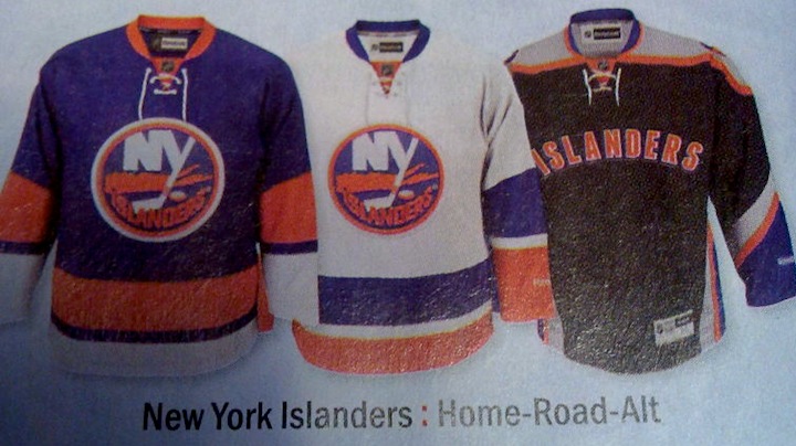
 What's been called the worst hockey jersey design in history has become the NHL's worst kept secret of the year. And now there's another leak of the New York Islanders' forthcoming third jersey.
This time it's a photo I can actually post on the blog. According to Glen Cuthbert, who tweeted it tonight, it comes to us by way of River City Sports. Looks like a page from the retailer's catalog — and it probably shouldn't feature that unreleased jersey quite yet.
Over the summer, I posted a image that depicted the sweater's design. It was based on a photo from Reebok — the same photo seen on the catalog page above. I was not permitted to put that particular photo on the blog but I was able to provide my own graphic rendition of it.
It's believed the Islanders will officially unveil the jersey in late November. Every year since third jerseys came back, there has always been a team or two that holds out until Thanksgiving (US) or Black Friday for the big reveal — obviously hoping to capitalize on the Christmas season.
As for the design itself. It's been widely criticized primarily by Islanders fans. As you'd expect. It has black and grey in it. (Perhaps they're just using those colors to maintain balance in the universe since the Lightning dropped them.) It's very much untraditional and that tends not to sit well with Icethetics readers.
Now the opinion part — which you're highly likely to disagree with. So stop reading if you're not interested in an alternative perspective. Fair warning.
I like it. Not the jersey design, that's pretty hideous. But I like that a team like the Islanders is still willing to experiment with their uniforms even after all the trouble that's gotten them into in the past. Now that they've perfected their home and road uniforms, why not use the third jersey for which it was originally intended? Showcasing an alternate color.
If it doesn't catch on, so what? Try it for a year or two and surrender it to the pages of history. Wouldn't be the first time. Won't be the last. Yeah, maybe black was the wrong way to go, but maybe it's just bold enough to gain traction with the nontraditional fans and build up a struggling market. Or maybe I don't know anything at all. Wouldn't surprise me.
Clearly the Islanders are no longer interested in catering to the traditionalists. And good for them! They've done that for the past few years and it made everyone very happy. Myself included. Now why is it so wrong that they want to try something new? The world doesn't move forward without things trying new things.
So... I like it. A lot. I know this won't be a popular stance, but when have I ever spoken for the majority? But rather than going on, I'll just leave you with another look at the Isles' newest ugly sweater.


Reader Comments (78)
I don't like it. It looks far too much like some crap product they'd sell on NHL.com, like one of the baseball jerseys or something. It's a shame, too, because the Isles have great sweaters otherwise.
NOOOOO. Oh my God, it- it just can't be...
Is that the same template as the Ducks alternate? Either way, I don't like it!
Great blog Chris, good reasonings. Way to take a glass half-full approach haha. Of course, we haven't seen these monstrosities on the ice yet, maybe they wont look so terrible live and in action. I'm probably wrong, but you never know! For now, I can undoubtedly see why Isles fans are upset.
I've started to agree with you more and more lately.
Go try it, I don't like the grey, but whatever.
Actually, I really liked the original Edge uniforms for the Isles. They didn't have a crazy striping pattern (they were all horizontal), they had a hem-stripe, and the orange sleeves really stood out. Other than being a slightly darker shade, it really had everything traditionalists like.
I totally agree. Not a great jersey, but at least it's truely "Alternate". Kudos for at least trying to do something outside the box, Islanders.
YUCK!! I have nothing against the "concept" of trying out a new design and alternate colors on a third jersey. But I have EVERYTHING against one that looks like THIS!! Just a horrible, horrible representation of a once-proud hockey dynasty. No creativity whatsoever, and the color scheme is absolutely offensive to the eyes. And like one other reader of this blog suggested, the basketball-like front numbers (a la Stars) are also a possibility, which will only further disgust me. But am I surprised? Not at all-- We're talking about an organization that FINALLY brought back our classic jerseys, BUT FORGOT TO GET THE STOCKINGS RIGHT!! As my son would say.. "FACE-PALM"!
It looks like something the NY Knicks rejected in the late 90's. I hope they wear it one year and just dump it. I was hoping for a giant orange creation of some sort. Black is a decade late...
It's sort of similar to the New York Mets uni's.
That is one ugly jersey
Just F****ing UGLY
yep, its a great jersey.........if they swapped the grey for white & got rid of the islanders wordmark & put ANYthing else on the front!!! there's good experimentation in designs & then there's this......sorry, that's just awful, 0 /10, FAIL.
Why are the pics of the home and road authentic jerseys, but the alternate is a replica? Is Reebok not releasing authentics for this season's new sweaters?
Just replace the text on the front with the circle crest, and replace the shoulder patches with either the 40th anniversary patch or the four hashmarks, and you've got at least something halfway decent.
Or we could revive the fisherman...any takers?
I actually like the colours. Yea yea, I know, it's black. But I think it actually looks pretty slick and it's different. The only thing I don't care for is the "ISLANDERS" across the chest. I think it would look unreal with the lighthouse logo on the front. I think the jersey has received far to much flack before seeing the on ice product.
This is so awful and unfair for the fans.
3rd jersey = woof, buzzes girlfriend.
I hate it because it could have/should have been SO MUCH BETTER. The Isles have a lot of history to work with, and some sort of throwback-vintage script with an image of Long Island on a grey sweater with arm stripes and the like would have been a welcome addition. I just think it's boring and unoriginal and a total waste. It's not as bad as the Ducks alternate though, so it definitely won't be the worst in the league.
Is it me or is that a recolored Anaheim alternate?
I'd be ok with the black if it didn't have the crazy stripping. Lose the underarm and overarm(?) stripping and it would be better. Hell, lose it on top too and go incredibly drastic and unique. Murder it out.
The color scheme unto itself isn't terrible, but Islanders printed on the front kills it. Teams need to stick with putting logos on the front of the jersey, that's what they were made for.
I have to agree with you. Sure, vintage jerseys are great, and everyone loves the Original 6, but a lot of icethetics commenters seem too wedded to tradition. It's 2011 and teams shouldn't be afraid to incorporate some modern design. I like that this jersey isn't generic. It's bad , don't get me wrong, but it's still just a third jersey, so who cares? Glad to see some originality.
To be perfectly honest, this design isn't inherently BAD (it looks somewhat like a goat-lord era Sabres jersey), but the question that pops up is "Why Black for Black's Sake?!" Seriously, why? Do the Islanders NEED to have a black alternate? Does EVERY team in all of sports really NEED a black alt?
And also why is there grey again?
This is horrible. Your point about trying new things is fine, but I'm not sure how much "try" went into the development of this sweater. Perhaps the try came from a class of LI third graders??
NYI: Ok class, pick a color.
Little Suzy Islander: Black.
NYI: Got it. Now what should we put on the front?
Joey Nassau: "Islanders"
NYI: Genius. That's a wrap. Tell Santa you want one under the tree.
Will anyone really buy this thing? If so....ouch.
Lol, it's SOOOO bad! It's so bad that I can't help but laugh, actually. There is no way this sweater was designed because people thought it really looked good... There is absolutely NO WAY! I think management came up with an idea to design a new jersey knowing there are people out there who would buy anything, only with a plan to turn around and get rid of it in a couple seasons and come out with yet another one. A cleaver and quick cash grab for a financially hurt team.
I've already wondered about this with that first wave of horrid edge jerseys... Was that just a ploy to suck money from devoted fans to help make back $$$ lost during the lockout a couple years prior? Can't say for sure... But most of you have to agree that many of those sweater designs didn't make a whole lot of sense.
What bothers me the most about this, is that sometime ago, the Islanders posted a question on their facebook page asking NYI fans what they wanted in a 3rd jersey. Nearly 85% of the responses were "No Black alternates." And then they go ahead and let their 9 year olds design this monstrosity.
It's as though they looked at NY Mets jersey sale figures, saw that their black jersey sells & decided to go with it. Problem is, most of the Mets loyal fanbase doesn't like the black either. It's the casuals who thinks it looks decent with jeans that bought them. In theory that would work on Long Island too. Problem is, there's no such thing as a casual Islanders fan. Since the Islanders last played in the Stanley Cup Finals (83-84 loss to Oilers) they have only been past the first round 4 times. That much mediocrity, combined with all the other nonsense & the casual Islanders fan has become extinct.
The most glowing review I have seen on these jerseys from Islanders fans is something along the lines of "It's not that bad guys." Shame on any Islanders fan who buys one.
I think it would look better if the black and blue colours were switched, although that would give then a second blue jersey. The blue is more an "Islanders" colour and the black would be an accent colour. If they were to wear it with black pants, helmet and gloves, it would give them a unique and different look.
This jersey could have been salvaged if they would've put the anniversary lighthouse logo on the front. The "Islanders" letters could stay, either above or below.
I don't disagree that trying something new is a good thing much of the time (otherwise we wouldn't have teams wearing bright yellow/gold or powder blue or purple), but this is awful. I can live with a bad jersey design, but that wordmark kills it. Absolutely kills it. The Isles took the Ducks' 3rd jersey template, changed it to their color scheme, added two new colors, and then took the worst design element from the NHL today (Dallas and Atlanta's old 3rd) and smacked it right in the middle.
It's not so much the black that I have a problem with (some of the concepts posted here were very nice in black), but the use of the wordmark and the styling. If they want the modern look, why not use the SENS template or the St. Louis template or even the Phoenix alternate template...WITH the logo on the chest (or an updated logo on the chest)??
I despise this jersey, but I'd only greatly-dislike it if they had used the logo as the crest instead of that horrifically-stupid wordmark.
WOW... So this makes the thrashers and senators alternates (the one that said "SENS") look phenomenal. Whoever was responsible for this should be fire... Or wait maybe he already was?.. Ha ha ha!
I really don't like it. Didn't they try and fail with these kinds of experiments in the 90s and early 00s? Why go there again? I think it's clear that the best designs right now focus on simplicity, classicism and tradition.
Oh well, it's the Islanders.
It's really not that bad. It looks like the Anaheim Ducks jersey re-colored.
Points taken, for sure, but the Islanders could have found a way to be out-of-the-box while satisfying those who are pure blue-and-orange zealots. There's no shortage of ideas.
The problem us Islanders fans have is that we're opening ourselves up to more bandwagon criticism. We've had enough, and respectability is all we ask in our team's outward moves. A jersey that, while interesting and may have its merits, is considered vile by the other 90%, is not the respectability we ask.
If my hunch is right there's going to be a number on the front, and I know you just loved when the Dallas Stars did that. So let us know if your opinion changes after that. :P
"What's been called the worst hockey jersey design in history..."
Anyone who calls this the worst hockey jersey design in history has the memory of a goldfish. This isn't even the worst hockey jersey design since Reebok started doing them. It's still not very good, but it's not "Atlanta Thrashers Third Jersey" bad.
So disappointed with this, all they had to do was make it orange, they could have even just switched the colors around on the home jersey they have now and it would have sold. The design is terrible, the colors are terrible, didn't introduce a new logo (which I was hoping they would). As a fan, I am extremely disappointed.
It's ugly as hell, but I like the colour scheme.... save for the silver. The problem is that I can't imagine a configuration that makes all those colours work together in a way that makes a nice-looking hockey uniform for the Islanders. Maybe put pin-stripes on it and write "Islanders" in a nice cursive font.... oh wait....
This Jersey looks like trash! I'm happy this Isn't my team or else I'd be really embarrassed!
If they would have gone with an actual logo on the front and not just 'ISLANDERS' (and likely (shudders) front numbers), this could have actually been a decent design. As a fan of the outlined shoulder yoke, I don't actually mind the template too much. The template actually sort of reminds me of the pre-edge Gatineau Olympiques jerseys, and that of course is a good thing. I think Orange would have been a better choice, but I can deal with a black jersey.
But seriously, what were they thinking using an arched name over a number on the front? Did they not see how bad the Dallas and Atlanta jerseys were?
If this thing has numbers on the front, they better not be primarily white.
Aweful, they need to add Captain HighLiner on the front to make it a uniform.
LOL.
The post by Steve is spot on. The Islanders asked their Facebook Page fans (arguably some of their most hardcore supporters) what they would like to see in a third jersey. Almost all of them said - NO BACK JERSEY! If they actually come out with this monstrosity, it will be a big FU to their strongest supporters. Isles fans have had to deal with a lot to support this team (although the '80s softened the blow), but this would be just another insult to the small, but hardcore, fan base.
really exciting i could care less about this stupid black jersey but we might finally get the code for nhl 12 thanks to the leak.
This sweater is absolutely terrible. There is nothing good about it. First off, its black! When have you seen the Isle's wear black? Ahhhh, never! Second, regardless of the color, it's probably the ugliest jersey I have seen yet. Please Please Please, someone stop this from happening! The home and away are all we need! They finally did a good thing, why ruin it.
I think the Islanders love to torture their fan base. Let's come up with the ugliest jersey possible and stick it to our fans.
Now that the SENS jersey and ALL Thrashers jerseys are dead this will be the worst jersey in the league. Way to go Isles.
It's fairly obvious that they were going for a Mets/Knicks look by using black and word mark. It's somewhat permissible to tie into the local use of black but baseball/basketball influence or not, there is no excuse for word mark as a main logo. It's terrible. At least they didn't slap "Isles" on there. The "Sens" and "Bolts" jerseys are just laughable (as if this isn't). In my opinion, thirds should feature the lesser used secondary color of the team, orange in this case. I think it would look great if they used the home/away design with orange as the main color perhaps with an alternate logo and maybe some black/silver accents if they absolutely had too. A black helmet and pants could work but I'd prefer they just stick to their color scheme. Isn't that what identifies your team? I get that other blue and orange teams in the area adopted black but those were desperate attempts to cash in on fads, but why not have the Blues slap some purple on their threads.
I have nothing against experimentation. For instance, the mid 90s Calgary Flames jerseys are among my favorite all-time because of the diagonal intersecting stripe on the waist, but there is literally no excuse for this Islanders.
Seriously, in 1998, when you vowed to ditch the fisherman jersey, you made a promise to the fans. Be thankful that it isn't on youtube, else I would like to it. That promise, and I'm all caps-ing because it was shouted at Nassau Coliseum at the time...
"NO MORE UGLY JERSEYS!"
You've now broken that vow twice. The first was that orange monstrosity that you called a third jersey back in the early part of the last decade. Now this....
Little wonder they'll be playing elsewhere in 2015.
they gotta pay to build that arena some how
The Gorton's Fisherman sweater is better than this BFBS monstrosity by a country mile.