


Winnipeg Jets: Bridging the Gap
 109 Comments
His Heritage Jersey design for the Ottawa Senators inspired fans. So much, in fact, that in just a few short years it morphed from a simple concept into an NHL uniform that defines the hockey history of Canada's own capital city. That flowery language may sound like an exaggeration, but I challenge you to name another NHL fan who's managed to pull off what Jacob Barrette has.
Two nights from now, that fan-favorite Senators jersey will be worn by the Daniel Alfredsson & Co. for only the third time ever. Today, Jacob embarks on a new campaign to revive and rejuvenate a classic NHL uniform. In the last few days he declared, "We weren't gonna bring them back, without bringing it back."
His subtle teasers this week led many of you to accurately predict that Jacob was working on an alternate jersey design for the Winnipeg Jets. And it couldn't have come at a better time, as the Jets are more than likely already looking at future third jersey possibilities.
Now that you've seen his new project, I'll let Jacob tell you about it in his own words:
I want to clear this up right away: I'm a fan of the new Jets branding. This attempt wasn't created to overthrow their efforts, but rather to add to their arsenal.
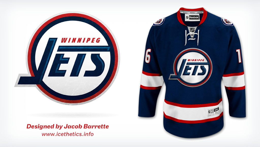
As opposed to what I was able to accomplish with the Ottawa Senators Heritage uniform — a full out nod to the old Senators franchise — this Jets alternate concept borrows elements from the old and new era. While a refreshed old logo is used as the main mark, the current crest appears on the shoulders to create a link between old and new.
While the logo was given a makeover, the lines on the jersey fully respect those of the uniforms worn between 1990 and 1996. However, the base color used is the newly introduced polar night blue. Laces were added, cause, well, I won't pretend there's a reason for those, they just looked nice, but that is an element worth debating.
What was done:
- Created a new, modern typeface to refresh the Jets word mark.
- Added shading to the word mark. This was also a way to incorporate both shades of blue which comprise the new Jets brand.
- Added an inner blue ring to the logo and silver ring to the outside. The silver ring creates a link between the logo and the jet present on the shoulder patches.
- The jet was removed from the logo to create a more balanced look, but is still present on the jersey via the shoulder patches.
- The NHL shield area is silver, again to subtly bring back that shade.
- The typeface for the numbers would be the same as the newly introduced uniforms but with a red outline as the slanted numbers compliment the JETS word mark.
I felt it was important to incorporate all the colors of the new brand. It proved to be a little challenging as I didn't want the jersey to look cluttered, so I think the shading in the word mark was the perfect solution. It also adds a bit of dimension to the logo.
We've all witnessed a strong synergy between the Jets organization and their fans, with ownership finally landing a team, organizing the best jersey unveiling in recent memory and the fans responding by supporting the team and committing to multi-year season tickets. I think that if fans are vocal enough about wishing to see this concept or the Jets' own take on it, a similar design could see the light of day down the road.
I agree. If Senators fans could do it, it should be a piece of cake for Jets fans, who practically forced their ownership's hand in bringing back the Jets moniker. There's no question it can be done.
As for the design, I asked Jacob about the lack of a Jet in the crest on this jersey — an element featured in both of the Jets' original primary logos — and he was quick to point out the lack of balance it created, as explained above. But personally, that was the only flaw I could find here.
Tomorrow, we'll go into a bit more depth with Jacob in a brief interview. He'll also answer any questions you may have about his new Jets jersey, which bridges the gap between the original franchise and the current one. Share your thoughts and questions in the comments below. Do you envision the Jets wearing this sweater someday soon?

Reader Comments (109)
this would be perfect if the logo had a hockey stick and a small jet in it. they are a hockey club, and theyre called the "jets". i dont understand why he would leave such important details out for the sake of simplicity / "cleanliness".
other than that it looks great.
the silver and laces is a very nice touch! beautiful blue too. good work
''And to every person that feels the need to tell us all that you could've done this... here's my question: Why didn't you then?''
...Because it's the easy way out that's all. He made a near-perfect jersey with Ottawa by taking bits and pieces of their history to make a truly unique jersey and that's what designs should be about.
This on the other hand, is just a slightly different logo on an already used jersey template, to me, it's almost like he felt he had to come up with something fast or his ''momentum'' would slow down and no one would take him seriously, so he came up with that, which is really underwhelming.
Two more points : Third jerseys should be a bit wilder than regular sets and should never be the same color as another jersey in the team.
I'm hoping for a red or powder blue jersey from them next year, not what he came up with, which I'm sure will not even look close to what they ice next year. They were pressured into the Jets name, they won't fall twice for that for sure !
This is pretty weak overall. Taking the 90's jersey wholesale and throwing an uninspired "JETS" in a circle on it is just lazy design.
Except for 1972-73, there's always been a plane somewhere in the logo, something this is sorely lacking to break up all that white space. This is like Kansas. There's no "there" there. It just...is.
Call me a whiner all you want, this is just substandard. Just because someone put it on this site instead of one of the others is no reason to defend it into the ground.
Eric, the Rangers did that with the Lady Liberty jerseys, too. It wouldn't be a bad idea if they did it, but I get the feeling that unless it's a special anniversary jersey, it's not going to happen.
I personally think they should make a throwback white uni, or at least wear the away jersey at home on occasion... Bring back the white out!!
@Fredrik: Nothing is shoved down your throat, I mean, if you dont like it, dont look at it. No one is making you view this site, other than you.
As for the concept, I do think it was extremely overhyped, dont get me wrong, it's a good concept, just not extraordinary. I think the shoulder patch is unnecessary, and the stripes could have a little more flair. Maybe a gray outline, like the logo. But the whole campaign was a bit too much, IMO.
It's a nice enough jersey, but not really earth shattering.. Should've probably been there primary jerseys to begin with.
I'm not a huge fan of this jersey or logo. I think the jersey reminds me of columbus too much, and the words on the logo are too boxy and plain. I was a huge supporter of the sens jersey from before though
This is almost right. I don't get the argument about balance, when the "J" sticks out of the left side of the circle. Couldn't he then have added a JET streaking out the top right side of the circle where the line for the E, T and S is?
That would make it balanced, whereas now, it is NOT BALANCED.
At least that's how I see it. It doesn't NEED the Jet, but it would make more sense. Otherwise, what is the point of the line going across the top? It is screaming for a Jet at the end.
The jets orginization allready said that they would not bring back anything that would resemble the old franchise. Nice design but it is just that.
Ha, what a joke. Simply stated, it is awful.
Just not good. The old 90's Jets logo was awful to begin with, and this slight re-imagining of it doesn't help at all. Removing the jet from the logo was a bad idea whether it throws off the balance or not, you may as well just write "JETS" across the middle if you want a perfectly balanced wordmark.
Chris, I don't think people are 'whining' because it's not perfect, I think people are just a bit let down by all the hype you put out for a concept that at best should be somewhere in the middle of one of your concept art posts.
Jacob hit it perfectly with his Senators concept, it was bang on, but with this, all he's done is taken an old jersey, altered the font, colours, and removed a triangle that looked vaguely like a plane.
I like this alot, and I really like the idea of adding the additional blue for shading and detail. As for the missing jet, the very first jerseys that the jets wore in the WHA (I have one of these) only had 'Jets' and a player on it. I do kind of miss the jet though, but since there are the jets on the shoulders, it's cool to me, but there's definately a little extra white space on the crest. I think this is a good concept. I love the Senators alternate, definately a tough act to follow.
I really am disappointed with this. The "JETS" word mark reminds me of the NY Jets 1980's FUTURISTIC JET logo (which is my favorite NFL team and logo ever and hope they bring that back ASAP!). Maybe you could bridge the history of hockey in Winnipeg vs. just the Thrasher/Jets.
Does this guy even realize the difference between a "J" and a backwards "L". I am sorry, but this is so awful, that if you post anymore of his work on the front page of your site, I am taking the icethetics link off of my website, and will tell all my users not to visit here any more.
For all the attention it got, this is an embarrassment. Using the old Jets template, and modifying the old Jets logo (which Phoenix owns) is lazy and boring. I am embarrassed to call myself a graphic designer after seeing this.
Meh. If they decide to go the retro route (which I would like), they'd be better off just going all-out and wearing the old jerseys, instead of taking half-measures.
Maybe instead of shifting the font around to make space for a jet, what he could do is put a really big jet diagonally across the background of the logo, behind the font?
I'm thinking a silver jet, diagonally upwards from bottom left (where the J in Jets is) to top right. I'd do a mock-up to show what I mean if I weren't awful with Photoshop, but I'm sure someone gets what I'm saying.
Jersey looks good, expect for one big BUT - the crest.
The crest just looks a bit too plain, with too much white space. At first glance it looked like a washed-out/over-airbrushed version of the Minnesota Twins logo (i.e. script over top of a baseball).
One option would have been to incorporate elements from all three different jersey eras, and borrow elements from the original logo. Swapped the 'Winnipeg' text to below 'Jets' and make the T in 'Jets' into a plane? A passenger-type jet might have been a nice retro nod, and distinct enough from the militarized look of the current logo.
I'm a fan
I will say one thing -- this concept has found the perfect location for the new primary mark, the shoulder. I think it looks rather sharp there.
This is terrible. Uninspired, bland, boring, etc.
While it isn't a completely unique concept, it does exactly as the title of the article says: "Bridging the Gap." I do like it, and would be happy if the Jets decided to use this as their alternate, but there are a few things that I believe could improve the jersey.
The first is that, like many others have said, I don't really like the exclusion of the jet. I know there isn't a lot of room for it in the logo you created, so I wouldn't worry too much about it.
Secondly, the J in Jets looks awkward as the concept currently stands. In the original, you knew that the J was both a hockey stick, and a J. If I were a non-hockey fan and I saw that logo on it's own, I would probably have no idea that the J was supposed to double as a stick.
The last thing is the silver outline on the crest. I understand that it's trying to link the old and new Jets, but it just looks out of place (aside from the small bit in the collar and the shoulder patches, it's seen nowhere else on the jersey). I believe that the crest outline would look much better in white, but I would also accept it staying on the logo if there was some addition of silver to the jersey stripes (as long as it isn't overkill).
It doesn't work. Besides the missing jet, the 'J' is fused with the circle outline, and the 'Winnipeg' text is too small.
The 90's Jets logo had none of these issues. You could even read 'Winnipeg' clearly in a smaller thumbnail.
It's a nice-looking jersey, with good use of the Jets current logo as a shoulder patch, the laces, and color scheme. But the logo is an underwhelming wordmark parked on a circle and brings the whole thing down.
Wow. I signed up for the email notifications and just got flooded with some angry people. I don't think the design is worthy of all of the insanely-negative feedback that seems to be pouring in.
After seeing it about 12 hours ago and letting it sit and coming back to it, it's made me like the direction the Jets have taken. When we found out that the Jets were being reborn, I was excited and hoped they'd return to the past for the logo/colors/etc. HOWEVER, I now realize (and the crest designed for this concept confirms it for me) that the old styling was nothing great. Sure, it's iconic, but only because of what it represented. Let's not sit here and pretend that the pre-90s or 90s Jets logos were on the same plateau as the Blues, Red Wings, Lady Liberty, Blackhawks, Flyers, or black-and-gold Penguin logos are. The old logo was PLAIN, particularly after they updated it for the 1990s.
I'm very happy now with the RCAF tribute crest logo the Jets use. It may not be the Chicago Blackhawks logo, but it looks great at center ice and, once we all get over the early disappointment that the Jets we grew up with are not returning, will be a great logo for the Winnipeg franchise for a long time.
I personally hope that they never fully return to old look. If they do, I hope it's a one-off in a Winter Classic, using the pre-1990s layout and a crest similar to the one Jacob made (but with a different look of the current jet in the logo).
I don't think all of the smack talk and "this is garbage" is warranted (it's still a crisp design, even if I don't want to see it used), even though I agree that the teasers may have led us to believe that this would be another Senators Heritage Jersey.
The reason why I feel like we get this shoved down our throats is the whole "he was the force behind the new Ottawa Senators' Heritage jersey and now he's doing it again!" thing. Chris hyped a concept beyond what we've ever seen before on this website, and then calls people "whiners" when they respond with poor reviews. It's like you're expecting or even demanding people to love this and start a movement to make this a NHL jersey. However it's simply not such a good concept, you've got at least 10 Jets concepts on the concept page which is better than Jacob's but I can't see those get all this attention.
It's ok. But not more. And as the 'original' Team is still out there in PHX I think to keep the name is tradition enough but they should definite stick to there new logos and the current jerseys which I like more and more as longer as I see them on ice.
Well I have looked at this design since yesterday. I like the design of the logo and the lettering with the red white and blue included. but I do not like the overall design and color of the jersey. It just seems incomplete for some reason or just not right for a third jersey.
That being said it is pretty plain and boring otherwise. It does not reek of excitement but does creat a bit of a nostalgic feeling as the designer pretty much just copied the old jersey and put in modern font. As a winnipeger I would prefer something a bit different or more retro as a third jersey.
I think the design of the logo is a little basic, not very innovative and lacks any sort of visual interest. The sweater itself is a direct lift from the last Jets sweater so I won't comment. If you want a "throwback" go back to the original Jets design. If you want "heritage", IMO you have to go to a franchise started before the '70s.
I do think the hype and attention given to this design was unwarranted. Maybe a line - "another mockup from Jacob".
I wll also agree that the 'Winnipeg' is now a little too small and becomes a bit difficult to read from a distance.
I think I would have liked to see something based on the logo from the early WHA era. Bring back the hockey player! :)
Actually I never looked at it closely before but it strikes me that the 90-95 logo is a nice tribute to the two logos that came before it, incorporating the 80's logo's basic layout but incorporating the swooshing jet and 'Winnipeg' on top from the 70's logo.
Would be a great challenge to create a clean logo that tips the hat to all four Jets logos.
Thanks to everyone for the comments, good or bad. It does help determine what works and what doesn't.
I would just like to point out that the reason that this concept is based on one of the old logos but not the actual old one is that I feel, personally, that the old logo did not age very well and could use a makeover, but did have strong bones. Going through the comments, I do find some of them very interesting. For example, it looks like I underestimated the attachment people have for the jet in the actual logo, kind of like how Tampa fans were attached to the bolt on both sides of the pant shells. So that's definitely something that seems like it should be worked in there in some capacity. Another interesting comment is to have a white alternate as opposed to blue. I agree that it would be a nice nod to the whiteout. Didn't think of that. As for white being used as an alternate, I could see it happening. The Leafs alternate prior to their new one was white.
Also, for those who have followed the Senators project over the years, you'll notice that the final product differs quite a bit from the original concept. Talking to the organization and having access to the proper ressources makes it easier to end up with a better final product. This Jets concept is speculative at best and was created without any idea of if the team would even go that route or create something new entirely.
So judging by your response, it does need some work in order to please Jets fans and that's perfectly fine :)
A couple of things to finish, this concept wasn't created last minute as some of you believe. Just because it's a variation of an old mark, doesn't mean that time doesn't go into it. Sometimes details take quite a bit of time to get just right. I can see how some of you might have that impression as graphic design is widely misunderstood. I'm often ask about my job, with people asking "So, like, you draw on computers"? Hehe, so the planning and approach part of our job isn't as obvious to everyone and that's fine.
Finally, no need to point the finger at Chris for the hype, it was my idea. It was posted on here to gather your thoughts which again, I thank you for. The little extra teasers, well, I thought we're all just waiting for the Islanders to drop their alternate and because there isn't much to talk about these days, I thought it would be fun. It definitely got am exchange going ;)
Cheers!
I think it is obvious that Mr. Barrette has good ideas, but when it comes to creating logos doesn't have a clue. In the case of the Sens new alternate, that logo was already there for him. This is a good attempt to bridge the gap between the two Jets franchises, but I believe fans would demand to have the crest resemble the old one more closely. It just doesn't work for me without the element of the jet.
The problem with this concept is that it tries to make a connection that isn't there. The old Winnipeg Jets are the Coyotes and it makes zero sense to throwback to a completely different team. It's not a bad concept but i have to agree with "DB" when he says the True North Designed jerseys completely surpass it..
@Jacob Way to take the criticism in stride!
Looks amazing, I love it!
Awesome jersey, shoulda gone with this from the start. Jets front office take notice!
too boring. needs the aviator blue.
I really just don't get this. As others have said, it's so close to the 90s Jets jersey that you may as well go back to that. This doesn't impress me.
Same issue as the current LA Kings jersey. It's so close to Gretzky's Kings jerseys that they should have just gone back to those.
I'm not going to say that it's unoriginal, because that's not the point. However, it is atrocious.
I get that he wants to make a link to the past of the Winnipeg Jets. That's fair. I have no objections with a modernization of the 90s logo. However, the problem that I have with it is that is doesn't associate with the 90s Winnipeg Jets image. The jet was part of the logo. In fact, the jet has been part of EVERY Winnipeg Jets logo that has existed.
Now, in reading Jacob's feedback, those are fine points, however, "JETS" isn't lined up along the bottom. This makes it a little difficult to read. The bottom of the letters should be lined up.
That being said, it isn't terrible, but it isn't altogether good either.
PLEASE READ JACOB. The reason your Senators Jersey was a success was it was a completely fresh jersey from long ago and transplanted into the modern. You need that time gap to be successful; the 1990-1996 jersey is only 15 to 20 years ago. People are buying the original ones hand over foot. So why would they buy this one? It's not much different and people are connected with the original. My suggestion is go to the very earliest jersey the Jets ever had and update the logo slightly and call it a day. That will have success. That jersey is almost 40 years (1972-1972) old and is totally different than anything they wore until 1996. You can't buy those replica's so they're also very rare. http://www.gamewornauctions.net/products/1972_73_WHA_Winnipeg_Jets_1st_Year_Jersey-3088-88.html
Use the Heritage Cream Color instead of the white as with the Senators. The name plate is loved by Philly fans and can be used as the Jets originally did use it as well. The only alternative I would say to this is to use the original logo, which wasn't on the Jersey's.
You can't tamper with anything 1973-74 on, because you can buy those replica's already and everyone loves them the way they are, changing them will not be accepted by the majority. That very first season is you're opportunity. Hope you agree, Kirk.
Pure junk. This guy would have been better off keeping this to himself. All he did was take the old logo and make it ugly and static. Just plain terrible. I think the success of the Senators jersey (which was not really an original design) might have gone to his head.
"Start a movement"? It's pretty clear that the Jets will do a retro third, this guy isn't starting anything. I really hope that when the inevitable throwback third happens, he doesn't try to take credit. Well, unless they actually use his design of course ;)
Love the blog Chris, but this was a silly post. Why the hype? You put up jersey concepts all the time.
i'm a huge fan of this and i'd love to see it on the ice, the only thing i would change is the primary logo seems a little "bald" without a jet involved on the top maybe, but overall a nice nod to the original jets jerseys
@Kirk, best advice I've read on here, not that the others weren't good. I really liked my concept but I think what you suggest is better and would make it one of, if not the most, unique uniform in the NHL. Any picture of the full uniform?
Cheers!
I'm gonna second Kirk here. The jersey that inspired this only became our old jersey a month and a half ago (at the unveiling of the new ones) and was readily available in the city of Winnipeg anywhere NHL jerseys were sold since it was unveiled in 1990. Sportchek, Canadian Tire. Anywhere. It still is readily available. This is what people were buying in the frenzy between the announcement to purchase the Thrashers and the release of the new logo and jersey. While it's a fine update, it's ultimately pointless, as the situation is not comparable to the ones that inspired the Panthers, Oilers and Islanders to dig into their past for their current looks. We didn't have a fisherman logo for instance. Maybe the Winnipeg Falcons for further inspiration? They did win the first ever gold medal in Olympic hockey. Personally, I like the new Jets look and logo so much, I don't even want to see the old ones dug up.
I don't get why everyone is hating. Effective simplicity is often very hard to do., and he did it perfectly. This is honestly one of the best concepts I've seen in quite some time, and definitely looks like something that could be seen in the NHL.
that was a great call kirk. i had never seen those before. i thought the original jets jeresey was the 73-74 one. those are sick. add some silver detailing in and use the polar blue and that will look fantastic.
also, those rbk edge jersey templates are an embarrasment to hockey jerseys everywhere. what is with that cinched waist?
Hi Jacob, Glad you liked the suggestion. If you just type in 1972-73 Winnipeg Jets Jersey into Google, there are a few images you can see both the Blue and the White. I'm sure you've already done that, but just answering the question. Here is a link to a Hull jersey that went to Auction and sold for a few grand.
If you question was what would the Jersey look like as a suggestion to what you could revise / re-design, my suggestion is don't change anything, it's a beauty.
Your opportunity is with the Logo. Ironically, your logo rendition here has a "J" that is similar to the one in this original Jersey, so I'd say your half way there. I think if you add the light shading as you've done to the format of writing that was done and then really work on the Skating guy, then you've really got something! In the original the Skating guy disappears in Photos of the players wearing the jersey's. It's too small and too thin lined. It needs to be bolder and slightly bigger. I think the skating guy could be really cool if done well. The Canucks went back to Johnny Canuck skating figure for some secondary logo use, like on the players 3rd jersey helmets, which I really love as a Canuck fan. I know Chris didn't think it worked when they tried it on the crest of the practice Jerseys for the Team's Skills competition last season, but that's because it was on a Green Jersey. I think it would work great on a White Jersey. Anyways, back to this, another jersey is Team Canada's logo, they have the skating player in Negative space cutting the Maple leaf. Maybe try that, Make the Skating Guy a Cut out or Negative space (I guess it would be the Silhouette) cut out of the White Boarder around the Jets lettering. That could be made more modern by giving the Silhouette a level of detail, but would still keep the overall logo with the traditional look. From a distance the player would have to be big enough that you could tell it was a player, not just a blob. So it’s a balance there.
That would give some homage to team Canada as well, as some have stated that they should be doing something regarding the Winnipeg Falcons winning Olympic Gold. I wouldn't link those things any closer than this, I think doing a retro jersey of the ones they used wouldn't work and it's already been done and it looked terrible. The Gold they used didn't seem to match the original, it was almost Yellow-mustardy color, similar to Nashville's first 3rd Jersey.
Kirk
Also some have commented that it should be a white Jersey, so that the fans could celebrate there "White Out". I thought that was a great idea, but there is one major problem. The White version of that original year 1972-1973 It's almost exactly the same as what the NY Rangers have used off and on for 60 years, since 1951, although the Jets had different shoulders, they had just solid blue, no strips as the Rangers had and still have.
What I've always found interesting (since they had retro Jerseys on EA NHL 06 or 07) is if you look at the Jets Jersey History, there is a link during those 1970’s years between them and NY Rangers jersey’s. I guess because they were in the WHA and the NY Rangers were in the NHL, so for the years they had similar and in some cases the exact same jerseys at the same time. Check this out;
http://www.nhluniforms.com/Rangers/Rangers.html
It's too bad this site doesn't have the Jets WHA history of jersey. But if you check multiple sources on the internet you can confirm that the Jets Jersey's through the years. There are a lot of dates on Jerseys flying around out there that aren't accurate, probably the best source here.
So the White Jersey we’ve been talking about the Rangers wore from 1970-76, the Jets from 1972-79.
Interestingly, the pre-season of that year 72-73 they wore this jersey (if the date on this site is correct);
http://www.classicauctions.net/Default.aspx?tabid=263&auctionid=36&lotid=489
This Pre-Season is the exact pattern the Rangers used for there Dark jerseys from 1934-1976 and then again from 1997 until present.
Not sure why the Jets changed that before the Regular Season and wore the strip pattern we've been talking about in there original jersey 1972-1973.
http://www.classicauctions.net/Default.aspx?tabid=263&auctionid=57&lotid=205
The plot thickens..........
Then from 1976 to 78 the Rangers wore the Long Armed full color change jerseys. Then in 1979-80 Season when the Jets joined the NHL, they took on the Jerseys the Rangers had worn from 1976-1978 and wore them until 1990.
Then the flip the other way........in 1978-1979 Rangers went to Darks that were the same as the Jets darks for the 1978-1979 year. So that was the only year they wore exactly the same home and away jerseys. They Rangers went on to wear that style until 1997 and then went back to their original pattern pre-1976.
Finally in 1990-91 Season, the Jets seemed to have broke free, doing something different.........but that wouldn’t last forever…... Did anyone notice Last year’s Rangers Third Jersey, doesn’t match the pattern of the 1990-1996 Jets Jersey’s? This Jersey has the Red as the wide band and the White as the smaller band above and below the wide red. All they did was flip the colors, the White large band in the middle with the Red trim from the Jets Jersey's of 1990-1996. A weird Twist at the end of it all, why would the Rangers use this pattern? It's no part of there history, maybe they ran out of idea's, hard to say, but it's weird. Are they hiring the same designer over the last 40 years? probably not likely.
So to wrap it up, the original Jets jersey, the dark of 1972-73, the Rangers used that pattern for a few years, but it wasn’t there original and they went back to there dark originals in 1997, so the Jets could use that pattern of striping and still be different than the Rangers currently use. The White they can’t use, it’s the same as the Current Rangers jersey, except the shoulders.
Lastly, check this out.
http://www.winnipegjetsonline.com/jetsTeamPhotos-77-78.htm
When you take a closer look at this team image you see.......on the ice......an “updated” version of the original Jersey logo. I haven't see this text style on any logo they used for jersey's or any where else. But I'm sure some could find that out. That was an interesting find.
Anyways, it could help with your design, if you so choose to do this Logo update. I'd be crazy interested / anticipating your re-creation of this logo with this classic Jersey.
All the best, it’s easy to have the idea’s but hard to pull it off, so I admire anyone that can………. because I’ve tried before and seen how hard it is.
Kirk
Kirk: This might be a good time to point out that the guy who runs NHLUniforms.com also built WHAUniforms.com.