Entries in winnipeg jets (13)

Tuesday
Feb122013

Hockey Talks Across Canada

Canada's seven NHL franchises are taking part in a mental health initiative throughout the month of February. Among other things, it involves the players wearing special helmet decals for select games throughout the month. Each team will host a Hockey Talks game night, led by the Vancouver Canucks back on Feb. 1.

The Toronto Maple Leafs picked up the torch the following night on Feb. 2.

Last Wednesday, it was the Montreal Canadiens doing their part on Feb. 6.

The next night, on Feb. 7, it was Hockey Talks night for the Winnipeg Jets.

The other three teams will host their Hockey Talks nights next week, beginning with the Calgary Flames on Thursday, Feb. 20.

The Edmonton Oilers follow up with their hosting duties on Feb. 21.

And finally, things wrap up in Canada's capital city on Feb. 23 when the Ottawa Senators host the Leafs for the final Hockey Talks game night of the month.

By the way, take a close look at each of these seven logos. They're not as generic as they seem. The type is all set in the same font the Vancouver Canucks use for their wordmarks and jerseys. And the hockey stick in the middle, it's from the Canucks' secondary logo.

I know this campaign has a lot to do with Rick Rypien, so it makes sense the Canucks marketing team would take the lead on designing the logos. It's just interesting to see Canucks branding incorporated into that of all the other Canadian clubs.

Not that any of that matters. This is an important issue and it still would be regardless of any silly logos. It's nice to see Canadians trying to take care of their own. We could learn a thing or two about that down here.

Wednesday
Nov022011

Winnipeg Jets: Bridging the Gap

His Heritage Jersey design for the Ottawa Senators inspired fans. So much, in fact, that in just a few short years it morphed from a simple concept into an NHL uniform that defines the hockey history of Canada's own capital city. That flowery language may sound like an exaggeration, but I challenge you to name another NHL fan who's managed to pull off what Jacob Barrette has.

Two nights from now, that fan-favorite Senators jersey will be worn by the Daniel Alfredsson & Co. for only the third time ever. Today, Jacob embarks on a new campaign to revive and rejuvenate a classic NHL uniform. In the last few days he declared, "We weren't gonna bring them back, without bringing it back."

His subtle teasers this week led many of you to accurately predict that Jacob was working on an alternate jersey design for the Winnipeg Jets. And it couldn't have come at a better time, as the Jets are more than likely already looking at future third jersey possibilities.

Now that you've seen his new project, I'll let Jacob tell you about it in his own words:

I want to clear this up right away: I'm a fan of the new Jets branding. This attempt wasn't created to overthrow their efforts, but rather to add to their arsenal.

As opposed to what I was able to accomplish with the Ottawa Senators Heritage uniform — a full out nod to the old Senators franchise — this Jets alternate concept borrows elements from the old and new era. While a refreshed old logo is used as the main mark, the current crest appears on the shoulders to create a link between old and new.

While the logo was given a makeover, the lines on the jersey fully respect those of the uniforms worn between 1990 and 1996. However, the base color used is the newly introduced polar night blue. Laces were added, cause, well, I won't pretend there's a reason for those, they just looked nice, but that is an element worth debating.

What was done:

  • Created a new, modern typeface to refresh the Jets word mark.
  • Added shading to the word mark. This was also a way to incorporate both shades of blue which comprise the new Jets brand.
  • Added an inner blue ring to the logo and silver ring to the outside. The silver ring creates a link between the logo and the jet present on the shoulder patches.
  • The jet was removed from the logo to create a more balanced look, but is still present on the jersey via the shoulder patches.
  • The NHL shield area is silver, again to subtly bring back that shade.
  • The typeface for the numbers would be the same as the newly introduced uniforms but with a red outline as the slanted numbers compliment the JETS word mark.

I felt it was important to incorporate all the colors of the new brand. It proved to be a little challenging as I didn't want the jersey to look cluttered, so I think the shading in the word mark was the perfect solution. It also adds a bit of dimension to the logo.

We've all witnessed a strong synergy between the Jets organization and their fans, with ownership finally landing a team, organizing the best jersey unveiling in recent memory and the fans responding by supporting the team and committing to multi-year season tickets. I think that if fans are vocal enough about wishing to see this concept or the Jets' own take on it, a similar design could see the light of day down the road.

I agree. If Senators fans could do it, it should be a piece of cake for Jets fans, who practically forced their ownership's hand in bringing back the Jets moniker. There's no question it can be done.

As for the design, I asked Jacob about the lack of a Jet in the crest on this jersey — an element featured in both of the Jets' original primary logos — and he was quick to point out the lack of balance it created, as explained above. But personally, that was the only flaw I could find here.

Tomorrow, we'll go into a bit more depth with Jacob in a brief interview. He'll also answer any questions you may have about his new Jets jersey, which bridges the gap between the original franchise and the current one. Share your thoughts and questions in the comments below. Do you envision the Jets wearing this sweater someday soon?

Wednesday
Sep212011

Jets' New Look Hits the Ice

It was 112 days from the announcement of the Atlanta Thrashers' demise to the first time its' players would suit up as Winnipeg Jets. And for a blog like this one, watching the branding process unfold before our eyes was nothing short of a rollercoaster ride.

I'm not from Winnipeg. Or Canada. Or Atlanta. So I didn't really have a stake in the team itself. I was only interested in watching the first NHL relocation (since I started the blog) play out. Once the jerseys were unveiled, I went back to looking at them the same way I look at any other team. An enemy the Lightning need to beat. Even moreso this season since they're a division rival.

But that's not the end of the story. I haven't told you what I think of the uniforms yet. And many of you have been asking. Now that they've seen their first game action, I have no reason to hold out any longer.

Blake WheelerIn a funny twist, the Jets' first pre-season opponent was the Columbus Blue Jackets. Funny, because sentiment among many readers is that Winnipeg's new sweaters are a bit of a fusion of Columbus' uniforms.

And I see what they mean. The crest is blue, red and silver. On the road jersey, blue covers the top of the sleeves from the neck line to the wrist. Just like the Jackets.

There are light blue sleeve and waist stripes wrapped in silver. Just like the Jackets' third jersey. Even the font is hauntingly reminiscent of what's on the alternate Columbus sweater — only more rounded.

But those are other people's opinions. You wanted mine. And many of you have been waiting patiently for it. So I have to get it right. Not that it has to be popular, just an honest assessment.

It's no secret I'm not a fan of the primary logo, the crest. I made that quite clear when it was unveiled. And got a lot of hassle for it, I should add.

There's a lot I dislike about it. The central element, the jet, has no distinguishing features. The jagged maple leaf it sits atop is red, making it look like the plane is exploding. And worst of all, it's set in a circle.

I understand the impulse to go with a circle when your team is named Oilers or Islanders. But Jets? It's a name that conjures so much whether you were a hockey fan in the 1980s or not. Jets! They're meant to fly freely but instead this one is locked up inside a fat blue circle. Why?

Because True North liked Winnipeg's military connection and wanted to take advantage of that. It's one thing to have a military night and give free tickets to soldiers and have the players warm up in camo-colored jerseys that are auctioned to support the people that serve their country. I'm 100% behind that.

I'm just not sure an NHL franchise should market itself (read: try to turn a profit) by capitalizing on the iconic imagery used by the people who put their lives on the line almost daily. To me, it's just wrong. I know the Jets aren't the first team to use military-inspired marks, but I'm not making comparisons here.

Whether you agree or disagree with the military theme, the fact is the design itself is quite poor. It looks like a compromise. One guy wants the roundel. Another guy wants a red maple leaf. And the other guy says, "wait, don't forget to get a jet in there too." I don't mean to harp on it, especially considering they had to rush to get this done. All I'm saying is I stand by my initial review of that logo.

Now, the uniforms. Those I like. I like the two-tone blue and silver color scheme. I like that the red is nothing more than an accent color on the crest and shoulders. It really pops that way. I like the shoulder patches and the socks. And the fact that the sleeve stripes wrap completely around the arm. I even like the new number and nameplate font. All of these things bring some much-needed originality to this club's look.

Everyone wants to call the Jets unoriginal for using dark blue, the new "in" color, apparently. Actually, the only other teams that will have dark blue home jerseys this season are the Sabres, Maple Leafs and Blue Jackets. Granted, there are five teams that have dark blue thirds. But really, the biggest color offender is red. Eleven different teams use it on their jerseys in some form. And for 10 of those 11, it is the primary color of the home jersey. Let's praise the Jets for avoiding that color and looking more like Columbus than they already do.

There are some things about the uniforms that I don't like. Just a few. I don't like that the collar tie is the same color as the jersey. No contrast there. And I don't like the wordmark on the pants. Or the wordmark at all. I don't mind them using a wordmark on the pants, but I just don't think this particular custom font works well. It doesn't feel as modern as I would've expected.

So there you have it. My view on the Jets' new uniforms. Some of you will agree, others will not. 

Tuesday
Sep132011

Loose Threads: Jets, Pens, Avs & Sens

I'm working on a huge Icethetics side project right now that should be released in the next few weeks. So while there are a number of things to cover today, I'm going to make this post quick.

Jets Hold Real Jerseys a Week

Young Jets get practice unisWinnipeg Jets players took the ice competitively for the first time yesterday in the Young Stars Tournament, though not wearing their new jerseys as we expected. Instead they donned practice jerseys with some extra patches sewn on.

So after weeks of listening to the team say the new uniforms had to be unveiled before the tournament so the players could wear them, we still have to wait a week to see them in action.

The following comes from the game recap on the Jets' official website:

The young stars did not debut the new Jets sweaters, instead wearing practice jerseys. The Winnipeg Jets will wear their new jerseys for the first time on September 20th against Columbus.

We've waited this long. What's another week?

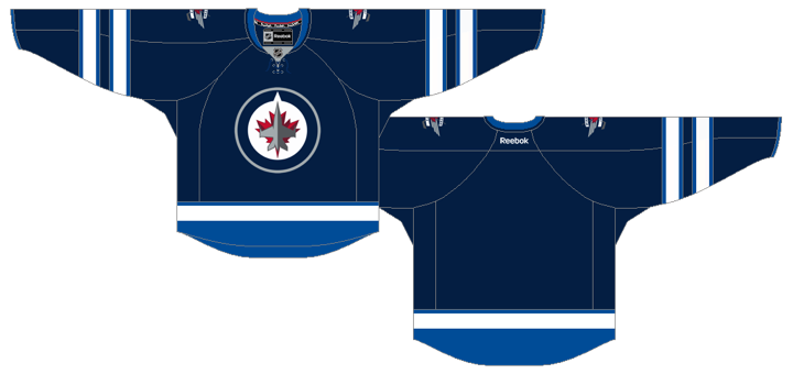
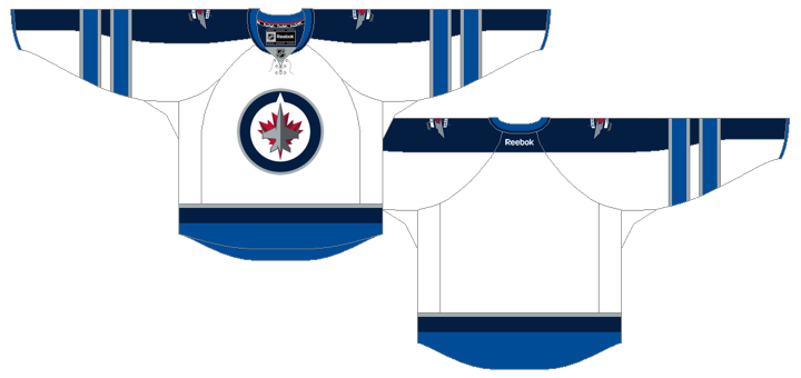
Some of you have written in asking about the sock design — as if that could single-handedly change the entire look of the uniform. But as you can see in this photo, the sock stripes appear to match the sleeve stripes from the real uniforms.

Is that a good thing or a bad thing? I'm surprised that a week after the jersey was unveiled, only one person has asked what I think of it. Don't get me wrong, you'll still get my take eventually — just not yet. I was going to write something up last week but I'm holding off to see the jerseys in action before I dive in with my critique. It may surprise you, actually. May.

For now, though, I have a couple of third jersey schedules to share.

Penguins Officially Announce New 3rd

We've kind of taken for granted all summer that the Pittsburgh Penguins would be switching their third jersey to their most recent Winter Classic sweater. It was never really official until today.

The Pens said in the release that fans told them "they love the new look, the new shade of blue, and the blending of different eras of Penguins hockey." Based on what I've read from Penguins fans on this site, it sounds to me like you've been telling them you love the black and gold from the late 1980s. But they can't seem to hear that for some reason.

Sidney CrosbyNo matter. I think it's a great looking uniform. And  came the schedule for the new third jersey in the 2011-12 season. We'll be seeing it for 12 home games:

  • Sat., Oct. 15 – vs. Buffalo Sabres
  • Thu. Oct. 27 – vs. New York Islanders
  • Tues., Nov. 15 – vs. Colorado Avalanche
  • Fri., Nov. 25 – vs. Ottawa Senators
  • Tues., Dec. 27 – vs. Carolina Hurricanes
  • Fri., Jan. 6 – vs. New York Rangers
  • Sat., Jan. 7 – vs. New Jersey Devils
  • Fri., Jan. 20 – vs. Montreal Canadiens
  • Sat., Feb. 11 – vs. Winnipeg Jets
  • Sun., Feb. 12 – vs. Tampa Bay Lightning
  • Wed., Mar. 7 – vs. Toronto Maple Leafs
  • Thu., Mar. 22 – vs. Nashville Predators

Nice spread over the course of the season. I like that they're wearing them on a couple of back-to-back nights, and of course, against my Tampa Bay Lightning. That'll be one good-looking hockey game.

There's another third jersey schedule floating around out there...

Avalanche Set 2011-12 Third Jersey Dates

The Colorado Avalanche recently posted the game schedule for their blue alternate jersey, which will be entering its third season in use.

Interestingly, they even included details about the design that I don't remember reading when it was unveiled in 2009. They include information about the designers and prototypes. Have a read:

The third jersey design is a collaboration of ideas from the Colorado Avalanche (including Kroenke Sports Enterprises Creative Imaging), the National Hockey League and Reebok. ... Two rounds of sweater prototypes were tested and ran on ice before the final version was made.

Milan HejdukNow here are the 12 home dates in which the sweater will see action during the coming season:

  • Fri., Oct. 28 – vs. Edmonton Oilers
  • Wed., Nov. 2 – vs. Phoenix Coyotes
  • Wed., Nov. 23 – vs. Vancouver Canucks
  • Fri., Dec. 2 – vs. St. Louis Blues
  • Tue., Dec. 13 – vs. San Jose Sharks
  • Tue., Dec. 27 – vs. Winnipeg Jets
  • Wed., Jan. 18 – vs. Florida Panthers
  • Thu., Feb. 2 – vs. Minnesota Wild
  • Mon., Feb. 27 – vs. Anaheim Ducks
  • Sat., Mar. 10 – vs. Edmonton Oilers
  • Tue., Mar. 20 – vs. Calgary Flames
  • Thu., Apr. 5 – vs. Columbus Blue Jackets

The Panthers will be the only true Eastern Conference team to see the Avs sporting blue this year. They have Stanley Cup Final history together. (Though I guess strictly speaking, the Jets are still in the East for this year.)

One final item for today...

Sens Give Another Glimpse of Heritage

One final item for today. A reader tweeted a link to a page on the Ottawa Senators website, offering the new Heritage Jersey for sale without really showing it to us.

From what I can tell, this is the same photo that was used in the team's own sneak peek way back in March. Only difference is now we get it in full color without any distortion from projector screens or compressed Flash video.

First, you can see that vintage white is, in fact, in use. And second, the shoulder patches seem to contradict my earlier report which said that they were bilingual, English on the right shoulder, French on the left.

I'm staring at a photo (which I can't show you until after the official unveiling) that clearly shows one patch is in French, so what's the deal? One of two things: either 1) there was a change made between this photo and that one, or 2) we're actually looking at two jerseys laying side-by-side in this photo. It's hard to tell for sure on that.

Meanwhile, the Senators say the Heritage Jersey will be available on Oct. 1, meaning the official reveal will have to take place on or before that date. I'll be keeping an eye on it, obviously.

Tuesday
Sep062011

Winnipeg Jets Uniforms Unveiled

Winnipeg Jets officially unveil uniforms / Jets

They're here. The Winnipeg Jets officially unveiled their uniforms today. I don't really have a lot to say on the matter at this point. Give me a day or two and I'll get back to you with my thoughts on it.

Back of new Jets jerseys / CBCThe unveiling ceremony was held this morning at 11 AM central at 17 Wing in Winnipeg and was well-attended by local media. You can read more details about the design in the club's official release.

A few pictures have started turning up on Twitter, so that's all I have to share at the moment. I'm sure it won't be long before we have something more official from the team.

Both jerseys feature a unique double-striping pattern on the sleeves that hasn't been seen before on Reebok Edge jerseys in the NHL. The number and letter styles are also new are very modern.

Like I said, I'll get into my analysis later in the week when I have a little more time to dedicate. For now, feel free to share your thoughts on the new jersey designs. I'm sure we're all curious to see how they're being received.