


Flyers Unveil Winter Classic Jersey
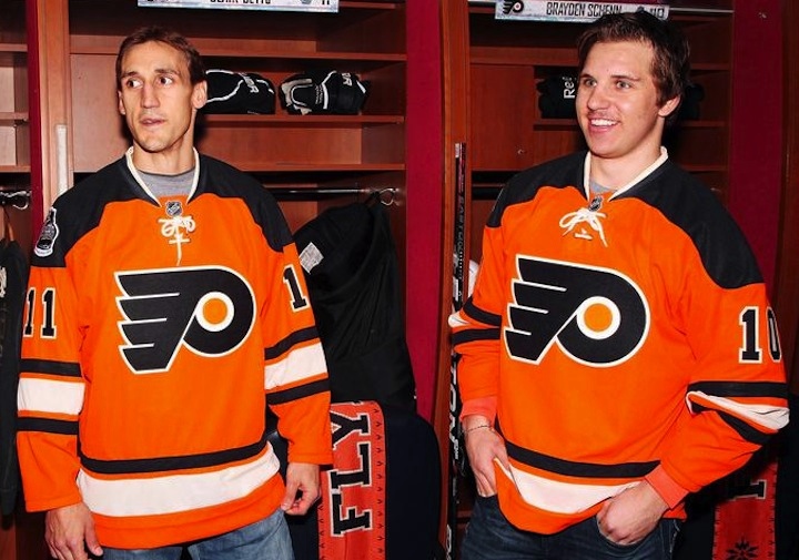

 Modeling the new sweater / Schuyler BaehmanAfter a long wait, the Philadelphia Flyers finally unveiled their 2012 Winter Classic sweater. And interestingly enough, it lived up to the leaks.
The new sweater has no place in Flyers history, but then neither did the Bruins' or Penguins' second outdoor game uniforms. Though unlike those teams, this one isn't even based on anything in the team's 44-year history.
And to explain a little about why that's the case and what inspired them, here's a what the team has to say:
Designed by Reebok, the jersey’s primary color is the team’s current recognizable orange with secondary colors black and a vintage off white.
The Flyers primary front crest and player numbers are executed in rich felt black and vintage white appliqué. The player name and number name bar is a contrasting off-white color on the core orange jersey body. This is a design element unique to the Flyers current and past uniforms.
The shape of the jersey consists of a new silhouette and striping pattern that has never been worn by the team in its history. The heritage striping is inspired from a sock design worn by the Flyers in the late 1980's. A very strong retro inspired neck lace closure will ground this jersey’s place in NHL Winter Classic uniform history.
So, striping from a sock design, eh? All right. Can't say that's not getting creative.
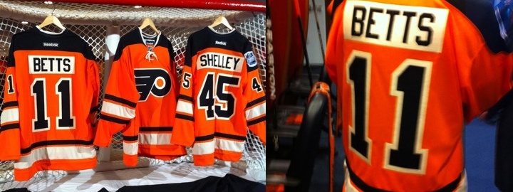
Flyers Winter Classic jersey unveiling — photo gallery
I like the black shoulders. It's an element that's never been part of a Flyers uniform and I've always thought it should be. It's a good look. Overall, I'm a fan of the design. You've heard me bemoan the "vintage white" to no end (and I still don't like it here) so there's no need to go on about that.
But that's just my take. What about yours?
 Chris
Chris
Here's another, more complete look at the Flyers' full Winter Classic uniform.
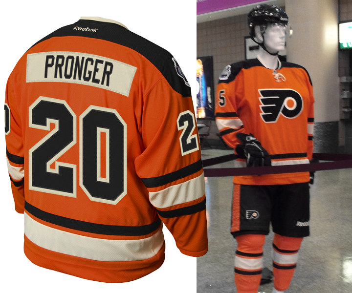
The photo of the back comes from the Flyers' official website. The shot on the right of the full uniform on display at the arena comes from @kevind182 on Twitter.

Reader Comments (63)
I am really disapointed Chris,, myself as well as the millions of Icethetics followers were really hoping you were going to introduce the Flyers W/C Jersey with your trademarked, eye catching catchphrase.....
"Worst Kept Secret"!!!!!!
I really like this jersey. Surprised to see such a split with the comments. Everybody on here is always saying how they don't like vertical stripes and busy designs. Yet, when teams like Philly try and do something completely traditional, they turn around and say "it's boring". Makes me wonder if anything pleases you folks anymore. Im kind of happy they went with this and not those Quakers designs that surfaced a few months back. This has a classic/traditional feel to them... So what's the problem? I would've been most happy to see the '82-'01 orange jerseys, but these are totally fine.
I like this vintage white alot more than others i have seen. It looks a lot more toned down.
@AtomicAddiction - The Bruins WC sweater had a felt logo and name/numbers.
I agree with you jimbo, doesnt seem like you can please anyone these days. I loves this cause its classic and somehting the Flyers have never done before. I'm all for the traditional sweater cut hem at the bottom instead of the EDGE (baseball/diaper) style hemm. I'm a huge fan of the yokes, lace, and the stripes look great (except as i and many others already mentioned waist and sleeves should match but no biggie). Cant wait to see the Rangers, i hope theyre not the leaked ones cause theyre like the exact same design as the Flyers just with their colors and retro shield. Itd be sick if it was lady liberty but since the t-shirts are already out with the shield it wont be. Anyway, I can not wait for the winter classic!!!!
The Flyers are the ONE team I accept a vertical sleeve stripe from because they've always worn a variation of that. That's why it's a bit surprising they've made up this design rather than try to retro-ize their current design or go the full Quaker.
I like the traditional-ness of the design, although I think the extra black hem stripe would improve it and, since white is the more dominant color on the striping, a white shoulder yoke may have been better. But I DID notice that the striping matched those post-Cooperall socks and I'm surprised they said so explicitly. And on a personal note, my high school colors were orange and black and this would have been a MUCH better match for our home jerseys (think Devils with red swapped out for orange) than what we had.
As a Red Wings fan, something I notice about this is that the shoulder yoke seems to have a more traditional shape. The Red Wings' white jerseys haven't looked right since they got RbkEdged because the shape of the shoulder yoke doesn't produce the correct pattern on the red sleeves. I can imagine (and hope) that the Wings see what I think is happening with the shoulders on this Flyers jersey and request that this pattern be used on their whites.
Orange stripe on the pants should have been outlined in white - reference to the cooperalls!
http://nhluniforms.com/Flyers/Flyers06.html
it's awesome. really well done. the best set in the flyers' closet. gotta be their 3rds for next year.
on a side note... the cooperalls thing... any chance of these coming back? or is it against league policy now?
Hook, the cooperalls were banned from the league in 1983 due to safety. I heard when a player would slip or take a hit they would sliding like crazy almost half-way down the ice (exaggerating but they would slide a bit fast n further). Plus people thought they looked ugly, I totally agree and imo pants only look good in roller hockey
I actually like the look of the vintage white, but I think it ruins the jersey. The whole idea of the color is to give the jersey an old-school look, but combining vintage white with bright orange ruins that feeling.
pants shoulda been black with a (vintage) white stripe. Otherwise great.
UGLY. They dropped the ball. Rangers got it right.
Should have went with the Quakers based design.
i like the jersey, everyone needs to stop hating on it. ur jus mad u cant go to the game. ILL BE THERE LOL