


67's Bring Back Barber Pole
 18 Comments
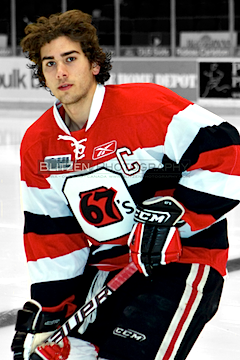 New 67's jersey / Blitzen PhotographyThe OHL's Ottawa 67's announced yesterday that they'd be bringing back their classic barber-pole jerseys for the 2011-12 season.
The new sweater will be unveiled to fans at tonight's game but the team has posted a preview on their website. In addition, the Ottawa 67's Fan Blog posted a better shot (right).
The 67's haven't been able to wear the full stripes since before Reebok took over the CHL's uniforms for the 2009-10 season. The manufacturer blamed limitations to the jersey "technology" on the inability to recreate the unique effect.
Reebok says the technology has now "advanced" allowing the 67's to bring back their classic sweater. It replaces the black jersey the team had been wearing since 2009.
I may not be the biggest fan of the barber-pole look, but I certainly know it has its place in Ottawa. And with their combination of logo and colors, it just looks right on the 67's.
Now that we've seen the 67's new sweater, could you see the Senators borrowing this look for their forthcoming new third jersey? Do you think it'll be more like the black jersey the 67's just retired? Or will it be something entirely new?


Reader Comments (18)
I am very excited to see this jersey return! I have never bought a non-NHL jersey before but after missing it in action for 2 long years, it may be time I do! Of course, if the Sens do a same/similar look next season, it may be a bit premature on my part. Having said that, what do they mean by "the technology has now advanced" and all that? Ironic how the technology needs to advance to create a vintage look, eh?
The Reebok Braber Pole jersey looks great, very nice. I think they should keep the black one as a third jersey, as that is pretty nice as well.
I grudgingly admit that, aside from the 67's logo, which I've always hated (don't like the sharp angles of the background O), that's actually not an eyesore, and I like it better than their previous dark uniform with the half-stripes on the arms. I doubt the Sens will have the same jersey but I wouldn't actually mind if they did. Throw some shoulder patches on and get rid of the two advertising patches on the chest? Solid.
On to the math! So the new 67's jersey is basically 6 stripes along the front, whereas the Binghamton barber-pole, illness-inducing jersey (just my opinion) is basically 14 (there's a triple stripe at the bottom waist which I counted as 1.) Interesting what the eye does.
I'd still prefer the Jacob Barrette jersey I think, but it looks like the thick barberpoles aren't bad after all. I have learned something about myself today, and isn't that the most important thing? Probably not.
I wonder if this "technoligical advacment" has anything to do with us the fans being pissed off that reebok took personality and uniqueness out of Jersey design. Maybe just maybe this is the start of that coming back and we wont see 4 or more teams with the exact same design.
I still stand by the fact that the inventor of the Edge system should be kicked in the balls for every jersey that been done.
I would be ecstatic if the Sens adopted the 67's jersey, but with just a white O on the front. Hopefully it would become the home jersey a few years later.
As much as I would love the Jacob Barrette design, I would strongly prefer full barberpole (Or even Dallas' Senators concept from earlier this week). After all, I never stopped wearing my full barberpole 67's jersey to games! I suppose I wouldn't hate the black 67's jersey as the Sens alternate, but meh...
That's a very sharp jersey, perfect execution. The ones before this weren't so bad either, but I really like these.
whata beauty
Heritage I know, and for most I love it....But this a horrible look. Then again who cares, it's the bottom feeder's.
Maybe I'm not read(ing)betweenthelines well enough, but a team that's second in the East is hardly a bottom feeder...
Those jerseys are sharp. Wouldn't want the Senators wearing a replica of it, but the originality of it is great.
I still don't know why the Senators can't find a use for the new 2D logo on their jerseys.. The New 2D logo is still available on some customizable merchandise on Canada's NHLshop.com. Just bought a few pieces. It's so much nicer than the current 3D logo. sigh
FINALLY the jersey that's been synonymous w/the 67's has returned. As much as I have grown to like the black sweater I must say that it's nice to see the tradition return (and as it NEVER should have left).
Awesome.
2nd in the east and quite entertaining to watch, the game I was at the other night had 7000+ fans... Bottom feeders?
The 67's wore these jerseys in all the memorial cups Ive seen them participate in, And both of the times they won these are what they were wearing. I think they're iconic and definitely worthy of full time use.
Every time I played against the junior AA 67's as a kid I was always intimidated by the stripes. They're just awesome jerseys...IMO
Trans said: I still stand by the fact that the inventor of the Edge system should be kicked in the balls for every jersey that been done.
I don't think there is a person in the world that cares about hockey that doesn't feel this way.
Being from Ottawa and being a major 67s/Sens fan, I'm ecstatic about the looming barber pole. Absolutely beautiful.
I think these do look really nice, and would like to see the senators use it as their 3rd, but with their old 2D logo(like many others). I totally agree that rbk edge designer almost ruined the game. the technology is a bunch of bullshit. Reebok took over and it was all about the marketing and money. Since it was after the lockout they pretty much wanted to give the NHL a new and "bolder" look. So much for tht as we can see tht fans still prefer the clasics over the overdone hideous looking piping jerseys and the other terrible designs (the thrashers current road design that the flyers also sported looks like shit and thank god the flyers went back to the days of the broad street bullies, being a die hard i was very happy lol) Theres nothing wrong with changing colors a bit and your logo but a hockey jersey should be a sweater, it shouldn't look like a friggin football jersey (reebok makes them 2 obviosuly and they looked very similar with the the cut on the bottom of side panels of the jerseys). I rest my case lol
Personally I don't buy the "technology has advanced" bit. I'd say make three solid coloured uniforms, lay them perfectly flat on a table on top of each other and slice em up, then just sew the parts together. It's not like we're forming steel with out heat and a hammer here. My personal opinion is if the NHL went in the so-called "edge" direction too early. Making limited choices(and ugly ones at that) is bad business. Would you fly in space if the ship was experimental? Would you go to an ice cream shop if they had chocolate, strawberry, and vanilla shakes but if you asked for any combination the staff would get confused? I think I'd wait until the staff was adequately trained professionals, and I'd probably wait until that ship has blown up a few times and properly fixed and adjusted. However, the last few years has shown us that we the people love our games history, and this uniform in particular shows that no matter how advanced 'technology' is we'll always love the tried, tested, and true. Go 67's! Mr. Hunt, you're a God in the hockey owners world! great decision to bring them back, you're always thinking about the fans and the history of our city! :-D
I don't buy the "technology has advanced" bit because the year the edge took over in the CHL the Rouyn-Noranda Huskies got two jerseys with gradients in them, the Chicoutimi Saguenéens still had had a barberpole shoulder yoke, and (as seen above) the Ottawa 67's had barberpole sleeves
Re Buffalo.
Growing up, I hated the Sabres uniform. Their blue and yellow bothered me as much as the Leaf's arm-length piping I gotta say that I'm thrilled that Buffalo has returned to the same, though. Their new sweaters are an example of great design (much like TB's new sweater lineup for next year).
The best thing I like about Buffalo's changes, though, is the "1970" in their logo. What a great way to remind fans of your history! It reminds me more and more of English Football crests. Job well done, Empire City!