Entries in minors (159)

Tuesday
Jan282014

RIP: San Francisco Bulls (2012—2014)

Sophomore ECHL club shuts down midseason

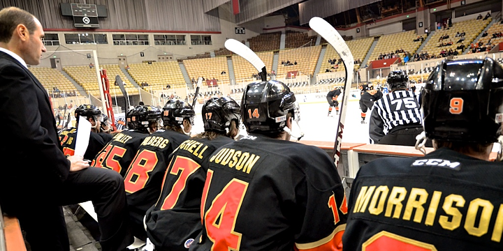
Maybe the Bay Area can only support one pro hockey team. The San Francisco Bulls — ECHL affiliate of the San Jose Sharks — ceased operations on Monday after only a season and a half in action.

It's not difficult to figure out why.

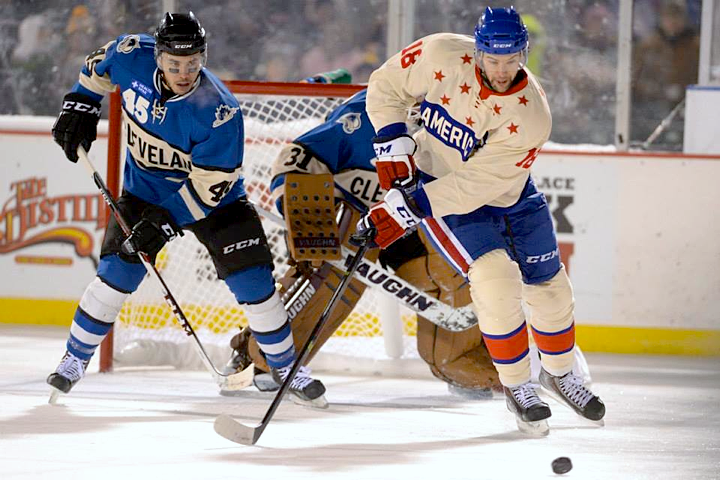
Photos from San Francisco Bulls by Mike Tkacheff

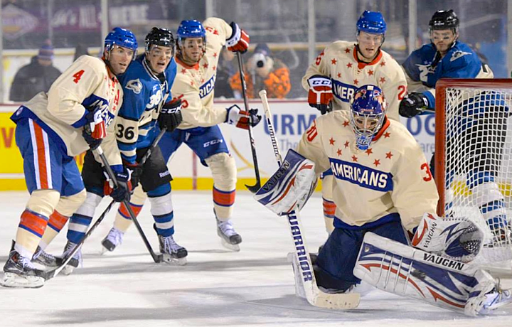
The team's press release tells us they couldn't find a new owner in time. The empty Cow Palace seen above on Jan. 15 tells us why no one was interested in buying the Bulls.

During their brief existence, the Bulls brought us one of the most wretched logos in minor league hockey — except, of course, when it had to be embroidered on the front of a sweater. So I can't say I'll miss this team all that much.

There is one thing they got right, though.

Last season, on Feb. 9 and 10, the Bulls skated in San Jose Sharks throwback jerseys — with that classic Pacific teal and gray. A lot of us miss those uniforms, so it was nice to see them in action one more time. Although they did their best to wreck it with those gradients in the crest.

Thanks for the memories.

Said no one. Okay, well there's that one guy in the middle a few rows up. He's the only one.

Wednesday
Dec182013

ECHL Opens All-Star Jersey Voting

Three finalists selected; voting ends Monday

Polls have officially opened on the 2015 ECHL All-Star Classic jersey design contest hosted by the Orlando Solar Bears. Last week, the Solar Bears began accepting submissions from fans. Today, the three finalists were revealed as voting began. Take a look at the options presented to voters.

Image from Orlando Solar Bears

According to the press release, the Solar Bears received more than a hundred entries and the finalists were selected by "a group made up of individuals from the ECHL, CCM, the Joe Bosack Design Co. and the Orlando Solar Bears."

Polls close Mon., Dec. 23 at noon ET so VOTE NOW!

Icethetics contributor's design among finalists

Unfortunately, the Solar Bears elected not to include the designers' names with their entries in the poll of finalists. However, we do know "C" was designed by frequent Icethetics concept contributor Matt McElroy, who tweeted about it earlier today. It also showcases his IceBorn concept template, which is featured here on Icethetics. Good luck to Matt!

For a look at some other all-star jersey submissions which were not among the finalists, check out yesterday's post on the Concepts page.

What do you think of the finalists? And which one will you be voting for?

Sunday
Dec152013

Frozen Frontier Sweaters Shine

All photos by Micheline Veluvolu

AHL's Americans and Monsters meet at Frontier Field

The first outdoor game of the hockey season happened Friday night in Rochester, New York. The Rochester Americans hosted the Lake Erie Monsters in a game with a very distinct look. In typical outdoor fashion, the opponents sported throwback jerseys.

The Amerks were dressed to look like they did back in the late 1950s. The Monsters, meanwhile, took on the look of an even older team that preceded them in their hometown of Cleveland — the Cleveland Barons.

A photo gallery posted on the Amerks' Facebook page allows us to enjoy the aesthetics of the game in all their splendor. I recommend spending some time there.

What do you think? Are you over the throwback trend? Or is it a welcome relief from the onslaught of modern Olympic and NHL Stadium Series jerseys?

Wednesday
Sep042013

Minor League Anniversaries

It's been a busy summer with a lot of changes in the NHL. While I work on the next edition of NHL JerseyWatch, how about some new anniversary logos to hold you over? The AHL alone has at least four that I know of. Let's take a look at them here.

The Syracuse Crunch will mark their 20th season after arriving in upstate New York in 1994. (The franchise was actually founded as the Hamilton Canucks in 1992.) This logo was unveiled Aug. 14.

Also in 1994, the Springfield Falcons joined as an expansion franchise. So this season marks their 20th in the AHL as well. Although, I don't know what to say about this logo, which was released just last week. There's just too much going on and none of it good.

Fifteen years later, a couple more teams arrived on the AHL scene. The Abbotsford Heat are celebrating their fifth anniversary with this neat mark. It was unveiled almost two months ago, back on July 11. This is what most anniversary logos should be, actually. It cleverly incorporates an aspect of the team's primary logo with a unique type treatment for the number.

Here's what not to do. The Texas Stars are also marking five years, but in a much less interesting fashion. Hey, it's an anniversary logo. They can't all be winners. It was unveiled way back on June 28.

I'll wrap this up with a league anniversary. Can you believe the Southern Professional Hockey League has been around for almost a decade? But I think an intern made the logo. (Does the SPHL have interns?) Regardless, the execution is poor even if it's not a bad concept.

See any minor league anniversary logos I missed? Drop me a line and I'll update this post.

Saturday
Aug172013

Providence Bruins Update Uniforms

P-Bruins tout tweaks to all three kits for 2013-14

Back on the minor league beat this weekend, the AHL's Providence Bruins launched a new mini-site to promote and explain the updates they've made to their uniforms for the coming season. And because they did it in three elegant graphics, that makes less work for me.

The big takeaway from the new home jersey is that the P-Bruins will no longer wear white at any time. (I think they did a bit of that last season, but now it's official.) The AHL is going to prove that you don't always need one team to be wearing white to tell the opponents apart. When will the NHL get on board? We're looking at you, Nashville.

The road jersey is pretty close what we see with their NHL affiliate in Boston. Unfortunately, they've gone with that awful opposite-color name plate. This is a terrible trend that doesn't seem willing to die.

Finally, there's the black alternate jersey. It's a bit plain — not unlike what Boston's third suffers from — but I like what they've done with the collar. It's different. And I really like the complete lack of white in this jersey. There's a bit in the logos, but no white stripes. This is totally a black and gold sweater and it looks great.

What do you think? Did Providence hit the mark with their updates?