


Sabres' New Owner Keeping Look
 26 Comments
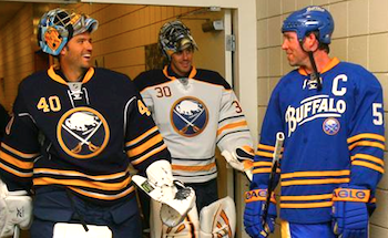 No changes to Sabres uniforms in 2011 / SabresThe Buffalo Sabres will retain their current home, road and alternate uniforms for at least another season, according to the club's new ownership.
This is old news but it deserves a place on the blog for posterity. Sabres blog Die by the Blade recently did a write-up on an online chat between fans and new president Ted Black, speaking on behalf of owner Terry Pegula. Among the topics were two that will please Icethetics readers.
Quoting Die by the Blade's Andy Boron:
- The slug will be taken off the scoreboard, and they team is considering some sort of fun "Slug Appreciation Day" for that event. He did not mention whether this would involve the proposed jersey trade-in/discount program.
- There will be no changes to the primary or third jerseys for next year.
Despite the sweeping uniform changes this season (back to something a little more traditional), the slug has persisted in some places, most notably, the arena. Totally unacceptable, right? Sounds like the new brass will be doing some house cleaning.
And of course, it's great to see that the current uniform set will remain unchanged. As it should be. But don't count out the possibility that the new owner may want to put his stamp on the club with a new third jersey in 2012-13 or beyond.
Related: A Look Back at the Infamous Buffaslug | Sabres Debut New Uniforms


Reader Comments (26)
lose the silver piping and "armpit stains" as well as the numbers on the front, and they are perfect, but thats being nitpicky
They should just go back to the black and red uniforms before the slug.
i am actually really happy about this. i think the sabres have the best jerseys in the nhl, so why would they change that? but, if they do get a new third jersey in 2012-13, i hope it would have something to do with the old red and black logo, or maybe a yellow third?
The current set is great. I'm hoping they lighten the blue on the home and road uniforms at some point though. The ultimate 3rd jersey would be a yellow version of the white "road" uniform.
this is nice to hear. I'm alright with the fact that they stuck with the navy and gold when they switched to the current look as opposed to going back to the saturated royal blue and yellow of the original jerseys, but i REALLY with that they'd get rid of the god awful piping around the shoulders and the ridiculous pit stains.
These uniforms are great. Riding out the slug-storm for four seasons was excruciating. I could go either way with the chest number. I'd say get rid of the silver/gray. The darker blue shade is what gives the jersey a modern feel to a classic look. At times it almost looks black, like the slug jerseys did.
As for the third jersey, everything is good except the yellow nameplate. I don't mind the cross-stitch look on the numbers or the separated pairs of yellow waist and arm stripes.
Lastly, PLEASE take the hideous slugs off the bottom scoreboard ring. Slugs don't snort smoke!
I agree with GCAP. I'd like to see the red/black/white again, especially that red alternate from 2000-2006
i actually quite like the slug & i'm keeping my ryan miller buffa-slug jersey, but i do prefer these 3 jerseys & i dont think i would change anything about them!
Glad to hear this. The one and only problem I have with the jerseys is the silver piping on the primaries. Besides that, this is great news and I'm glad they're keeping the jerseys.
I thought the numbers on the front was supposed to be a new idea that Reebok was going to do on all the jerseys. Buffalo was the first team to have the Reebok complete redesign, and then after they designed them they decided not to continue the idea on any others. I would be happy to see them go as well. I've heard of many people who custom order jerseys lettered up ask for them NOT to put the number on the front.
As for the idea of bringing back the red and black unis for some reason, I was never a fan of those personally. They were an unfortunate holdover from the '90s, when teams from all sports started changing thier jerseys to those colors, maybe trying to emulate the success of the Chicago Bulls. While accepted by the Sabres fandom, they were always referred to as the "Goat's Head" or "Flaming Yak" jerseys, looking more like either of those than an actual buffalo, and had nothing to do with Sabres at all. I think now that we have our classic logo back finally, we could do something with those as a "Throwback" type of jersey, but I'd rather not see them several times a season. I'd be interseted to see a new version of the crossed-swords alternate done in the new colors, that could work..
My only problem is with the pit stains, get rid of them and then its a perfect set.
Yes! I love this guy! If they are gonna change the third at some point I'd go with something like their old red third, except with the navy and gold color scheme
If Francesco Aquilini, the Canucks owner, had owned the Sabres and not the Canucks, he would have kept the Buffaslug, like he's kept the orca. Sabre fans are VERY lucky.
As a lifelong Sabres fan (I'm older than the team) this is GREAT news. And for you who would like to see the goat's head return, or the red-black, or any combination other than what we have now -- go away. The uniform set is PERFECT. It is a modern update to the originals and respects the history of the Sabres, and the third pays tribute to hockey in Buffalo and the old AHL Bisons.
I agree - lose the gray striping and the front number and the jerseys will be among the best in the NHL.
The best description that I've heard for the black/red/silver/white uniforms is this: they would have been great for a 1996 expansion team, but had absolutely nothing to do with 26 years of Sabres history. Quinn was smart to go back to the blue and gold, but had to put his own, unfortunate stamp on the team's identity with the slug. Fortunately, they figured out that it was a mistake and started the change back; Pegula will finish the job.
I'm OK with the change in plans on the 40th-anniversary jersey (was originally a one-year-only design), but I could imagine lots of great third designs for 2012-13. A re-colored 2006 third (crossed swords) is definitely an interesting option.
While these jerseys are significantly superior to the Slug ones that preceded them, they still aren't every good. The primaries are ruined with purposeless piping, pit stains and a dull colour palette that already looks dated. The Alternate would look alright without vintage white and the obtrusive, unnecessary nameplate. As it stands though, its just another trendy fauxback.
as a born and raised sabres fan, the sabres should NEVER bring back anything associated with the black white and red era. those jerseys totally changed the identity of the team for the worse. we looked like a bunch of other teams. but what they should do is go back to the original jerseys! forget about the whole "modern" look with the silver and gray. the originals are classics and timeless. they will never get old. and they should keep the 3rd they have now as the 3rd. just take away the yellow nameplate.
The blue slug jersey was going to be the third jersey for 2011-2012 before ownership changed and the "40th anniversary" jersey took off as much as it did. Hence why there was so much slug stuff left over around the arena this season...it was Quinn's baby...he didn't want to see it go away so quickly.
RE: numbers on the front, Sabres weren't the only ones. SJ, Tampa, and Islanders had em, while Dallas and Atlanta 3rds had them centered. However Isles have ditched them since going retro, ATL is ditching their 3rd, and the new Tampa jerseys won't have them. So that leave just BUF and SJ with them on the shoulder, Dallas still in the middle. They are pretty pointless, and simply removing them at least from SJ and BUF will only make those jersey better, Dallas' on the otherhand are hopeless.
Plus, I see people in SJ getting customized jerseys and the numbers on the front are in a totally different size then they should be. They are supposed to be smaller then the arm numbers, but the place they got them done probably didn't know so the use the same size numbers as on the arm, making their jersey look even worse.
Let's all have a toast that Quinn is gone. Make sure the door doesn't hit you or the slug on the way out, Larry!
I am very happy for Drew Celestino who originally founded FixTheLogo.com backlash against the leaked slug logo. Clearly now we now know where the majority of the fans stood in the whole logo debate. I am proud of our little blog and all of our contributors that patiently worked since the summer of 2007 to organize and rally support from the fans to fix this issue. We learned a lot of the RBK Edge Uniform system debacle and the Sabres and Ducks as it's first victim and in turn, with help from other forums like Icethetics, Puck Drawn, Puck Daddy, and Sportslogos.net sparked awareness from fans of other teams who also suffered uncacceptable changes to their team's identity. In addition, I want to thank Chris of Icethetics for his support, exposure, and SUPERIOR coverage of all things Uniform and Hockey related.
I am also proud that our site and blog had a measurable impact on how the Buffalo Sabres conducts business. The team's new ownership right out of the gate has put a premium on fan input, are working very hard on improving everything about the fan experience, and are pledging a sincere committment to capture a Stanley Cup.
Since he won't thank himself, I would like to tag on to Charlie's post by thanking him. Sabres Not Slugs was a great effort, even achieving national press attention.
@formeremployee: the Slug was not going to be the third or, at least, the plan had changed long before Pegula's arrival. As of November, the Slug was not coming back next year (and believe me, my source was not just some employee.)
Keep em as they are minus the piping and the grey pit stains like a previous poster mentioned. The third is classy too. Leave em be for a long while. No drastic changes please.
@carpandean My source was someone involved in the process-it could very well have just been a idea at the time but I have not been there since 09/10 season so I believe it when you say that the plan changed before Pegula arrived.
for the record: The reason the sabres went to red and black was to match Adelphia, the company our owners also owned. Pathetic.