


Does Mask Design Hint at New Logo?
 34 Comments
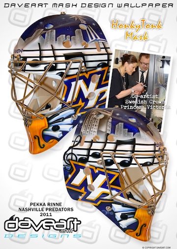 Pekka Rinne's new mask / daveart.comSwedish airbrush artist Dave Gunnarsson paints goalie masks for some of the best netminders in the world. His most recent work was done for Pekka Rinne and was revealed to the world via his blog this week.
Gunnarsson creates new masks all the time, but what makes this one noteworthy to Icethetics readers is the never-before-seen logo featured on both sides of the freshly painted helmet.
We already know the Nashville Predators are redesigning their home uniforms (presumably, the road ones as well). What we don't yet know is what they will look like.
The NP lettermark on Rinne's new mask does not look like any mark that the Predators have used before. So here's the question: Is it a future Predators logo that has yet to be publicly released? Or did it simply spring from Gunnarsson's mind?
[UPDATE 2:26 PM: For the record, if this is an actual Predators logo, my guess is that it would be nothing more than a shoulder patch or helmet decal or something.]
In his blog post, Gunnarsson talks about the HonkyTonk theme of the paint job but makes no reference at all to the NP logo. Is that because technically it's not supposed to be seen yet? Or are we reading way too much into this?
From what little I've seen of Gunnarsson's work, it seems he mostly adapts existing or past logos rather than creating new ones. This could be a departure from that. Or not. Don't know.
Your thoughts? Is this a sneak peek at a new Preds logo? Or am I making a mountain out of a goalie mask?
For a better look at the design, check out the mask gallery at daveart.com. My thanks to Nick F. and Kevin H. for sending along this information.

Reader Comments (34)
I hope not...looks St. Louis Blues-ish with the music notes..
A lot of blue and gold!
Usually I'm not a fan of lettermark logos on hockey jerseys, but if it gets this otherwise-respectable team to shed those god-awful silver sleeves, I'll tolerate it.
I thought they used an "NP" wordmark on their alternate jersey pants, don't they? Or does it look different?
Getting my hopes up for a yellow road jersey.
I think it could be more of a sneak preview of the color scheme for next year. Maybe the NP will
be used for a shoulder patch though.
I think it's nothing. No way the Predators would change their logo to something musical related when the St. Louis Blues are in their own division.
i hope that's not the new logo... nothing in it resembles a predator
Didn't realize I wasn't clear enough on this, guys. I'm not suggesting the musical notes would be at all part of a new Predators logo — just the NP lettermark. Also not saying it would be THE logo as in a primary mark, just A logo, as in a shoulder patch. Furthermore, I didn't say the Predators have never had an NP logo before, just not like this one.
The hoop of the P forms a fang.
It seems consistent for the rumors of more yellow. Think it might be nice to see more yellow.
I couldn't agree more Chris. I see it as a shoulder or pant logo.
Did they change their colour schemes to blue and orange?
That'd make a fine shoulder patch but not a main logo. The current predators logo is pretty ugly so I hope they make a significant change.
@Glen: Did not notice the fang in the P until you pointed it out...awesome detail of the logo.
@Spencer: I'd have to imagine that it's just showing up as orange in the pictures and is close to (or is) the Predators' old mustard yellow from the pre-Edge days. I hope it is anyway.
This NP logo is different than their previously-used NP logo (which was very tall and used on the pants for a season or two, see the jersey gallery for the Preds). It's a nice logo if it is, indeed, to be used on the pants. The only way I'm okay with it as a shoulder patch (if, in fact, it is an official new logo) is if the Skull logo currently on the shoulders becomes the primary mark (meaning that the current logo would be left just as the crest of the alternate, and even then only in a simplified color scheme).
I would have to imagine that this would be a new logo of some kind...let's just hope it's just a pant logo or shoulder patch (or helmet logo). I'm really excited to see the new unis for the Preds (and Panthers and every other team for that matter), so this is a nice little sneak peak, even if it tells us absolutely nothing about the new set. Haha.
Might be reading too much into it, guys. Look at Anders Lindback's new mask for next year as well (Silver P's for Predators, full logo on top):
http://www.flickr.com/photos/daveartmaskgallery/sets/72157626189588154/
Steve, I hear you and I saw Lindback's mask. But the fact that his has the current logos doesn't mean there can't be a new one added for the new uniforms next season. That's all.
I think it's just an embellishment of their standard font. I've bugged the Preds staff I know for months and they say the new design's locked up tighter than Fort Knox.
oh and this helmet's totally not mean enough. I'd love to see a saber-tooth cat version of Jonathan Bernier's mask
Honestly I prefer the np logo that they introduced with the thirds. The first game I went to with the thirds, I ended up buying a hat. That being said, I'm kind of concerned with this new np logo. It's not nearly as cool as the other, and the lack of yellow in the color palette worries me as well. If they're staying with their current colors, yellow needs to be predominant over the orange, which has always served as an accent color.
At first glance of this mask, i thought it was for the islanders.... blue and orange? Whats up with that..? Should be gold or mustard yellowish, not orange. Not a fan of anything going on there... my opinion.
I wouldnt be surprised if that is a new shoulder patch or pant logo.
Is it worth the mention that the playoff promotional items given out by the Preds are yellow?
I keep getting confused reading these comments... orange? I see where you're getting it, but I think it is more of a stretch to call the yellow-gold color "orange" than to call it "yellow." Unless you're referring to the violin(fiddle?), which has brown shading on it which could possibly make it look orangish... I dunno, it looks yellow-gold to me, not orange.
The NP should only be used as an alternate script logo, like the MH the Miami Heat use in the NBA. There current primary is fine, though it is a bit busy.
Is anybody here musical? What is the music on the mask sound like? Is it an actual song or is it just nonsense?
It could be part of a song but the notes are so basic it would just sound like a tune you hum to yourself. With only 8 notes to go off, without a scale or time, it's hard to tell.
The NP logo is a secondary logo to be used on their pants. Nothing more. Yes, they are simplifying their primary logo to make it less busy. Their home sweaters will be yellow/gold.
Please no. im tired of us being the butt of all jokes for our jerseys. something more subdued please? i like the current alternates. we dont need to propagate theory that the predators are run by Dolly Parton.
Something I find interesting about Rinne's maks as well as Lindbacks is the inclusion of orange as a prominant color. From what I can tell orange was really only included in small details of their logo and even then it's almost gold, whereas yellow/gold has been used much more frequently (alt jersey, piping).
Another interesting point which further pushes the orange can be found on NHL11, if you start a new season and go to select the Preds the background behind their logo is also orange. Not to mention
A lot of orange hints popping up for a team confirmed to be redesigning their unis.
That's not orange, although it shows up a little orange-y in this picture. it's a yellow/gold. I have been told all orange is going to be eliminated as they are going to a more simplified 3-color primary logo and removing what little orange was there. The new home jerseys will be the yellow/gold like the piping on the current homes. If you don't believe the yellow movement, tune in to Game 3 Tuesday night against Vancouver. The Preds are having a "gold out" with every fan being given a yellow/gold t-shirt and rally towel.
So, how about last night's yellow-gold fan shirt giveaway? Does that lend more credence of this new emphasis on the yellow color for Nashville? I certainly think so. Also, it was so hard to watch on TV with everyone dressed in yellow, it almost hurt my eyes. I hope they don't do it again.
You can hope they don't do it again but you'll be disappointed. They're doing it again tonight for Game 4. In the arena it looks awesome and is clearly yellow/gold but I noticed on the megatron and when getting home and watching the replay on TV, it sometimes looks a little orange and even reddish sometimes. I hope they have tested the new jerseys with TV cameras and they don't come off as orange like the shirts sometimes do. As a adamant non-Vols fan, I would hate to look like we're skating around in UT orange.
Meh. Not a fan of logos or word marks with initials of city and name. Reminds me of "Rheinfire" in NFL Europa. Seems very hokey. The only one I've seen that I like is the Rangers Libertyhead logo with NYR. But the R also acts to differentiate them from the other New York team.
Yes, navy blue with gold and white high-lights, Sounds and looks like they want to conform to the image a certain team not too far north west of Nashville with a much more storied past. Preds should go more gold/yellow and stop copying the ST. LOUIS BLUES color scheme for once in their short history.
Soon, it will be all over.