I can't remember the last time an NHL draft yielded so many new jerseys. Eight different teams used the 2011 NHL Entry Draft in St. Paul to showcase something new. So settle in, there's a lot to cover.
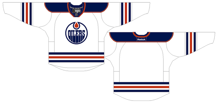
Oilers Go Full-On Retro
 1 Ryan Nugent-Hopkins, 19 Oscar Klefborn, 62 Samu Perhonen, 92 Dillon Simpson
After 16 years, the Edmonton Oilers once again look like they did when they entered the NHL in 1979. The Oilers used the first overall pick in the draft to select Ryan Nugent-Hopkins as well as to unveil their new retro road sweater — which now matches their home uniform, with the colors reversed.
This is exactly what Edmonton fans wanted and I'm happy to see them get it. The jersey looks fantastic! On the team's website, Oilers president Patrick LaForge said, "We listened to our fans and know they will be happy to see the set complete with the new road vintage jersey." Truer words were never spoken.
The Oilers also announced that the previous road jersey is officially retired. And while they didn't say so specifically, it's likely the navy and copper third jersey will remain in use next season.
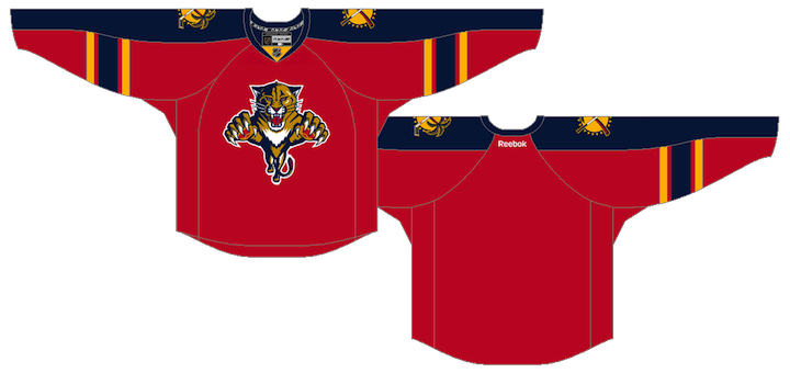
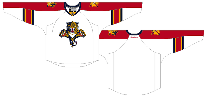
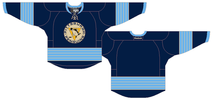
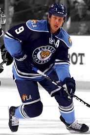
Seeing Red in South Florida
 3 Jonathan Huberdeau, 64 Vincent Trocheck, 76 Logan Shaw, 87 Jonathan Racine
Earlier this month, the Florida Panthers launched their "We See Red" marketing campaign — an effort to return to the franchise's color roots. This weekend, it culminated with the reveal of their new red home sweater, which was given to each of their 2011 draft picks.
The Panthers didn't do an all-out redesign with this jersey, but more of a color swap. The sleeves are now blue, but there is no piping on — a refreshing change of pace from the old jersey. So that's a big plus. All in all, I think this is easily the best jersey in the Cats' arsenal at this point.
But that's not to say it's perfect. The elbow striping is an element of the Reebok Edge template that I just don't like. Maybe if it went all the way around the arm. I also think gold piping would've looked sharp and added contrast between the red and blue on the sleeves. But these are not dealbreakers.
I don't yet know about the fate of their other jerseys. I would assume the white road uniform will remain unchanged. They could use the old home jersey (the blue one) as a third jersey, but I think the blue alternate they already have is superior. So I'd bet the old home sweater is retired.
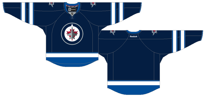
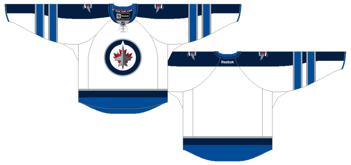
On Behalf of the Winnipeg Jets...
 78 Brennan Serville, 7 Mark Scheifele, 119 Zachary Yuen, 157 Jason Kasdorf
The new Winnipeg franchise used the occasion to announce their new name — or should I say old name? The Winnipeg Jets are once again an NHL team. How about that. Unfortunately, while the team had a name ready to go, they couldn't say the same about a logo and jerseys.
Each of their draftees were given generic black jerseys with the NHL shield on the front. Rest assured, this will not be the uniform of the Jets come the fall. True North chairman Mark Chipman has said it may be a while before we see the new uniforms and logo.
Illegal Curve tweeted some details from Chipman yesterday. He said they wanted to have a prototype jersey ready for the draft, but were worried about knockoffs showing up before they were able to put official merchandise on sale. So production time is likely the reason we'll have to wait to see the new branding.
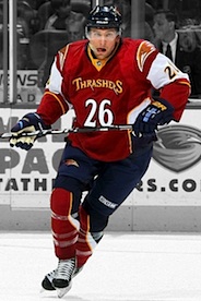
The team has also said that the colors "won't be completely different" from the old Jets. I take that to mean possibly a darker shade of blue and the addition of a third color such as silver. So another red and blue team, then. Fun. I may sound bitter, but at least the Thrashers and their too many colors were unique.
Earlier today, TSN's Darren Dreger tweeted, "I haven't seen the Winnipeg Jets new logo or sweater design, but I'm told it's very impressive." I'm sure it is. And I'm sure a lot of money is being spent to make sure of that. To be honest, I hope it doesn't leak so as to avoid the knockoff issues.
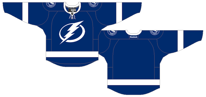
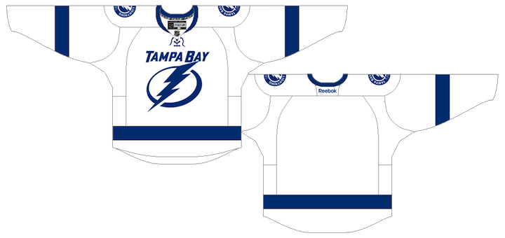
New Bolts Get New Blues
 148 Nikita Nesterov, 27 Vladislav Namestnikov, 178 Adam Wilcox
The Tampa Bay Lightning unveiled completely redesigned blue and white uniforms back in January. This weekend, they handed them out to their new draft picks in St. Paul.
There is one element of the jerseys that has changed since we last saw them at the January press conference. The numbers now feature an inner black outline after enough Bolts fans complained about the lack of black in the new threads. (I wasn't one of them.)
As much as I've praised these new sweaters, I was disappointed by one thing I noticed this weekend. Based on the previous pictures I've seen, I thought the blue was a lot lighter than it is. Turns out it's basically identical to the Maple Leafs' blue. Really not happy about that. Don't get me wrong, I'm still buying one, but I was hoping Stevie Y would do something to make us stand out.
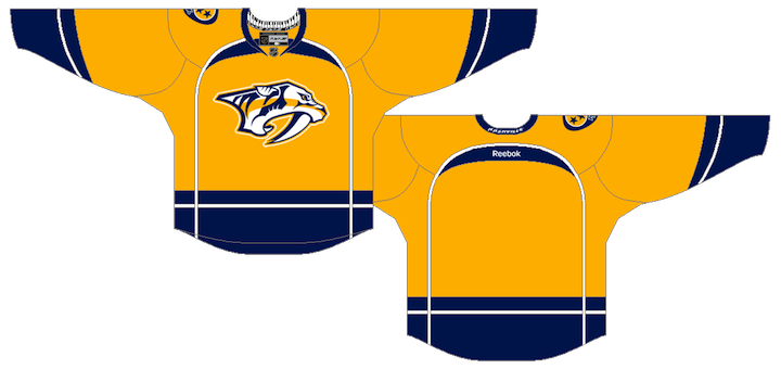
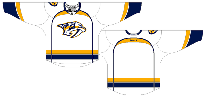
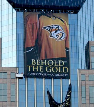
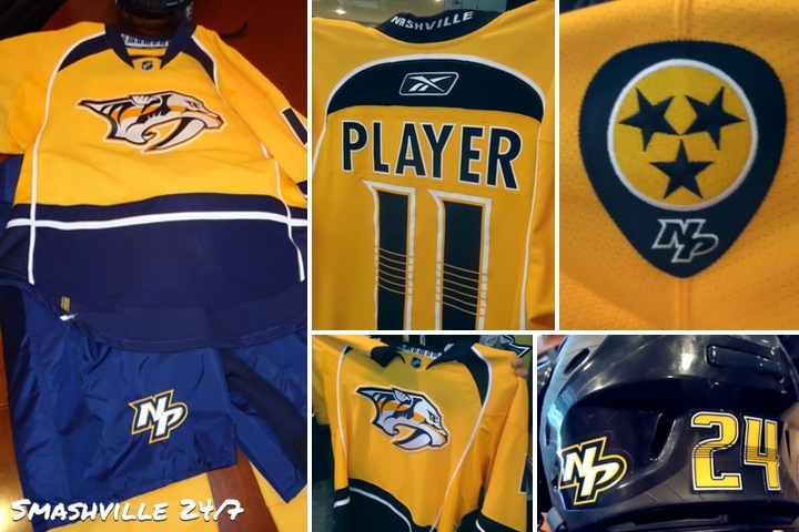
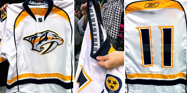
Predators Decide to Simplify
 38 Magnus Hellberg, 52 Miikka Salomaki
The Nashville Predators didn't have a pick in the first round this year due to the Mike Fisher trade, so we had to wait a day to see their new road jersey. As the NHL draft picked up with Round 2 this morning, the Preds gave the new sweater to their draftees, who became the first players to wear them.
While both new jerseys were sort of leaked on Thursday, we learned they weren't the final versions. Today we can play spot the differences. The biggest one (and only one that I could spot) would be the left shoulder which featured the word NASHVILLE in small text. On this version, it's only seen on the back of the collar. Everything else is basically how we first saw it.
Prior to the jersey leak, the new logos were officially unveiled, so I won't spend anymore time discussing them. I did want to note, however, that the new guitar pick logo is only used on the right shoulder of the road uniform. I suspect it will be the same on the gold home jersey.
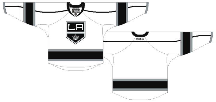
Kings' Worst Kept Secret is Official
 49 Christopher Gibson, 110 Michael Mersch
The Los Angeles Kings will have a new road uniform next season and their 2011 draft picks became the first to sport it for cameras today. (Like Nashville, they lacked a first round pick.) And for what it's worth, it was the worst kept secret of the year. We first saw this jersey way back in October!
Well a version of it, anyway. An Icethetics reader snapped a photo of what appeared to be prototype jerseys in Luc Robitaille's office at the Kings' practice facility before last season even started. To be fair, though, there's an L.A. pee wee team that's been wearing something similar for a while now.
They're nice. That's really all I can say. By dropping the purple from their palette, I think the Kings have done themselves a disservice. But the new jerseys aren't bad. But for the waist stripes, this new road sweater nearly matches the black and silver alternate the Kings have been wearing for a couple of years. It will become the new home jersey.
The old black and purple home sweater will become a third jersey and the old road sweater will be retired.
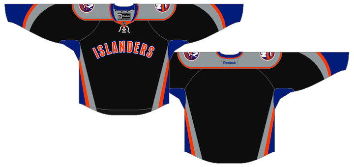
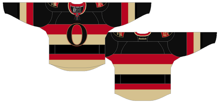
Isles, Sens Add Patches to Mark Special Occasions
 5 Ryan Strome, 127 Brenden Kichton, 21 Stefan Noesen
The New York Islanders have created a new 40th anniversary shoulder patch while the Ottawa Senators will wear an All-Star Game patch for the 2011-12 season. The new add-ons were first spotted on the teams' first round draft picks on Friday night.
This is our first time seeing the Islanders' new 40th anniversary mark and I'm still waiting to get a better look. So far the above pictures are the best I've seen. The Isles entered the league in 1972 with the Atlanta Flames, but Calgary tends to only recognize the Calgary years with their anniversary logos.
Ottawa hosts the 2012 All-Star Game next season but the logo was first unveiled way back in September. The Senators are also celebrating their 20th anniversary, but it seems that logo will be trumped on the jersey this season. Perhaps they could change it after the All-Star break?
If you've made it this far into this post, you're clearly the kind of person who will be interested in the following minutia. I'm talking about the breakdown of what jerseys were handed out by teams to their draftees.
- 21 teams gave colorful home jerseys to their draftees, 1 of which was seen for the first time (Florida).
- 7 teams gave white road jerseys to their draftees (Buffalo, Colorado, Edmonton, Los Angeles, Nashville San Jose and Vancouver), 3 of which were unveiled at the same time (Edmonton, Los Angeles and Nashville).
- 6 teams gave jerseys that have never been used in a game before, one of which will never be used in a game (Winnipeg).
- And 1 team gave an alternate jersey to its draftee. And that would be Minnesota. Perhaps a privilege of being host of this year's festivities.
I hope that answers all of the jersey- and logo-related questions you had about this year's draft. If it doesn't ask in the comments and I'll do my best to answer.


 9 Comments


