


Victoria Royals Unveil Logo, Jersey
 30 Comments
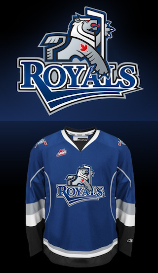 Victoria Royals logo and jersey / RoyalsTwo months ago today, the WHL's Chilliwack Bruins announced their relocation to Victoria. Now, the club finally has a new name and logo.
On Monday, the Victoria Royals revealed their colors, logo and dark jersey (right) — all of which will be used when they hit the ice to start the 2011-12 WHL season this fall.
Before I share my thoughts, got to tip my hat to Chris Creamer at SportsLogos.net for being the first to show the logo to us. He tracked it down in a trademark search a couple weeks ago.
Now the logo. I'm surprised by it. This may be junior hockey, but in Canada that's no excuse for having a below average logo. Nothing really stands out about it, except for the red maple leaf which looks tacked on.
In fairness to the designer, by no means is it on the level of the Connecticut Whale or anything. I was just expecting something more along the lines of fellow WHL clubs like the Giants, Rebels or Silvertips — not the Ice or Rockets.
The Province, in Vancouver, talked to artist Brent Lynch about the design.
The logo is a stylized, heraldic lion designed by Vancouver Island artist Brent Lynch of Nanoose Bay, who designed the Vancouver Canucks’ orca logo and the logo for the WHL’s Vancouver Giants.
“It’s a contemporary look that has a bit of an edge to it,” said Lynch. “It’s cool for the kids, and adults can relate to it, too.”
I'm not so sure. But then there's the jersey. Clearly, it's the Tampa Bay Lightning's blue third jersey with the new Royals logo on it.
The Vancouver Sun said this has to do with the quick turnaround time.
The franchise had to go with an existing colour template. Reebok didn’t have enough time to customize a colour scheme because the relocation of the Chilliwack Bruins to Victoria was only made official in April.
This explains why the jersey itself lacks one of the club's colors — red. No other team wears that color combination — blue, red, silver and black. A white jersey will be unveiled later this summer.
Now it's time for you to weigh in. What are your thoughts on the new Victoria Royals and their branding efforts? Am I missing the mark with my assessment or do you agree with it?

Reader Comments (30)
Victorian here,
I have mixed feelings about all of this.
-I like the logo, other than the maple leaf. Most of the teams in the WHL are Canadian, why the leaf? It looks and feels tacked on and unnecessary. I would bet money that it was not in the original proposal, but was something that management or ownership insisted on.
-I just can't unsee the bolts jersey, no matter how hard I try. I like the colours otherwise.
-I am worried that the white jersey will not match, as there is no white equivalent of this design. I guess this shouldn't be a big deal, but it bothers me.
-I'm looking forward to buying a jersey and supporting my home team, but the way they are talking about this one as a last-minute compromise almost makes it sound like they intend for it to be a placeholder. I think I'll wait for a season or two to see if they replace it.
I actually rather like the logo, although I agree that the maple leaf does look a little tacked on, it might just be because its red. overall its not bad though
How much nicer would that have looked on a leafs home jersey and a leafs 3rd for away.
I am disappointed with both the font and look of the Royals'. Victoria has a tremendous British population, and I can understand the rational for the decision in the name for the team, even the stylized lion that is represented, but the lack of creativity in its expression depresses me. Granted the previous team was the Salmon Kings, and their logo and colours had many different combinations over the years, but at least the logo and name was unique to Victoria. Why did they not just call them selves the LIONS or MONARCHS? I am also worried that the new NHL team in Winnipeg will suffer the same fate, as the relocation was only finalized today, so will Winnipeg suffer the same fate as the Royals'? I think the logo would have been improved if it was a V the lion was emerging out of. And the Royals Text was on the shoulder.
putting the jersey / logo to one side for one second, it's very troubling that a company as big as RBK cannot create a new jersey template!!!
BRING BACK CCM (or nike at least).
as for the jersey, always liked the 'bolts' design, so no problem there. the logo isn't the best tho.
I actually like it, except for the big Royals wordmark. I think the Lion would look much better on its own. I hate that CHL & AHL teams feel the need to spell out the name of their team AND have a logo at the same time. That being said, the execution is cleaner than most.
eh.... not bad, but not great either. Just.... average.
Honestly, it looks like a bird's eye view of a kitten playing with a hockey stick.
I think the uniform would be better without the wordmark.
Why the heck is he licking the stick?
I would like to see a version without the "Royals" text. I think the serif font is too basic and common. If a word mark was required by the club, I would have aimed for something more heraldic to match the icon.
Wonder if it'll have victory stripes...
I think the logo would work with just the lion and no word mark, and yeah I cant unsee the Lighting either...but overall I think its pretty decent.
I like the blue primary with just a touch of red accent, lose the black and it would be awesome.
reminds me of the blue jays, the maple leaf is definitely not needed. Agreed it feels quite rushed. Get rid of the royals mark all together and just have a hearldic lion. I like the idea, i guess its just the execution that i don't really like.
Lets hope the Jets don't fall upon the same rushed fate.
Probably would have been better without the wordmark - just the sigil-style lion holding a hockey stick. Maybe put the logo on a shield too.
I'd say a 7/10, room for improvement, but not an abysmal failure like the Whale which Chris mentioned.
First of all, I'm a Vancouver Islander so I'm pretty pumped about the WHL coming to Victoria.
The logo's pretty lame. I like the name (in fact, I voted for Royals) because it suit Victoria very well and it's unique in that there's so few hockey teams with the name. I also felt like the name had a lot of potential for a unique colour set and logo. Obviously, they kind of dropped the ball on the unique front. I'm able to over look the jersey since it seems to just be a place-holder but blue, silver, and black? Come on! I was hopping for something a little more original like purple and gold. With LA going back to black and silver, the Royals would be the only team with this colour scheme. Actually, I think they'd be the only team with purple, period. In the leagues I follow, anyway.
I'm disappointed by the colours but the logo's almost as bad. It's so busy. Drop the wordmark and the maple leaf and it would be a okay logo. We're part of the CANADIAN Hockey League and your team's called the Royals - I'm guessing your from Canada! There's already too many teams with maple leafs on them. Some originality please! And I'm not a fan of wordmarks on logos but I'm really not a fan of wordmarks that are boring. Like someone else said, if you need a wordmark, at least make it a little more heraldic looking. Simplifying this logo would go a long way but, at the same time, might make it look more like the Royal Bank logo. Again with the unoriginal!
I actually really like the logo, although I do agree with the rest of you that the maple leaf is really unneccessary.
I don't think the logo's bad. I agree with most of the people above me that I'd like it better without the wordmark on the front and I would've liked to have seen a unique jersey design, though the white version will have to be unique, will it not? Unless they pick another jersey from a different, non-matching set.
The Maple Leaf tattoo on the lion's shoulder would be better if it wasn't on there...or if the jerseys reflected it (red maple leaf shoulder patch with Kansas City Royals-like "Royals" script across it maybe?).
It's not bad at all, but it's not great either. It looks like if they had an extra month it would be great, but I guess deadlines are deadlines.
this is a sad addition to a league of pretty good jerseys, like the whl.
the regina pats
the edmonton oil kings
the medicine hat tigers
the red deer rebels
the seattle thunderbirds
the spokane chiefs
all have great jerseys.
this is not one of them...
“It’s cool for the kids, and adults can relate to it, too.”
Now how will I be able to relate to that logo? Licking a hockey stick isn't something I truly relate with....
umm whats the bump of grey above the Y anyways? I would like it if it had any reason for being there. kinda kills it
Horrible.
The stylized british lion has been massacred here by:
-slapping a maple leaf tattoo on his bicep like he just visited a tattoo parlour at age 17
-inserting a hockey stick it now appears to be licking
-chopping off his legs - if the full lion was placed underneath the wordmark, the legs would protrude below
The wordmark is unexplicable. Not a bad font, but why is the lower paw so awkwardly covering a seemingly random area of the mark? No effort to blend the two at all.
Given the name and the elements they are working with,, it could be a wonderful addition to the CHL's classic looks. Sadly, it seems as if someone was told: Take the lion, maple leaf, hockey stick, and the word royals, slap them together, and make it blue, white, grey, black and red. Oh, and make it snappy.
Apart from the bland logo, they really screwed up. The Lion clutching the hockey stick is clearly influenced by the ancient art of heraldry. The Lion itself I'd classify as "Rampant" (although it's hard to tell because the legs are cut off, so it easily could be "Sejant Erect" but that's minor ).
Where they really screw up the heraldry motif is that the Lion is facing Sinister... which is one generally strongly frowned upon. In fact, it's nearly impossible to find a sinister facing animal in heraldry, unless the arms are presented Accolé (Husband and wife, where the Husbands is intentionally flipped 180º to face the wifes arms) or if the animals are facing each other.
(a good primer on all this stuff is here: http://www.americanheraldry.org/pages/index.php?n=Primer.Page1
I actually kind of like the logo and sweater to be honest.
For a first try, I think it's good, they will more than likely improve on it in the years to come but at least it's a good start! I like it!
Maybe remove the wordmark like others said, incorporate a bit of red in the jersey, perhaps a little stripe between the white and silver stripes and I think they'll have a winner!
I honestly thought that open mouth and tongue was a red and blue mustache. I couldn't figure it out.
and Brent Lynch puts his ugly mark on yet another BC team.
The thing I can't unsee is the Royal bank logo - would have like royal purple with white and gold
I still hate that colour scheme. Why not go with the kings purple black and white or use the colours from the chilliwack Bruins third jersey? this is plain awful. The wordmark in the logo sucks, the colours suck. Ugggggg
How is it possible to mess up a british lion logo?
Montreal Juniors are moving to Boisbriand, expect uniform overhaul