Behold the Gold: Preds Unveil Jersey
 Wednesday · Jul 13 · 2011 | 10:34 PM PDT
  52 Comments
  Predators unveil new home jersey / Predators
 The Nashville Predators became the first team in 21 years to use a solid yellow primary sweater as they unveiled their new home uniform today.
(For the record, it was the Vancouver Canucks in 1989 to do it last. But then they've worn pretty much every color at this point.)
Here's a slick promotional photo.
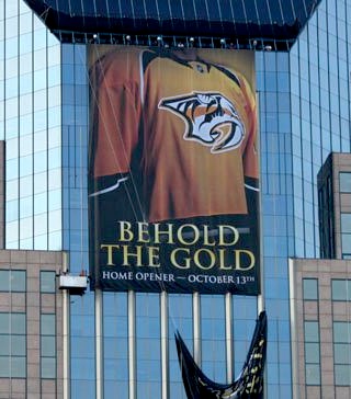
The Predators revealed the new look Wednesday evening, literally, on the side of a skyscraper, at their Skate of the Union event. They also launched the Behold the Gold marketing campaign which is obviously meant to draw attention to the new brightly-colored jersey.
Here on the blog, we got our first look at it when it was leaked back in June. It's basically the same as that original image save for a minor detail or two. And it looks just as incredible as it did then.
Reaction was largely positive as we've been presented with a clean, solid design and bright colors you don't often see in the NHL. These are all good things and should be welcomed with open arms.
I give it three thumbs up (I'm going to need to borrow somebody's thumb) for standing out in a sea of sameness in this league. I'm thrilled to see them drop the blue jersey — which is becoming overused. I'd say it's one less we'll see in the NHL next season but then I'm betting on a blue sweater from the Winnipeg Jets, whenever that comes.
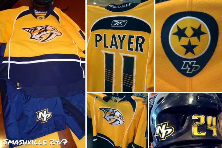
Enough chatter from me. I'll leave you with a collage of photos from Smashville 24/7. Also don't forget to check out photos tweeted by Preds winger Blake Geoffrion and of course, the Predators themselves.
 Predators unveil their new home uniform for 2011-12 / Smashville 24/7
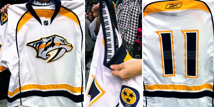
And just to be thorough, here's another look at the road jersey which was unveiled on Draft Day, June 24. These photos were posted to the Predators' official Facebook page.
 New road jersey debuted on Draft Day / Predators
I like the details, including the keyboard inside the collar and the guitar strings across the numbers. This is a very musically-themed uniform set and it doesn't look minor league. A tough task, but they've pulled it off. I almost want one. (But my Bolts have two new sweaters coming out soon.)


Reader Comments (52)
I kind of dig it though I really didn't think anything was wrong with the previous jerseys (though their alternate was ugly as sin).
The original gold back about 12 years ago was a much cooler color. It was more of a mustard color and was the most unique color in all of sports, plus the logo on the front was a 3D image, but the team did away with this 3rd jersey a few years back and this is weak make good, but better than the blue. Predators nickname has always been weak, but Sabertooth Tiger is cool.