


QMJHL Adds Armada
 32 Comments
 The QMJHL team that didn't really have a name has been rebranded — and now it doesn't really have colors. The Montreal Junior Hockey Club moved about 20 miles northwest and are now the Blainville-Boisbriand Armada.
The new name, logo and uniforms were officially unveiled today at a press conference at team's arena in Boisbriand. The bland palette is black and white with what appears to be an inkling of silver as a trim color — a lot like the Los Angeles Kings' depressing new look.
Despite its unfortunate lack of color, I like the design of the primary logo. It's very clean and bold. And it looks like every element of the mark was carefully positioned. You'd think that'd be a given in logo design these days — but then you saw the WHL's Victoria Royals logo, right?
The sweaters are simple, but they almost feel like an afterthought. Here's a look from the QMJHL's website:
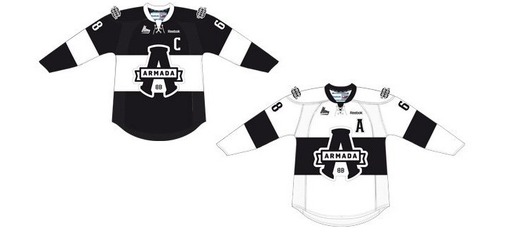 Blainville-Boisbriand Armada jersey design unveiled / QMJHL
One thing I will say about this branding is it's definitely not targeting children with bright colors and cartoon creatures. This is an all-out effort to create a professional look for a junior hockey club. I give it a tenuous thumbs-up overall. A solid effort in design but sorely lacking in personality.

Reader Comments (32)
Looks great!
I like them. Nothing wrong with black and white.
At first I liked the logo, but then noticed the "A" kind of looked like a pair of pants and now I can't unsee it!!
So nice , Such a clean look reminds em of a soceer jersey a bit .
The white jersey is almost an identical twin of Colorado College's home jersey that has been worn for the past 12 years.
Love the crest and the sweater design, I'm with you though... not a huge fan of black and white (but the kings do pull it off well)
I am usually not a fan of back jersies...but in this case it works. The team wasn;t going for back as a marketable fashion jersey...it was going for a very clean and professional look.
This look should translate very well to the ice..not just being modeled at a press conference.
The Kings' look is not depressing. It's clean, crisp, classic, and -- considering the current NHL landscape -- different. Would you prefer a blue alternate jersey with a logo encircled by the team's name?
As for the Armada... pretty solid design. The Blainville-Boisbriand name leaves a lot to be desired, though.
The owner, Québécor, had a TV show called Québéc-Montréal where amateur team formed of people from respectives cities fought a series and the shirts of the Armada looks like these used from both Montréal and Quebec team without the local colors...
http://www.boutiquelaseriemontrealquebec.com/
I wouldn't want multiple teams in a league doing it, but a black and white uniform is great I think.
On the positive side, they didn't forgo a logo to spell BLAINVILLE-BOISBRIAND across the chest a la the Dallas Stars' pathetic home sweaters. Still, have to say that, as someone who grew up when nearly all the televisions were black and white, seeing uniforms now in black and white on HD screens leave me scratching my head as to why the widespread lack of imagination.
And as an aside to Josh C., just think of the logo as a retro endorsement for Cooperalls.
Wags: No, I'd like it if the Kings kept the purple that made them stand out. I really like the LA logo, but it's pretty bland without any color in it. But if the only branding options you allow for are black-and-white or a played-out blue third jersey design, that's even more depressing.
The logo looks similar to the Amherst Ramblers of the MHL (Maritime Junior Hockey League)
Wow, this is beautiful - very well executed with a retro flair - looks like an old crest that was dug up from the 40s, or something you'd see at the Roots store - I'd love to see more teams go in a direction like this!
I personally think the colours are kind of cool now that the big black craze of the '90s seems to be over. It's almost like a black jersey is going "against the rules" again. I think this team as well as the Kings could really stand out now. Unfortunately the Kings do play in the blackest division jersey-wise in the NHL with Dallas, Anaheim, and SJ's third.
Thanks a lot Josh for the pants comment. I can't unsee it either.
The jerseys are seriously boring. Really don't like the new Kings one or this. I need to see at least a little bit of colour. Replace the black with red. Then you have a Canada jersey! DO IT!!!!
Phoenix's third jersey is black too!
If this had some colour accents this would be an unreal jersey. I like the design, it's just a tad bland.
I think they are absolutely superb....totally agree with a few comments made above. 1) They have a somewhat 'post-modern' vintage look, if that makes any sense. 2) They will transition to the ice well. Totally agree. Few teams in the NHL can truly pull of the two colour combo, and those that have are Classics, I.e. Toronto, Detroit. I mean look at Tampa's new colours this season. Blue and White, not even a touch of silver. Stevey Y knows how traditional and well respected the Wings jersey is, two colours. Two colours is a statement, attempting to truly brand a team. The simplified Lightning Bolt for example.
Not only is the A log solid, the fact it represents what is a great team name, the Armada, is even better. Once outfitted with black and white socks, gloves, skates, they will be sharp!
if you think LA's b&w jerseys are depressing, you obvioulsy won't like these. but i think LA's black is in the NHL's top 5. and the armada's jerseys are almost as good. can't wait to see it with gloves and pants. again, certainly in CHL's top 5. an example for every other team. i hope the new team in sherbrooke is as professional.
the fact that its black and white gives them a unique personality, the fact that thers no other twam in te Q qit black an white jerseys makes it a cool look that is intimidating lik newxealands all blacks in rugby. The kings are cool but a step back since no team has purple anymore in the league
THIS.
IS.
AMAZING.
That logo just became the best logo in junior hockey.
The Armada is now my second favorite favorite junior team after Oshawa, just because of this jersey.
WAY TO GO, finally a team gets an actual graphic designer to rebrand a team.
@Chris - As a long time Kings fan, I couldn't agree with you more...
I'm not sure how you can like the Lightning jerseys and call these ones lacking in personality. They are simple and clean and classic and far better then any other CHL teams recently.
Crest looks like a stapler
That looks AWESOME. It almost has a rugby feel to it. Very old-timey.
Is it me or could you see the logo and name on a beer? But Overall solid, clean and simple design.
I live near the team's arena. In the local paper, the photo made the jerseys look brown and white and I thought, 'Wow, that's strikingly muted.' Black and white is fine. I like the letter-logo, too. It says, 'We're busy playing hockey.' But I wish they had chosen a name that could be represented by an image, like the B.-B. Loups (B.-B. Wolves), then the fans could have cheered, 'Babalu!' Just kidding.
I really like this set, but it may be just because I really like Oreos.
disappointing. what a great name, Armada,what an opportunity to imagine logos with fleets of warships, similar to the baie comeau drakkar one. instead, we get a plain 'A'.
meh
Why did the Victoria Royals have to go with an existing Reebok jersey when the Armada got to make their own jersey?