


Store Leaks New Sens, Leafs Jerseys
Finally, I have photos of unreleased jerseys that I'm able to share with you. A reader wrote in today to tell us that the Buffalo Sabres' team store at the First Niagara Center (formerly HSBC Arena) is already selling Premier version of the Ottawa Senators and Toronto Maple Leafs forthcoming jerseys.
First, here's the Sens' Heritage Jersey which, the team announced the other day, will be officially unveiled on October 1. You get to see it now.
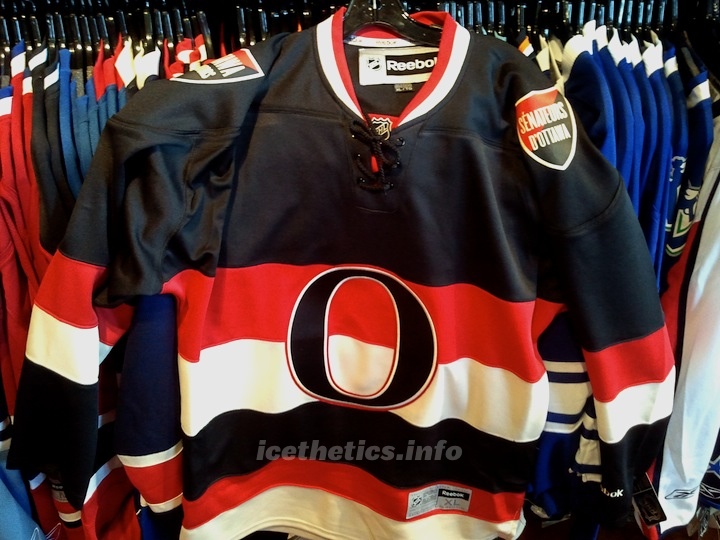 Ottawa Senators' Heritage Jersey leaked / icethetics.info
And as previously reported here, you can see it bears bilingual shoulder patches. A recent photo released by the team had us questioning whether that would actually be the case.
The other unreleased sweater on the store's rack was the Leafs' new throwback third. Take a look.
 Toronto Maple Leafs' new third jersey leaked / icethetics.info
One detail previously reported here on Icethetics was the silver inner-outline inside the crest. You can just barely make it out in this photo. We're looking at photos taken by a cell phone camera in what's not the best lighting conditions. I've done my best to tweak these photos.
So now that you have something more than my renderings to look at, have your opinions changed on these two sweaters? Are they at all what you were expecting/hoping for?
 Chris
Chris
I've been enjoying a nice, long four-day weekend, and as such have also been keeping my distance from the internet. But I thought I'd check in with some updates on Saturday's leaked jerseys.
First, it seems every media outlet in the universe has picked it up. Which is cool. Nice to see Icethetics getting a few extra mentions around the web. But most notably, both the Senators and Maple Leafs have been forced by the media to react the leaked designs.
 On Sunday, the Ottawa Senators posted an article on their website that confirmed their new Heritage Jersey had been prematurely revealed online. Yeah, sorry about that. But some of us don't like waiting and an opportunity presented itself.
The Sens are not blaming Icethetics or even the store where the photos were taken. They're placing the blame squarely on Reebok, as they should. The jerseys were simply shipped out too early. NHL teams launching new uniforms are supposed to get a five day window of exclusivity in their own market from the day of unveiling — which should be Oct. 1–5. So it was a mistake. A big one.
The Senators are still planning the "official" introduction to fans at Puck Drop on Oct. 1. But in the meantime, they did reluctantly offer some details about the design:
“While we are very disappointed to have our new jersey revealed in this manner, we are pleased to see the early comments from fans are extremely positive,” said Jeff Kyle, Senators vice-president of marketing. “We believe that this jersey will be a top seller in the National Hockey League this season, especially as fans learn the story behind how it was designed.
The heritage jersey pays tribute to the early Senators teams that won 11 Stanley Cups and was one the franchises that founded the NHL in 1917. The early Senators were considered the NHL’s first dynasty, with accomplishments so great that in 1950, sportswriters voted the Ottawa club as the team of the first half century in Canada.
“We have spent over two years developing this uniform and one of the most interesting aspects is that we did it in conjunction with a Senators fan,” added Kyle. “We look forward to telling the story of how a fan helped us develop a uniform that incorporates elements of the early Senators teams into what we feel will become a truly iconic symbol of Senators hockey.”
I do look forward to the story of the fan who helped develop the uniform. If they're talking about the guy I think, then we know him as Jacob Barrette. It's certainly been years in the making for him.
 Then yesterday, the Toronto Star took the other photo to the Toronto Maple Leafs for comment. They also confirmed the design and expressed disappointment at not being the first to show it to their fans.
Additionally, the Star learned that the jersey will be "officially" unveiled during their regular season opener on Thursday, Oct. 6. It's not clear if they plan to wear them for that game against the Montreal Canadiens, or simply show them to fans that night. If I had to guess, I'd say they're wearing them.
Here's what the team told the Star about the leak:
"Yes, the Leafs organization is aware that its third sweater was unexpectedly revealed," Rajani Kamath, MLSE’s director of corporate communications, said on Monday. "While our organization is disappointed that we did not have the first opportunity to reveal our third sweater, we are looking forward to ‘officially’ introducing it to our fans later."
On a personal note, I think the Sens' Heritage Jersey looks fantastic. I wouldn't want to see it more than 15 times a season, but it's definitely a great alternate uniform. So well done to them. With the Leafs, I like the design of the new third, but it's just not different enough from the home jersey to satisfy me. Not much they can do about that though if they wanted to revive something from their past.

Reader Comments (94)
As a Leafs fan who hates the Senators, I am very disappointed. Theirs is great and our is "meh".
The Sens sweater looks amazing! Easily the best one they have ever worn. If that doesn't became a permanent fixture for the Senators they are crazy.
The Leafs sweater is utterly uninspiring. Its not that it is awful, its just that it is such a big step down from the last one (which was arguably the best sweater in the whole freaking league), that it seems awful in comparison. I hope the 36 point Leaf makes a comeback soon.
Ottawa - 11/10
Toronto - 7/10
Why is the "n" in TOROnTO the only lowercase letter. That bugs the crap out of me
You sure one of the Sens patches aren't in German? It's just two flags stacked on each other.
Somebody, somewhere is going to get axed for this leak.
i alway wanted the leafs to use this jersey but if it was white with blue shoulder pads. that would be a jersey.
Funny how no one has commented on the weird lower case letter 'n' in the Toronto crest that got messed up...
Could be worth a lot of money for that mistake one day maybe...
I like how the Leafs jersey sports all uppercase lettering except one character. Seems that organization can't do anything right, heh heh heh.
Don't like the lowercase "n" in Toronto on the Leafs jersey. Looks like a typo. Both jerseys are solid overall, though.
I'd buy the new Senators' alternate. Not too sure on the Leafs' new alternate, though I'd like to see how it looks on the players first.
There's something 'unbalanced' about the Sens jersey. I'm not sure what it is (maybe because the photo is an XL?). I think it would look better with a bigger O/smaller stripes. It seems odd with the O and stripes lining up exactly. I'd also like a creamier vintage-white, or a pure white. It seems like it's a bad compromise right now. But those are minor complaints. I still love it and will probably buy one!
The Leafs jersey looks good, but I don't like the font on the logo.
Hey, im from Buffalo and was at the Sabres store today. They had a cool discount where if you wear your old slug logo jersey shirt hat etc. Then you get 41% off of a new item of similar value. Ex. I had two slug jerseys so i bought an ehroff and myers for my sister for just over 200 dollars. Not too shabby.
But anyways, my real point is, while i was there, i decided to go check out the around the NHL rack, and these two jerseys have both been taken off the shelf. I asked about them and the Sabres said that they have not put out any unreleased jerseys. I guess it was just an employee error.
That Sens-Hawks connection goes back a long way. The Sens' is like the Hawks' recent third. Which is an interesting twist. The hawks came into the league when the original sens were already several times' champion, so they obviously did not mind designing their jersey to be somewhat like the sens of that time. (stripes, colors) When the sens came in in '92, the original jersey and logo were supposed to reflect the hawks' design somewhat, too. (Believe it or not!) So it's gone around a few times.
I like the new jersey a lot and have one on order. The Leafs' one is right out of '67, and that's ok with me. A good year. Some day, I'd like to see a Sens-Leafs game with 1927 jerseys. But just once. The 20s had ugly jerseys, I think.
@James O
In a corner there is a small rack of other jersey from around the NHL. Nothing special, most NHL teams do it i believe.
To answer your question about the centering of the logos and what sizes they are, if you look closely in the bottom right, the Sens jersey is an XL and the Leafs is a Medium, so that answers that questions. I already have my pre-order in for the Sens one. Love it.
The Leafs jersey is a replica of what they wore in 1967 when they last won the cup.
Love the stripes and the "O" logo in play. Would have really loved to see the 1992-2007 logo on the shoulders rather than the shield. Can anyone confirm if that is white or vintage white as I can't tell from the photo? Please don't be vintage white...
From the 6 arenas ive been to, they all sell other team jerseys except in Pit and NYI (islanders because they dont have an actual store, just kiosks)
both jerseys will look good hanging in the closet durning the playoff
I really like the Leafs 1967 logo style jersey. In fact, I think they should ditch their current regular jersey for the other third jersey (circa 1964) that they've paraded out a few times a year since 1999. Yes, have both jerseys from the 1960's.
The Leaf one is a replica of the jersey and 11 point crest they wore in 1967 to 1970. As such, it's welcome, and about time really. The present jerseys are based on the style that preceded this new one, and were worn for many years. Therefore the previous, white 3rd jerseys were a bit redundant, except for the large blue shoulder bars. What they really should do is return the original 35 point logo that graced that white 3rd, to the regular uniforms, and get rid of the corporate logo. That would be a great return to tradition, and besides, they haven't won a cup wearing the corporate one.
Both are awful. The Sens looks like the Ottawa 67's old jersey which was terrible. The leafs previous 3rd is WAY better. They should have brought back the 70's - 80's jersey. That would look very cool today as the 3rd jersey
The Toronto logo appears to be in capital letters except for a lower case "n". This doesn't look right if you ask me. It looks like a mistake or that someone has a poor grasp of the English language.
I think the Sens problems have been since they had that
"O" on the shoulder patch of the jerseys. Now they put a great big"O" on the front. Watch how bad they get when everytime they look at each other they they they are as good as and worth 0!!! Check when their troubles started and when the "O" was put on the shoulders.
Just saying the mind can mess with you at times.
Does anyone find the small 'n' a little out of place on the Leaf's jearsey? Almost like a kindergarten student wrote it?
So much for staying traditional. Leafs stated that they didn't believe in having a 3rd jersey. I guess they couldn't pass up the $$$.
The Sen's "O" looks a lot like the University of Oregon's "O"
Why would the "n" in Toronto be the only lowercase letter?
Sens jersey => VERY VERY NICE!!!
Chris, you should come up with some realignment ideas, post them in a blog and then have everyone vote! It'll be interesting to see what people think, especially with all the rivalries around the league and keeping certain teams together.
Makes me wish hockey uniforms operated in a similar manner to soccer, where you can have 2+ team jerseys in different colours but not necessarily white. You could have both these jerseys worn in the same game.
I saw someone wearing the new Leaf jersey today. He picked it up in Buffalo. There is no silver outline on the Leaf. It's a slightly raised 'white' edge on the Leaf.
The Toronto jersey is nice (for a 3rd) and nothing beyond what i was expecting. I would consider buying it. The Ottawa jersey....seriously ? the O says nothing about the team or the city. its just an O with the team colours..please! someones 4 year old could come up with a better design. The Ottawa Sens "image" can not be condensed to a simple O with a couple stipes of colours. Very UNIMAGINATIVE! At least the Toronto Maple Leafs logo actually REFLECTS the team and the country. The Sens jersey is a waste of time, money, fabric and media coverage. keep in mind the angry guy logo that currently is on thier jersey blows too.
yes i am a sens fan and a leafs fan, so i am not being biased..i just like to think i have taste.
This league looks nicer and nicer with every leak! (P.S. My Blues are beating your Lightning 1-0 at the moment, Chris)
I can't find anything attractive about the 'Big O' on Ottawa's jersey. The centre of the O looks like a Contact C capsule. It's really missing something. Maybe putting Ottawa on the jersey front would have been nice - I'm just saying... Stripe colours are good, I'll give it that.
The leafs jersey... oh, is that a new design? Ho hum. Really 'though, an 'inner outline"? It's called - wait for it - an 'inline', folks. I think the white stripes are just too big. They overpower the leaf. I still like the 70s jerseys from the Sittler-Keon years best. Call me crazy.
To those commenting on the linguistic character of Ottawa, the National Capital Region in general and the bilingual shoulder patches on the new jersey. Yes, there is a large Francophone presence in the area. Ottawa, in Ontario, is on the border with the Province of Québec and specifically the former city of Hull across the Ottawa River, since named Gatineau as part of a regional municipality and because it was named after a city in England. I'm surprised that the language police took so long...Anyway, a succession of federal Liberal governments whose Prime Minister's were both French and from Québec decided to create a National Capital Region tear down a bunch of government offices in the City of Ottawa and build new, modern offices in the downtown of the former Hull so that the civil service employees that no one could or can understand on bureaucratic phone lines wouldn't have to cross the river to go to work in the morning. Ottawa's new retro jersey is very cool but Toronto's seems plain and font-deprived.
Oh, and the Toronto jersey put me to sleep. Unless you bleed blue and white, you'd be hard pressed to notice any difference. Why not use some imagination, god knows TO fans need it, and use some colour? Add some red and be damned if someone thinks that's too "Canadiens". Other teams use red white and blue like the Rangers and Columbus. Better yet, use a similar look but change the blue to royal blue, that would sell a lot of jerseys. Way more than this will.
they both suck
Is that a silver line on the leaf? or is it a white one similar to the line on the current leaf?
I scroll through all these comments and I see a bunch of "n"'s and "o"'s peppered throughout. All I can say is, my sentiments exactly.
Also, can we stop referring to the Harold Ballard squared-leaf as a "corporate logo"? The Leafs were not a corporation when they squared off the leaf, and I'm fairly certain they're still not.
The 'N' is lower case in the word 'Toronto'.
The 'M' is lower case in the word 'Maple'.
Can anyone explain why this is the case?
Yeah, the Ottawa market is about 35% francophone, so makes sense reaching out to the franco-ontarians and quebecers within the market
I can't wait to buy one of the Sens new jerseys. They look great, & I'm looking forward to seeing them on the ice!
I liked the Leafs old 3rds better... It was the best Jersey in the leauge
wow both of these look great. i love the vintage feel with both and man did Ottawa do a great job not over-killing the stripes, the patterns perfect, the "O" really stand out and the shoulder patches look great! And cant complain bout the leafs, nicely done!