


Store Leaks New Sens, Leafs Jerseys
Finally, I have photos of unreleased jerseys that I'm able to share with you. A reader wrote in today to tell us that the Buffalo Sabres' team store at the First Niagara Center (formerly HSBC Arena) is already selling Premier version of the Ottawa Senators and Toronto Maple Leafs forthcoming jerseys.
First, here's the Sens' Heritage Jersey which, the team announced the other day, will be officially unveiled on October 1. You get to see it now.
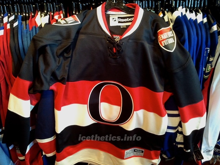 Ottawa Senators' Heritage Jersey leaked / icethetics.info
And as previously reported here, you can see it bears bilingual shoulder patches. A recent photo released by the team had us questioning whether that would actually be the case.
The other unreleased sweater on the store's rack was the Leafs' new throwback third. Take a look.
 Toronto Maple Leafs' new third jersey leaked / icethetics.info
One detail previously reported here on Icethetics was the silver inner-outline inside the crest. You can just barely make it out in this photo. We're looking at photos taken by a cell phone camera in what's not the best lighting conditions. I've done my best to tweak these photos.
So now that you have something more than my renderings to look at, have your opinions changed on these two sweaters? Are they at all what you were expecting/hoping for?
 Chris
Chris
I've been enjoying a nice, long four-day weekend, and as such have also been keeping my distance from the internet. But I thought I'd check in with some updates on Saturday's leaked jerseys.
First, it seems every media outlet in the universe has picked it up. Which is cool. Nice to see Icethetics getting a few extra mentions around the web. But most notably, both the Senators and Maple Leafs have been forced by the media to react the leaked designs.
 On Sunday, the Ottawa Senators posted an article on their website that confirmed their new Heritage Jersey had been prematurely revealed online. Yeah, sorry about that. But some of us don't like waiting and an opportunity presented itself.
The Sens are not blaming Icethetics or even the store where the photos were taken. They're placing the blame squarely on Reebok, as they should. The jerseys were simply shipped out too early. NHL teams launching new uniforms are supposed to get a five day window of exclusivity in their own market from the day of unveiling — which should be Oct. 1–5. So it was a mistake. A big one.
The Senators are still planning the "official" introduction to fans at Puck Drop on Oct. 1. But in the meantime, they did reluctantly offer some details about the design:
“While we are very disappointed to have our new jersey revealed in this manner, we are pleased to see the early comments from fans are extremely positive,” said Jeff Kyle, Senators vice-president of marketing. “We believe that this jersey will be a top seller in the National Hockey League this season, especially as fans learn the story behind how it was designed.
The heritage jersey pays tribute to the early Senators teams that won 11 Stanley Cups and was one the franchises that founded the NHL in 1917. The early Senators were considered the NHL’s first dynasty, with accomplishments so great that in 1950, sportswriters voted the Ottawa club as the team of the first half century in Canada.
“We have spent over two years developing this uniform and one of the most interesting aspects is that we did it in conjunction with a Senators fan,” added Kyle. “We look forward to telling the story of how a fan helped us develop a uniform that incorporates elements of the early Senators teams into what we feel will become a truly iconic symbol of Senators hockey.”
I do look forward to the story of the fan who helped develop the uniform. If they're talking about the guy I think, then we know him as Jacob Barrette. It's certainly been years in the making for him.
 Then yesterday, the Toronto Star took the other photo to the Toronto Maple Leafs for comment. They also confirmed the design and expressed disappointment at not being the first to show it to their fans.
Additionally, the Star learned that the jersey will be "officially" unveiled during their regular season opener on Thursday, Oct. 6. It's not clear if they plan to wear them for that game against the Montreal Canadiens, or simply show them to fans that night. If I had to guess, I'd say they're wearing them.
Here's what the team told the Star about the leak:
"Yes, the Leafs organization is aware that its third sweater was unexpectedly revealed," Rajani Kamath, MLSE’s director of corporate communications, said on Monday. "While our organization is disappointed that we did not have the first opportunity to reveal our third sweater, we are looking forward to ‘officially’ introducing it to our fans later."
On a personal note, I think the Sens' Heritage Jersey looks fantastic. I wouldn't want to see it more than 15 times a season, but it's definitely a great alternate uniform. So well done to them. With the Leafs, I like the design of the new third, but it's just not different enough from the home jersey to satisfy me. Not much they can do about that though if they wanted to revive something from their past.


Reader Comments (94)
I actually like the Leafs jersey WAY more than I thought I would. Pretty nice, though I still think they should have kept their old 3rds.
someone at the sabers store is going to get in trouble lol.
They're both pretty darn nice! No complaints here, can't wait to see them on the ice.
Both of them are incredible, but i'm absolutely in love with Ottawa's! Fantastic job!
Part of the reason the Hawks dropped their 3rd? The new Ottawa is almost exactly the same.
Nice vintage looks from both jerseys. I didn't think the Sabres would make any non-slug related news on this site lol.
Gotta say that I'm not the biggest fan of the off white on the Sens jersey. I think it would look much sharper if it was a regular white on it.
Both very sharp, IMHO
Good work, Buffalo. ;)
I'm buying that Ottawa jersey without a doubt. Looks excellent.
Wow im impressed! both are great looking.
Aside from a slight stripe tweaking, and a change to the logo you'd really have to look closely to see and a lack of shoulder patches, I really don't think the Leafs have much of a third. The previous on was distinct, and noticeable. You could instantly tell when they were wearing it, and it was unique from the other two designs. This really isn't unique from their current home jerseys at all. They should've used vintage white, or added more white to the jersey somehow.
logo sure looks lower on the Ottawa jersey...maybe because it's an XL and the leafs one is a M? Weird when they're next to each other though.
Must..... ownz..... new..... Senators
Ottawa's looks fantastic. Love that look for them. Toronto's looks very nice...but very much the same as their current set. I don't know that anyone outside of people like us who go to jersey information websites would be able to differentiate between the Leafs' current home, previous EDGE home, and new alternate, and that's something I don't really like. But, hey, it's still a sharp jersey by itself.
@Geoff...
I think it is lower on the Ottawa jersey. Compare the space between the top of each logo and each jersey's collar and armpits.
The logo on the Ottawa jersey is probably centered more like the CH on Montreal's home jersey relative to their home jersey:
http://www.nhluniforms.com/Canadiens/Canadiens28.html
It's because of the striping.
Ottawa's are great, but their shoulder patches are incredibly weak now that I get a good look at them. Should've just put their Sens head logo there or something.
I've seen some really old pictures of the Leafs wearing this uniform back in 1967, and some of them have a slight inner-outline like this one, while some don't. So maybe this isn't so much a tweak, but a full replica. Maybe it's not silver after all, but blue. It's pretty hard to tell.
I'm going down to Buffalo right now to buy those jerseys.
Ottawa's third is really nice looking.
On a separate note, why does the Sabres team store sell jerseys of other teams?
I love love love that Ottawa third. It will make a fine replacement for the Hawks' late lamented WC third.
The Leafs, as always, aren't actually willing to do anything new with their identity, but can't resist the lure of the third concept. Maybe more silver would help. Or a new leaf. Or some kind of wraparound graphic with a gradient and maybe an angry cartoon character of some kind.
not buffalo's fault... don't ship them until you unveil them, morons.
yeah i'm totally buying a leafs sweater...that thing is banging.
Love 'em both, can't wait to see that Sens jersey in action. They finally got it right!
Someone's in trouble!!! LOL
Upon a closer look, it looks like the Maple Leafs logo has a beveled edge as opposed to a silver inlay. It's all white, but the edge creates a little extra texture to the jersey
Super nice unis! Love them both. Oh yeah, and somebody is in a lot of trouble for selling these...
I cant tell is that Pure white or a little darker white on the Sens jersey?
The Sens jersey's look awesome! I'm not a fan of the team, but I'd almost put that aside and buy one for its look.
I do have one question though. Where were these photos were actually taken. I've been in the "team stores" at the arena's for a few NHL teams, and its impossible to find anything that isn't the home team. Such is the case in Calgary, Edmonton, Vancouver, and now Winnipeg. The only other teams I've found in their team stores are other teams affiliated with/owned by that team (EG: Calgary Hitmen, Calgary Roughnecks, Abbotsford Heat at a Calgary Flames team store). So, with that experience I've had at 4 NHL teams stores, I'm left to believe that is the case throughout the league. Why then, would the Buffalo Sabres store be carrying not only Ottawa and Toronto jersey's, but Vancouver Canucks and New Jersey Devils products (you can see both teams on the racks in the picture)? Is this a normal practice to have other teams products in your teams arena store?
I don't know if anyone else noticed this, but what throws me off on the Toronto jersey is the use of the Lower Case N surrounded by all upper case letters. Not sure of supposed to signify anything or what.
Ottawa - A, Toronto - C-
When are the Leafs going to unveil it officially?
I'm definitely buying the Leafs third. It's from a good era, and I was sick of the old thirds a long time ago.
I'll begrudgingly admit that the Sens third is much better than their old third, and pretty good in its own right.
Like the sens jersey, leafs isn't too bad, however I wish they would have gone with the blue jersey from the Wendell Clarke era.
The sens jersey kinda looks like the blackhawks alt. jersey. Is that why they got rid of it?
My province is full of unimaginative uniforms. :(
Sens Heritage Jersey is simply amazing. Love it !! Leafs Jersey does nothing for me unfortunately. I think the Sens new jersey gets my vote for top "third/heritage jersey" in the league now.
I was really hoping that the Ottawa jersey would look more like a sweater, with the collar that the Minnesota Wild home jerseys have. I want to see the official pictures though, the crest looks like its screen printed like on those kids jerseys; this picture does it no justice.
love the jerseys but being a sens fan/ fan who lives in ottawa i too think they could have done a better crest on the shoulders. I'm also not a fan of the bilingual crest too... sure there are quite a few people who speak french in this city but most are habs fans/you see alot of habs apparel. Keep the bilingual stuff in quebec and put the primary logo instead or even the clock tower logo or even go old school
Already have the Sens jersey ordered. Can't wait.
That Leaf's 3rd is hideous, and I'm a full-out Leafs fan FROM Toronto. Really disappointed in this jersey. It's too plain, and doesn't really make a statement aside from the fact that we won a couple cups in them.
If they really wanted a nice 3rd that had the home blue instead of a road jersey, they should have taken the current 3rd, and just reversed the colours (with the exception of the shoulder, keep it blue) and possibly turned the text in the logo red like the old jerseys actually had.
OR gone back to the Sittler era jerseys (80's, early 90's) and used them as a 3rd. They would have looked great in RBK edge form.
They really screwed the pooch on this one.
Ottawa looks very nice. I don't know what everybody's problem is with the vintage white. It's like you're all hopping on the Chris bandwagon because he doesn't like it, but for some strange reason is ok with the Bolts alternate. Not to mention the fact that he condemns the Sens old 3rds which look practically identical to TB. :S
I just noticed that the "n" in Toronto isn't capitalized though every other letter is.
Now what Ottawa has to do is drop their current two and make a white version and they could have the best jerseys in the league.
“We have spent over two years developing this uniform..."
Seriously? 2 years to put an "O" on a uniform with some stripes? Wow. Honestly, they're the ugliest I've seen.
Me Likey the Leafs 3rd jersey. Sharp and clean, reminder of better times. The Sens...Nothing can save the debacle that is their jersey collection from day one. As bad as the team.
Chris you made sportsnet.ca http://www.sportsnet.ca/hockey/2011/09/18/sens_jersey/
Is Ottawa traditionally a Francophone city?
Leafs jersey looks okay enough.
Sens jersey - shoulder patches do look a bit weak, and I'd much rather see a true white.
Agree with Matt...the Leafs 3rd, while nice, isn't all that distinct from their current home jersey. Would've liked to see something more unique. Nothing against the jersey, its classic, but just not distinct enough from the current uniform
Sens jersey is great! I agree that the shoulder patches are a tad weak (though maybe a typical Ottawa government-town gesture to have a bilingual jersey), but overall it's a gorgeous design. I wonder if they've designed a white version of this because I could see it becoming the first jersey some day.
The Leafs one is nice but unspectacular. I like the striping and the logo but I agree with the commenters above, it's too similar to their existing theme. Then again, why mess with a good thing.
Love the Senators jersey. That should be their primary from this day forward. Surprised it took this long to find such a back-to-basics original 6 (7?) look.