Solar Bears Prep Jersey Unveiling
 Wednesday · Mar 28 · 2012 | 1:44 AM PDT
  5 Comments
  The ECHL's Orlando Solar Bears recently announced they will officially unveil their uniforms on Tuesday, April 10 — six months before they take the ice for the first time.
This announcement was made a week ago but I kept forgetting to get it on the blog. It was made as part of a contest the team is referring to as a local "star search." They're launching a marketing campaign for their inaugural season that centers on the tag line "I am a Solar Bear" and they want about a dozen fans to be the faces of it.
That event is being held on Monday at the RDV Sportsplex in Orlando, Fla. (The Solar Bears will play their home games at the Amway Center, home of the NBA's Magic.) The winners of the "star search" will be the first to see the new Solar Bears jerseys as they'll be photographed wearing them. Presumably, the campaign will be ready to launch the following week when the jersey is shown publicly for the first time.
I would ask that, if there are any Icethetics readers in Orlando planning to take part, you clue us in on some of the design features of the new sweaters. But more than likely, if you got the chance to see it early, you'd be required to sign an agreement that would restrict you from sharing details with a blog like this one.
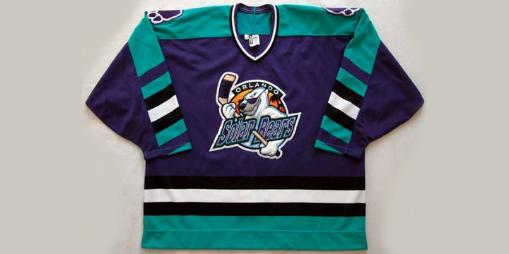
Once upon a time, this is what was worn by a team called the Orlando Solar Bears.

These Solar Bears played in the International Hockey League for six seasons and won the last Turner Cup championship before the IHL disappeared in 2001.


Reader Comments (5)
Those old colors make me miss my Detroit Vipers. I won a home jersey from their "kids club" when i was 11, and i can finally wear the adult size i was given!
I own the white version of that Solar Bears jersey! I miss the Vipers too James, I actually have a white Vipers jersey. And a Cleveland Lumberjacks jersey with the Beaver logo. Man I miss watching those IHL teams play here in Fort Wayne.
Ok, so I got my glimpse during the photo shoot. The purple jersey (Not sure if ECHL does white at home or the road) has the logo with the text, as you have in the picture at the top of the page. The white jersey just has "Shades" in the sun logo. No shoulder yokes or stripes, but there is a triangular and diagonal mish-mash of teal, purple, and black on the sides and undersides of the arms. The paw in the sun logo is a shoulder patch on both sweaters. The white jersey looked better, in my opinion, because I do not like text on a jersey.
The ECHL is stuck when it comes to logos. See: Aces, Condors, Express, Everblades, Eagles, Cyclones, Gladiators, Steelheads, Thunder, Walleye, Titans, Grizzlies, Sting Rays, Reign and now the Solar Bears. A name bar and a logo climbing over it, under it, standing behind it. I'm not kidding there is a creative block in that league.
so true paul lol I went to the ECHL.com and found that 90% of the teams used that exact scheme, the only team that was slightly more creative imo were the Florida everblades, where there logo consists of an alligator and the script everblades, which form to make the shape of an ice skate and looks pretty good.