


San Francisco Bulls Unveil Jerseys
 19 Comments
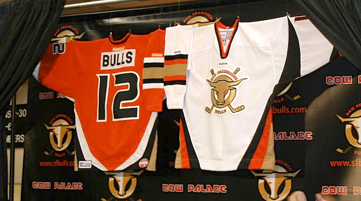 ECHL expansion team San Francisco Bulls unveil uniforms
 The ECHL's San Francisco Bulls won't hit the ice for the first time until later this year, but today they unveiled their new uniforms. And somewhat disappointingly, they're an odd amalgam of NHL sweaters.
The jersey itself is essentially the template based on what the Buffalo Sabres wore between 1996 and 2006 — otherwise known as The Goathead Years. I'm assuming they were chosen strictly for the bull horn style stripes on the sleeves. Not a bad call, but not all that original either. (Not that that's necessarily a bad thing.)
The colors being identical to those of the Anaheim Ducks, the Bulls have also borrowed the Ducks' number font. And the nameplate is straight off a Philadelphia Flyers jersey. And if I'm not mistaken, exact same font as well. The socks also look a lot like the Sabres' from the late '90s.
So it's not the most original uniform we've ever seen, but you'll notice the shoulders are bare. Last week, I mentioned that the Bulls agreed to look at some logo designs by Icethetics artists to use as a shoulder patch. Some awesome designs have been submitted and I can't wait to post some of them. And who knows, maybe one of them will be seen on this uniform by the time the team hits the ice.
You might also notice from the above photo that the logo on the jersey doesn't quite match what's on the backdrop. The Bulls went through some brand licensing issues this winter which pigeon-holed them into keeping the original logo that was being used for marketing purposes — or at least something very similar. The logo on the jersey is the newer one.
You can read more about the jerseys on the team's official website. Feel free to sound off on the San Francisco Bulls uniforms in the comments.

Reader Comments (19)
is the dark jersey orange or red? you said its Anaheim colors...so im guessing orange
looks like the red and black Sabres goatheads had a one-night stand with the Ducks number and color sets.
Are those ANA-style numbers??? Yuk!
sorry not a fan of this at all! where is the creativity with the logo? so boring to see them just add a couple of sticks YAWN
i like the colours
let's hope some contributors from Icethetics can help them with a better looking uni!
The logo (both old and new) would be a lot better without the hockey-sticks. When will designers stop trying to put hockey sticks in logos? I beg of you!
The jerseys are disappointing as well, but only because they fail to rise above the typical minor league standard. On the other hand, if they are going to pilfer Anaheim's palette, I'm glad they are using orange as the primary instead of black. Bravo for that.
It's the font from the old, pre-nameplate Flyers sweaters (and current replicas), but not what's currently on their actual sweaters.
Choosing the colors and number font of the nearby NHL team's biggest rival wasn't a great choice. The logo doesn't impress much either. Still, I'll go to a game or two to check out ECHL hockey.
The design and look is alright, but I wish the number font was more original. They should've put horn accents to the numbers maybe, like the Manitoba Moose did with antlers on theirs.
WTUgly!
If only there were some young hip graphic designers in SAN FRANCISCO who could design something creative and original....
ICK! I can't find anything I can like about it! Tired old blank, ugly colors, bad logo (which looks kind of small on the jersey).
They look very much like the ECHL Birmingham Bulls from the 90s: http://www.gameworns.com/images/echl/BirminghamBulls/2000-2001/Bulls25MERLIroadfrontG.jpg
Logo is also pretty similar to the Red Deer Rebels in the WHL...
http://www.sportslogos.net/logo.php?id=1799
Horrible.
They need to make the words on the logo bigger and get rid of the hockey sticks. I've also never been a fan of the "nameplate" idea.
But, I can see what they were trying to do with the sleeve stripes resembling horns. It also seems like these aren't the final uniforms (lack of secondary/shoulder logo etc.) so we'll have to see what makes it on the ice...
Yikes! It's a shame!
Did you ever notice that the negative (white) area of the old Sabres white jersey created a silhouette of a buffalo head? You sortof need the shoulder yokes to see it, so you won't be able to see them on the Bulls jersey, but I always wondered why the Sabres' yokes were not quite round and not quite straight, and that's why. Works best when you see the jersey laid flat.
Agree on ditching the sticks on the logo.
As far as shoulder patch ideas, I think they should use the old San Francisco Shamrocks logo [has 'S F' with the bridge through the letters] or make one that is similar. Shamrocks played in the Cow Palace in the PHL back in the 1970's.
Did someone already mention it looks like a BBQ sauce logo?
Can you say ana ducks numbers and side panel stripes lol