Flames Unveil New Third Jersey
 Sunday · Oct 27 · 2013 | 11:46 PM PDT
  59 Comments
 Calgary's alternate sweater officially launches
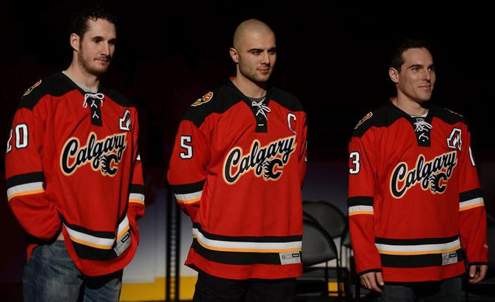
On Sunday afternoon, the Calgary Flames officially unveiled their new red third jersey to fans at Flames Fest. There weren't many surprises since the sweater was mistakenly leaked a few weeks ago by EA's NHL 14 video game. But notice I didn't say "no surprises."
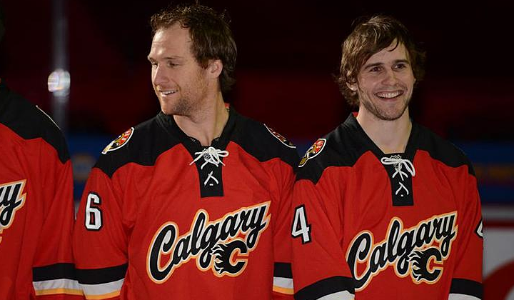
Take a good look at the shoulder yoke. It's difficult to tell in some of these photos, but that's not a straight line that runs from the collar to the shoulder. It dips down forming a sort of triangle. The photo below gives us a slightly better look at what I mean.
The first thing that comes to mind is the old Colorado Avalanche jerseys mean to resemble mountain peaks. And to think Reebok said it couldn't be done with the Edge style. Perhaps this means the Avs can soon be fixed? But this post is about the Flames. So let's continue.
One feature that caught my eye was the new number style. Definitely unique in the NHL.
For one thing, the 5 looks like an upside down 2. It's not, but it looks that way on first glance. That might take fans a little getting used to. But I'll get more into those details in my full review this week. I just wanted to take this time to get some photos up and point out a couple of interesting items.
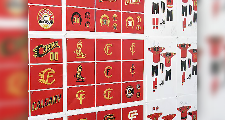
Speaking of interesting, the Flames also released a video that talked about the development of the jersey and some of what was considered during the design process. Included in the video is a shot of an idea board that shows a lot of unused concepts. I know we love seeing that sort of thing.
 Video still from Calgary Flames
You can see some alternate versions of the shoulder patch — which make it more clear the yellow patches were meant to symbolize Alberta's wheat fields, apparently. I had been wondering about that. There were also a lot of cowboy-themed logos under consideration at some point. The bladed boot stuck out to me as a very retro style logo. Any of them pop out to you guys?
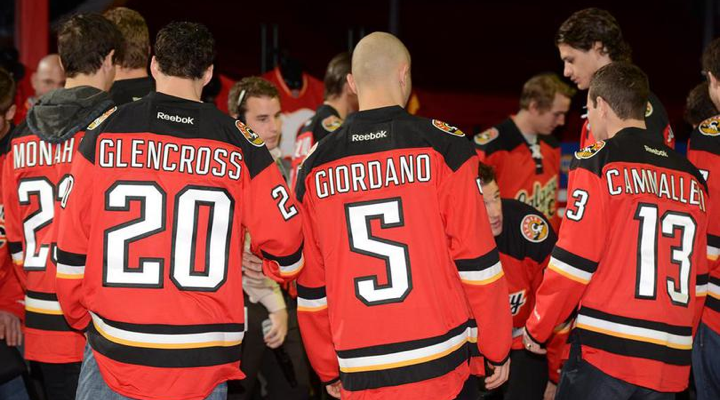
While you consider that, I'll leave you with a photo from today's event that features just about every sweater from Calgary Flames history.
Extra points if you can name what's missing — without going to NHLUniforms.com! Again, I plan to post my full review of Calgary's new third jersey this week. Meantime, share your reaction!


Reader Comments (59)
Oh goodie, yet another third jersey that's THE EXACT SAME COLOR as their home jersey. There should be a rule against that. As terrible as the Sabres' third is, they should at least get credit for trying something different.
Looks a lot better from behind than it does in the front.
I would drop the flaming C and use just the script. Together it looks way too cluttered and amateur
A bulk of the unused marks from the screenshot above are mine. I'm glad they are being well received.
I also did the numerals and lettering. Honestly, I can see what people are saying about the 5. It's not exactly conventional, (and yes, it was designed to mirror the 2). In retrospect, it's not my favorite 5 and I think the set of numerals as it exists now would work just as well (probably better) with a more traditional 5. My original design for the lettering and numerals had a more pointed/native/western look. These characteristics were apparently removed later in the process. This omission dulls much of the association and context the numerals relied upon, and I think that ends up accentuating the unorthodox look of the 5.
All in all, though, the lettering and numerals turned up pretty nice, and I think for a third jersey, I can live with that 5 as a fun little quirk. My favorite idea that made it to the end is the pointed shoulder yoke.
Why are mountains features so prominently on this jersey? You do not look up and see mountains when you are in Calgary. You are never surrounded by mountains like in that shoulder patch. The only mountains around Calgary are an hour and a half away in Banff.
I finally saw these in action last night while watching highlights... and to my surprise, they didn't look too bad. I'm still not enamored with the design, but I now wonder if they stayed with the same dominant field color in order to augment the famous "sea of red"?
After my verbal blast of them in the post documenting the leak from NHL 14, I, like Kozmograf/x, didn't mind them on the ice. They're not that bad. If I never see the front, I actually quite like 'em. Since every single Calgarian already has at least 1 red Flames jersey, I wonder how many thirds have sold since the reveal?
@EL The mountains and the tall grasses with the CF in the middle are supposed to represent Calgary's location between the prairies and the Canadian Rockies, not a literal postcard-esque view of the city. The points on the shoulder yoke, as others have mentioned, are supposed to recall the decorative construction of a western shirt, not mountains.
@EL It's also supposed to be a representation of the Alberta flag/coat of arms which appears on the shoulder of the normal jersey.
A terrible effort. Time for Calgary to hire someone who can design a decent jersey.