Flames Unveil New Third Jersey
 Sunday · Oct 27 · 2013 | 11:46 PM PDT
  59 Comments
 Calgary's alternate sweater officially launches
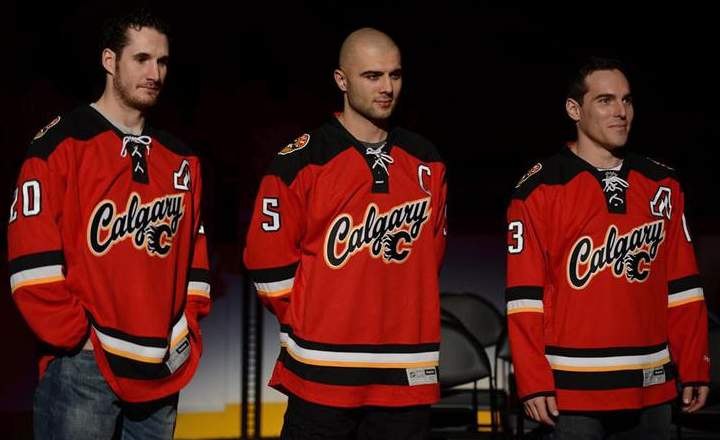
On Sunday afternoon, the Calgary Flames officially unveiled their new red third jersey to fans at Flames Fest. There weren't many surprises since the sweater was mistakenly leaked a few weeks ago by EA's NHL 14 video game. But notice I didn't say "no surprises."
Take a good look at the shoulder yoke. It's difficult to tell in some of these photos, but that's not a straight line that runs from the collar to the shoulder. It dips down forming a sort of triangle. The photo below gives us a slightly better look at what I mean.
The first thing that comes to mind is the old Colorado Avalanche jerseys mean to resemble mountain peaks. And to think Reebok said it couldn't be done with the Edge style. Perhaps this means the Avs can soon be fixed? But this post is about the Flames. So let's continue.
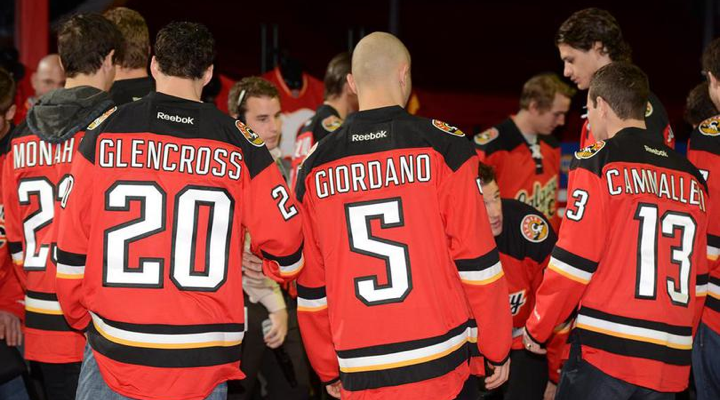
One feature that caught my eye was the new number style. Definitely unique in the NHL.
For one thing, the 5 looks like an upside down 2. It's not, but it looks that way on first glance. That might take fans a little getting used to. But I'll get more into those details in my full review this week. I just wanted to take this time to get some photos up and point out a couple of interesting items.
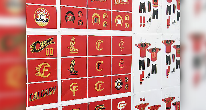
Speaking of interesting, the Flames also released a video that talked about the development of the jersey and some of what was considered during the design process. Included in the video is a shot of an idea board that shows a lot of unused concepts. I know we love seeing that sort of thing.
 Video still from Calgary Flames
You can see some alternate versions of the shoulder patch — which make it more clear the yellow patches were meant to symbolize Alberta's wheat fields, apparently. I had been wondering about that. There were also a lot of cowboy-themed logos under consideration at some point. The bladed boot stuck out to me as a very retro style logo. Any of them pop out to you guys?
While you consider that, I'll leave you with a photo from today's event that features just about every sweater from Calgary Flames history.
Extra points if you can name what's missing — without going to NHLUniforms.com! Again, I plan to post my full review of Calgary's new third jersey this week. Meantime, share your reaction!


Reader Comments (59)
White pre-edge jersey is missing, and I guess you could count the anniversary retro jersey as it had a different collar than the third jersey based off of it.
The pre-Edge white jersey isn't up there.
The new shoulder logo references the Alberta crest/flag, which Calgary wears (in violation of all good sense and taste) on their home and road jerseys. As an Albertan, the yellow bars immediately read as wheat.
http://en.wikipedia.org/wiki/File:Flag_of_Alberta.svg
The Flames' new alternate uniform isn't terrible but, I don't think it is anything great either. It is alright, for a third jersey, it is a change but I still much prefer the retro but that's me. I don't like this uniform's lace up collar, it looks like something that came from a museum even though that is meant to "honour their Heritage" and give a bit of a cowboy look but still, I think the collar is a little much and I do agree with those that say that it does look like a Replica jersey you would find at a major store chain that sells NHL merchandise. I also find that it is very similar to the Devils' uniforms and I don't see why they couldn't have put "ALGARY" behind the flaming 'C' instead of a wordmark and the 'C'. Even though I'm not big on wordmark jerseys, as I said before, for a third jersey, this is decent and hey, they could have pulled a Buffalo too. :p Also, Chris, there is something that I noticed during their speech on the third jersey that really interested me and raised some flags. They said that the third jersey is "adding to the current jerseys 'AND THE VINTAGE JERSEY'." This has got to mean that the Flames are going to continue wearing the vintage jersey too but, they never released a schedule for when it's being worn. Chris, I think you were right that the NHL has allowed teams to have an alternate jersey as well as a throwback jersey.
Is there other pictures of a 5? Because it really does look like a flipped 2.
Overall, well done, but it's is a step down from the previous third. What this franchise SHOULD have done was scrap the current home and away for the throwback and a white version to match (just like Edmonton did), then introduce a third like this one to keep things fresh.
I dig the yoke cut, but at the same time I think it would be better on a new Aves set. The new secondary crest is a gem, but does anybody else feel like it's positioned awkwardly high on the shoulders? The script+logo (a la Buffalo) lacks imagination, but it's not ugly. From the unused concepts, the black script that starts with the modified flaming C would have been a better choice.
And yean, that bladed boot is great. It doesn't really fit with their current brand, but I bet they could put it on a tee shirt that would sell like hot cakes.
Rather than representing mountains, the shoulder yoke looks sort of like the hem on any cowboy shirt. I won a replica jersey at the event, so I can look at it up close. This is maybe not the best reference picture, but something like this:
http://home.earthlink.net/~anitaastrologer/cowboy.gif
One of the "rejected" ideas looks like the "denver spurs" logo of the former WHA.
The new jersey looks sharp. But I already miss the retro they wore last year. Still one of the nicest hockey uniform ever for me.
Not really surprised, but not too disappointed either. Firstly, glad they kept that Atlanta Flames alternate captain's patch, that should never go.
And just as I was about to lose faith in modern design trends in the NHL, here comes Calgary out of nowhere with that awesome jersey font. I was afraid everyone was going to use a non-unique traditional blocky font, as the Wild recently scrapped their jersey with a unique font with a vintage-based one. That said, this is something I'd like to see more of, the only other teams with unique jersey fonts are Anaheim, Carolina, Colorado, Columbus, LA, Ottawa, Phoenix, Vancouver, Washington and Winnipeg. Well...more than I recalled at first...but no matter, I'm glad to see the trend is not fully dieing.
And speaking of being unique...I love that shoulder yoke. Perhaps the Avs can revert to their old ones after all! I'd love to see what's in store for the future.
I could have sworn they had a black one with the C logo on it, in white.
The shoulder yoke is supposed to mimic a Western style shirt.
As a Calgarian - and lifelong Edmonton Oilers fan - this jersey even resonates with me. The shoulder patch is perfect and should probably have been promoted to the front of the jersey. Not a perfect third but a nice addition to the city.
I'm pretty sure the shoulder yoke is just square, and the 'triangle effect' is a product of how it's hanging off the player's shoulders. If you scroll through pictures on the Flames website, there's no consistency with the shoulders. Even if you look at the picture from the Stars unveiling, Modano's jersey could suggest that there's a triangle pattern in the shoulders. But we all know that's not the case.
Looks better in real life than that first drawing that was leaked. Still, I'd rather there be more gold on the jersey and less black.
Would have loved further developed bladed boot logo on the crest. That could have looked awesome and been something more unique.
They are missing the white jersey from the 03-04 cup run with the flaming horse head on the shoulders. They are also missing the retro red jersey they used for their 30th anniversary, it was made by Reebok but featured the old CCM 6100 cut, despite all other jerseys that year being the Reebok Edge cut. To be honest, the jersey is meh. Flames could have done a lot better. Just don't see why they need to have the wordmark on the front as well as the flaming C. For the last time, this team needs to drop the black from its jerseys, and perhaps change this fireman red. The shoulder patch is surprisingly nice in my opinion, and the numbers and font on the back are alright too. Still, the old retro jerseys destroy this one. I don't see this lasting longer than 3 seasons.
It's not terrible, but I wouldn't say it's great either. It's pretty unique though, and quite different than what the Flames have had in the past, so that's a point.
I believe the unique sholder patterns are intended to reflect the design of traditional western/cowboy wear. A quick Google Image search for 'cowboy shirt' reveals numerous examples.
I appreciate the effort and creativity, but I'm not a fan of the new jerseys and don't think they will be big sellers.
Ultimately, the inclusion of the flaming C alongside the wordmark makes me think of something you would find in the men's section at a department store, and that kind of ruins it for me.
The mountains in the shoulder yoke is a unique idea, but its hard to notice when someone is wearing it because it just makes the jersey look like its wrinkled. I also don't like the way the black extends down the neck behind the laces, again making me think of department store merchandise. Hands down, I would prefer a traditional shoulder yoke.
The letter font will taking some getting used to but I love the new shoulder patch. At least they're not the worst 3rd jerseys in the league though (the Buffalo Sabres come to mind).
I think it's the first time in my life I prefer a jersey from behind that from front !
I'm not a fan of jersey with the city name on front, so i I would prefer only the Flames logo.
Looking at those concepts from the video still, the skinnier flaming 'C' with the 'F' inside it stood out to me. I know vintage scripts are the trend right now, but its the exact same thing that Buffalo had. Would like to see more creativity. Other than that, the rest of the jersey is fine, interesting insight with the shoulders. But to be honest it makes no sense for a team called the FLAMES to have black be such a prominent color. A flame can be almost any color except black...
Since Calgary is known as Cow-Town, and is home to the Calgary Stampede, I believe that the shoulder yolk front is intended to mimic the design on the front of western style "cowboy" shirts, not so much the mountain ranges in Alberta.
I like 'em as a third jersey, but I wish they could evolve more toward the gold than the black. With the black yoke, it evokes the Devils too much. But it could be worse (*cough*Buffalo*cough*).
my last comment should have been yoke, not yolk. I'm an idiot.
I find it odd that the players are wearing premier replicas and not authentics...
Not a bad third jersey at all, love the shoulder patch.
I will never look at that "5" and not think it is a mistake. Poorly executed design.
Despite my user name, I have nothing against the Flames. I do, however, have a few issues with this jersey.
So the new logo incorporates the old logo, and the 'A' on the front is the old Atlanta Flames' logo; that means there are 3! logos on the front of the alternate captain's jersey! Also, the Captains jersey sports 3 prominent C's on the front. Now that I have seen that, it is all I can see.
I really like all of the other elements of the jersey: the font, the yoke, the colours, the shoulder patch...
I just would have hoped that with all the great cowboy themed logos on the drawing board that they could have chosen something better than something you might expect to see on a T-shirt at the team store.
Hard to tell, but it's either missing the 2001-2007 white jersey or the current away jersey.
The new alternates have definitely grown on me since the leak, but I'd still rather see a different crest.
I like the shoulder yoke and the use of the more current reds and I like the using the Atlanta Flames symbol as the "A" for Alternate Captains. However, I really don't like the chest, I'm not at all a fan of the lettering (meant I'm sure to bring the lettering used by the Calgary Stampede to mind) and adding the flaming C makes it look cluttered and overly busy. I think I would have much preferred that they use the shoulder patch logo as the main centerpiece.
Didn't notice the shape of the yoke before. Will have to see the jerseys over equipment to get a real sense of the yoke's shape. As I said before, the flaming "C" is superfluous and just over-complicates the logo. Especially on the left side of the jersey where they had to place the captains' letters above the encroaching rising end of the wordmark. On the right, guys! On the right! And, if they hadn't used the flaming "C" as they did, then they could have used it as the captain's "C" to match the alternates' "A". That poor, poor captain's "C". Sigh... I'm sure I've seen that cowboy boot/skate concept logo before put just can't find it. It's the same concept as the WHL/WHA Denver Spurs and AJHL Calgary Spurs, but I'm sure that's not what I'm thinking of. Anybody?
Personally I think this version of the flames jersey utilizes that terrible non color black pretty well. I don't find it to be nearly as off putting as I usually do when looking around the league and I think it works decently as an accent color here. The yoke I could live without the mountain features as it just seems so amateurish to me but I realize some people really love those crazy minor league design features and at least it's rather subtle here vs in your face. I really liked some of those alternate FC logos and think they would look good if used properly and the cowboy boot with skates is interesting but to cheesy for me much like that lumberjack Vancouver guy on luongos helmet. Finally I am not a fan of teams who spell out their city on their jerseys or even their names. Even the rangers in all honesty I prefer the shield and wish they would use that.
I wish the flames would dump the color black and stick with yellow white and red much like I wish the kings would drop their terrible black white look. Bring back the purple!
Not too bad! I'm not sure I love the shoulder yoke triangles but maybe they'll look better to me when they're filled out/stretched into shoulder pads on the ice.
As for the wall of unused logos, I'm glad they didn't go with with any of the "CF" designs because the way it's formatted looked a lot like the interlocking CF on the iconic Real Madrid crest (or from number of teams that end with Football Club, Club de Futbol, etc.)
The only good thing about this jersey is the white numbers on the back. I've never been able to read the black on red numbers on TV.
missing 2004 whites
the numbers totally remind me of the ones used on the sabres old black and reds. not exactly the same but similar for sure
Did Ken King's kid puke these up? Because they're so horrible I have to assume they were "designed" by a pre-teen.
What's missing is the Atlanta Flames jersey.
Juxtapose the red with the black and the black with the red (and switch the sides of the Captain and Alternates' crests a la Detroit) and this would be a super sharp and unique jersey. As it stands now though, it's not awful.
its too bad they didn't try to modernize the previous "flaming horse" third jersey, I thought the logo was very sharp and not cheesy at all.
Dump the front logo and add a stylish new C and go with that. Over all the jersey is really sweet but that front logo is as bad as the 3rd jersey released by Buffalo a few years ago and surprise surprised has been shelved...for another bad design. Reebok really needs to change its approach to trying to be cute with front logos! Again, I like the look of the jersey. I could even see it being the new home but only of they change the front logo...please!
Maybe it's just me but the crest looks like a complete ripoff of the Sabres' 40th jersey.
Overall, not bad, but there are things that I dislike : I am tired of lace-up collars and this one makes it even worse because of how it goes down too low on the chest... Atlanta Flames "A" for the assistant captains : tacky. On the plus side, that shoulder patch is great. as is the number font. Even the striping is good. I would want the Flames going full time to vintage, but I could see them going full time with that set in the future. They'd only need to swap the script "Calgary" for the flaming "C" and add a white version. That would be a great improvement over what they are wearing now.
If they could make the front not reebok diaper style why not the back!? Overall fail, 0/10.
Lazy ripoff of the sabres last third jersey, rather they just used the throwback as a third or better yet bring a white version of the throwback and make them the normal jerseys. Then use the red jersey with the black C as the third.
I like the jersey. I think it would've been better with the scripted "Calgary" by itself and the Flaming C used as the captain's C.
I love the interlocking CF logos in gold on the red background...except they somewhat resemble the old Soviet Union hammer and sickle, which is probably why they were nixed...but that whole board is just full of retro logos that would look great on the ice.
I agree with Cory. Lose the black flaming C on the front, and this becomes instantly better. It just looks out of place and crowded, like it was shoved up underneath the word mark at the last moment.
I really like it's uniqueness and creativity I just don't like the weird looking "5". As others mentioned it really does look like a mirrored image or a flipped "2". Also the flaming C should really be in the Calgary word mark and not under it. It just looks like an after though & out of place. But I like how they tied in the history & landscape of Alberta and really like the flaming alt captain "A" patches, those are sick.
As a die hard Flames fan, at first glance I was neutral on them, I thought they were alright. Went to go check them out in person at Fanattic today after work - I gotta say that seeing them in person they did grow on me. I really liked the white numbering up close, especially when put side by side to the slightly slanted black name / number text style of the current home. Still nothing better than the red retro's, but I'm good with this jersey as a third for a limited run. How bout switching the red and black though, having the 'Calgary' font across the chest along with the small flaming 'C' red on a black jersey?
Looks like New Jersey Devils' jersey with a different logo. Yes the trim is different but the basic design and coloring is the same.
The 2000 whites are not missing, as a few people have suggested. It's hiding in the back, but you can see it. The current home and road jerseys seem to be missing though, unless I'm overlooking something obvious.
Never mind. I see them now. I can just barely see the blue flag on the right shoulder of the current white. So the 2000 white is missing, and I recant my previous post :-P