Did NHL14 Leak New Flames Third?
 Saturday · Oct 5 · 2013 | 4:31 PM PDT
  60 Comments
 Video game appears to show never-before-seen jersey
Regular readers know how I feel about using video games as a legitimate source for news. It's not that EA's NHL franchise is typically inaccurate — it's not — but the frequency of errors is still a little high for my liking. (For example, they incorrectly listed the Minnesota Wild's green jersey as their home uniform this season.)
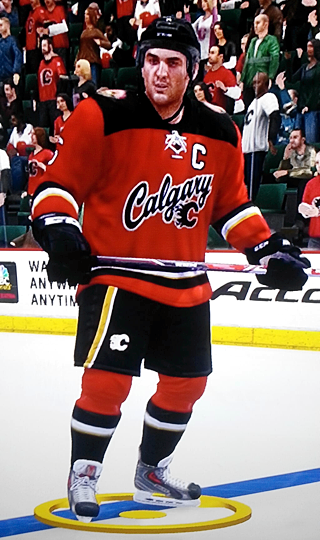
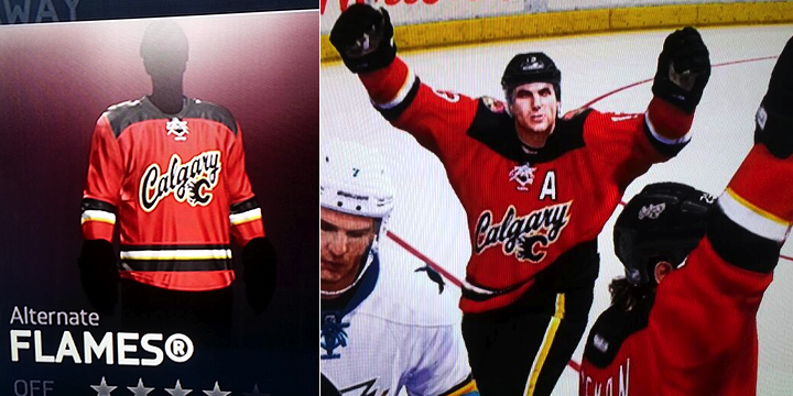
That being said, one reader stumbled upon something I'm comfortable posting here. Apparently, the Calgary Flames' new alternate sweater has been spotted in NHL14, according to Matthew Mahoney. I'll explain in a moment why I'm not immediately dismissing this. But first, another look.
Check out the squared off shoulder yoke. It's one of the new styles Reebok unleashed on the NHL this year. We saw it on the new road jerseys for the Wild and Hurricanes. Makes sense that one of the new thirds would feature it.
 Photo from Matthew MahoneyThe crest feels a bit inspired by the Buffalo Sabres' recently retired third jersey — the royal blue one. But it's the shoulder patch that throw me a bit.
This is an artistic style outside the scope of anything we've seen from the Flames in recent years. Perhaps it shows they're moving in a new direction?
Remember five years ago?
You may recall that in September 2008, Flames president Ken King spilled to a reporter some vague details about a new third jersey in the works.
He specifically mentioned working on a new shoulder patch. Could this be a remnant from that process? The jersey discussed in that report never saw the light of day as the Flames opted instead for a throwback sweater a year later.
It's very possible that this and other elements from the design developed five years ago carried through to this new look.
They kept the secret pretty well
One thing worth noting is that the Flames didn't breathe a word about a new sweater all summer. It only showed up in the JerseyWatch series because Reebok told retailers to be ready for it last January.
It then, of course, showed up "locked" in NHL14 when the game was released last month. So I have to assume that if it's showing up at this point, it's either a legitimate leak or it's fake.
These shots from Mahoney of the game are clearly photos taken of a screen as opposed to straight screen shots which could be more easily manipulated.
But given the sweater's appearance on the jersey selection screen and within the game itself, I'm comfortable saying I'm convinced it's the real deal. But you might be wondering how it appeared for Mahoney when most users are seeing a greyed-out jersey. Here's what he told me via Twitter earlier today.
@icethetics it was. I downloaded a roster file off the net and there it was in game.
— Matthew D. Mahoney (@MatthewDMahoney) October 5, 2013
If it's true, what do you think? Did the Flames make the right call by dropping the long-rumored black option? Is this a good look to add to the NHL?
Share your thoughts while we wait for something official from the Flames. My hunch is that the wait could be a while. Teams that don't release a new third jersey in the summer tend to hold off until right before Thanksgiving so as to maximize holiday sales. Think there will be a lot of these under Christmas trees in Calgary this year?


Reader Comments (60)
Awful - looks like a semi-official 'jersey' you would find at Wal Mart
@LV it likely means this new third will eventually replace the home. they did the same thing when the black horse head was introduced. was an alternate for a year or two, then became the permanent home, replacing the old jersey.
Like others, the first thing I thought of when I saw the shoulder patch was the old Colorado Rockies logo. Don't mind it though. As for the crest, why both "Calgary" and the flaming "C". Way too much. Also, seeing the alternate captain's "A" in the first action pic annoys me to no end. Unless there's an NHL rule that captain's letters have to be on the left side of the jersey, they should always be put on the lower end of a slanting wordmark; in this case on the right. (This has been a problem with a number of teams over the years.) That all said, if there was no flaming "C", and any captain's letters were placed on the right instead of the left, I wouldn't have a problem with the sweater at all. (On a side note, I loved the flaming horse-head logo.) Anyhoo...
The timing of this is perfect, really. After being bathed repeatedly in the hot garbage Nike is coming up with for the Olympics, this actually looks pretty good in comparison. I'm OK with the wordmark - even if wordmarks are uninspiring - but the Flaming C needed to be put elsewhere. Like on one shoulder, with the new mountain patch on the other.
Anyway, there were teaser commercials on the jumbotron at last night,s game. It was all quick-cuts and extreme closeups, but what we saw did resemble elements of this leak. We'll see the full reveal on October 27.
I'd say this is accurate. In between stoppages in play, there have been videos teasing portions of the new jersey that seem to match what is shown on the jumbotron. As stated above, it looks like a walmart knockoff, which is disappointing. Another hint confirming this is that vs Vancouver and Montreal, the Flames did not wear the retro third like they had the previous 4 years vs. Canadian opponents at home.
NHL '14 also did a good job at leaking the jerseys for the Sochi olympics.
This leaked jersey is a forgettable throwaway... the Flames current Reebok set is a garish, screwed-up re-imagining of their near-perfect 2004 look... and I was never a fan of their 80's look.
Dear Calgary Flames... PLEASE GO BACK to your 2004 jersey set. PLEASE. (But if I could suggest one little tweak, it would be to put the black C logo on the white jersey. THAT would look cool. )
Am I the only one who absolutely hates this jersey? I can't be! As a Flames fan, I have been through a number of jerseys and this would be one of the worst jerseys in our history. I am still holding on to the hope of a black jersey (hopefully with the flaming horse logo). This looks like some rip-off jersey you would find in some thrift shop or Walmart for about $30.
Anything is better than forcing the team to wear the tired old 'blood clot' jerseys of yesteryear as their 3rds. They were horrendous then, and they are horrendous now, END OF STORY.
Having said that, the misfires continue. The new shoulder patch is decent, and I'll take that over the flags any day...
[A brief side memo to Ken King: Western Canadian fans aren't bloody Americans, our sense of patriotism is more low key and internalized and we don't need to slap the flags all over our sports teams to remind the world of who they play for and reinforce our sense of self-worth. Replacing the fiery steed with the maple leaf and provincial flags looks just plain terrible (especially that shock of blue on the deep red background). You may as well have put two white flags on the shoulders instead, indicating to the world your complete surrender to the challenges of 21st century marketing and brand creation. ]
... but this constant need to turn back the clock and make everything look like it's from the 50's just irritates me. I'd much rather have seen the Flames buck that trend rather than follow it like everybody else and introduced another dark jersey as their third. Not black this time, but more of a dark charcoal with the burning 'C' emblazoned on the chest in red only (maybe two-toned red with a darker crimson along the edges) and then just red and gold trim, skipping the orange like they have with recent iterations.
Back in the tail end of the Young Guns era, I swear that team looked bigger and played bigger when they hit the ice in their black 3rd jerseys, and that's an element of psychological gamesmanship that they should embrace once again as part of the rebuild. DITCH THESE MEDIOCRE 3RDS AND REPLACE THEM WITH NEW DARK 3RD JERSEYS AT ONCE!!
These jerseys kinda resemble those cheap kids Flame sweaters you find at Walmart for $10ish :P No nostalgia here linking the team to its long gone glory days. Rather liked the use of the old retro orange sweaters from the 1980s, this use of the retro look that so many teams are doing in the NHL these days.