


Wednesday
Nov062013
Finland Unveils Olympic Jerseys
 29 Comments
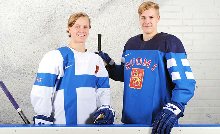 Photo from MTV.fi
Finland gets mix of traditional and modern jerseys
After taking a look last night at the new Olympic jerseys for Slovakia and Sweden, Finland has joined the party this morning. Their new Nike-designed jerseys were unveiled today. Photos of the new uniforms were shared by MTV.fi.
The blue jersey has the coat of arms crest you would expect — with the glossy outline of a lion planted on the shoulders. The white one is essentially the Finnish flag. Both are par for the course as Nike jerseys go. By that I mean the early response has been decidedly mixed. Most either love it or hate it.
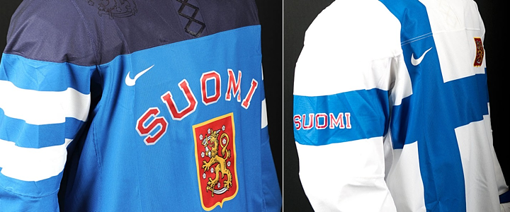 Photos from MTV.fi
What's your immediate take on these? Love or hate how Finland will look in Sochi?
Seven down, five to go. Who's left? Norway, Austria, Switzerland, Latvia and Slovenia.

Reader Comments (29)
Those Slovakian jerseys look great. The lyric pinstripes remind me a little of a Utah's college football team which used the Salt Lake City topographical lines on their uniforms a few years ago. Pretty cool to see the new ways designers come up with new ways to add the distinguishing traits of a city/state/country to their gear!
Ok Thats it, Nike has totally dropped the ball on these jerseys there have been a few bright spots but more misses than hits. Its time for IOC to allow the Hockey Federations to allow use their official logos instead of letting them get "creative" like this maybe then we'll have better looking jerserys
I like the whites. Very simple and different from what we've seen so far from Nike. Not sure about the dark one. It's a hodgepodge of elements, like the original didn't survive design-by-committee.
Nike, please stop this madness.
These Nike jerseys are all terrible. They all look like long sleeve rugby shirts we wore to middle school in the 90's. It wasn't a good look then either. Hockey jerseys are the greatest jerseys in sports, and that managed to mess that up. Am I alone on this?
I like the off-center use of the cross on the white one-- the asymmetry and use of horizontal lines as a major graphic elements are refreshing, it's an inventive use of a well-known iconography of Finland, and, most importantly, the overall design looks good.
Only criticism of that one is the Nike swoosh superimposed over the cross-- it's like defacing the national flag, and with a corporate logo, worst of all. If they insist on having the swoosh there, could they not do it in the same color at the stripe, perhaps using the shiny fake lace-ups material?
The white one, to be forget I hope. The blue one is almost good but I don't understand the pseudo stripes on the arms and as seen in the two pictures the two different patterns.
I know this website is supposed to be about only the design side of the jersey but the more picture we have the more it is like those jersey are not even good in terms of technology. Reebok has worked their ass off to get to the Reebok Edge jersey, and those just seems to be horrible to wear. Obviously this is just an opinion based on pictures anyway.
The white jersey looks more like a soccer kit than a hockey jersey or cheap knock-off Olympic merchandise.
These are really nice soccer unis !
Pretty sure that Slovenia released their designs months ago. Nobody noticed.
This was posted by the Slovenian Hockey Federation the day after they qualified for the tournament apparently.
http://img.rtvslo.si/_up/upload/2013/02/09/64962624_dres_show.jpg
Almost all of these Olympic jerseys I've seen thus far are pretty fugly.
If we're including the women's hockey uniforms (do you cover those?), we also have Germany and Japan.
My only hope is that Slovenia looks good so I can get a Kopitar jersey. Please let it be more like Slovakia and less like Finland and...well... everyone else...
Fucking Nike. Seriously. All these jerseys (except Sweden's) are like a kid playing around with Photoshop for the first time. Olympic jerseys are supposed to showcase national identity and tradition, not rejected third jersey designs from the 90s. If Sweden wants to keep the Tre Kronor (and anything else would be blasphemy) you don't fucking argue.
it's got some nice element but really doesn't compare to many of the other national sweaters. all the others seemed to have a little something special in the design. i'm not seeing it here.
and it feels... unfinished.
it will be interesting to see how they deal with the player's numbers with the flag on one arm and "SUOMI" on the other.
There's a lot of bizarre stuff going on. It's the complete opposite of the NHL trend towards classic, simple uniforms that everyone seems to love.
I can't make sense of those glossy shapes. They must look cool under bright lights because from a distance they make the jersey look like a garbage bag.
F
@Bickleton,
Check back on the Russian jerseys, which is the only one I've seen with a customization. The numbers will be placed higher on the arms....nearly on the shoulder like a football jersey. I had the same question with the Canadian and American shirts.
A more pressing question is where will the A's and the C go on the white jersey? The Suomi Lion takes up that space and the corporate-deface-of-a-national-symbol Nike swoosh takes up the right side.
If Nike values public opinion at all, heads will roll!
Some nice ones and some not so nice, i just can't get past the fake laces.
HAHAHAHAHAHA these are hilarious. The white one is an interesting idea but it looks TERRIBLE. Maybe it'll look better on the ice, where you don't always get the same angle.... idk, I want to like it because it is very different, but it just looks to awful.
And the blue one? Oh no. You know, it actually looks pretty good when you cut off the shoulders and can't see the dark blue. The dark blue ruins it totally; if that wasn't there and it was all solid Finnish-flag blue, it would look good I think. I do like the flag on the arm.
Anybody know what the jerseys are actually made of? Like it doesn't look like a normal jersey material, they look very stiff and wrinkly.
Put it to you this way, after seeing the Canadian jerseys up close, I'm completely unwilling to pay $149.99 for a jersey that looks like a Chinese knock-off. If all the other nations are similar, well Nike, step your game up, or step aside for someone that actually knows what they're doing.
This is hockey we're talking about, right??? Are those made of rubber??????? Will they be playing outdoors??? In the rain, perhaps???
I like every jersey released so far! Very out of the box and modern!
Thank you Nike for helping me save money! Why do we have to keep reinventing the wheel?
Sweden jersey looks like a rubber rain coat. Please!! Let's get back to basics
Wow, I'm surprised how negative everyone is. I think the white jersey's fantastic. Simple colours, great representation of their flag, and I even like the white Nike swoosh on top of the blue.
I understand the traditionalists, but not everything modern or assymmetrical is bad. There's simple and stylish jerseys (Finland) and then there's simple and boring jerseys (Canada). Compare the two: Canada's looks dull. The flag doesn't really pop, even with the gold border. The white Finland jersey, meanwhile, seems like a celebration of their flag.
Blue jersey's nice too, but more traditional.
@Mike: It's not so much the design of the flag being the jersey base. It's more for me the look of it over the pads, as it will be worn in action. It looks lumpy and unflattering. I'm more than willing to let a jersey look poor on a fan if it sparkles on ice. Also, I love the idea of incorporating more nationalist elements to the design- that is how a country truly owns their look. It just doesn't work here, and it feels like the forgot certain elements (front numbers, captaincy) when laying out the look. The fit, the overall design is unprofessional to my eyes.
In general, I'm extremely disappointed with this whole effort from Nike, and it makes me wonder if we haven't gotten a better option for the NHL with Reebok. That Nike can fill my head with such chilling thoughts is the biggest crime yet. I miss the CCM days.
The dude in white looks like Peeta from the Hunger Games, complete with cheap futuristic rubber jumpsuit. These jerseys are so shitty they're chasing me away from hockey altogether. Luckily the games will all be on tape delay by the time the North American working class see them, so they will only be an affront on our eyesight for two hours instead of three. WTF Nike, WTF?
@Matt W. The jerseys are made from recycled water bottles... I'm serious... $150 jersey made from used bottles we drink out of....